
Toolkit Tuesdays: DrawerFlyoutPresenter
Welcome to another edition of Toolkit Tuesdays! In this series, I’ll be highlighting some of the controls and helpers in the Uno Toolkit library. This library is a collection of controls and helpers that we’ve created to make life easier when building apps with Uno Platform. I hope you find them useful too!
This week we are covering the DrawerFlyoutPresenter, a lightweight way to create a drawer-like experience in your applications using Flyouts. It can also be utilized for other experiences such as a bottom sheet or a side sheet. In this article we will cover both the “navigation drawer” and “bottom sheet” use cases.
The DrawerFlyoutPresenter is a special ContentPresenter to be used in the template of a FlyoutPresenter to enable gesture support.
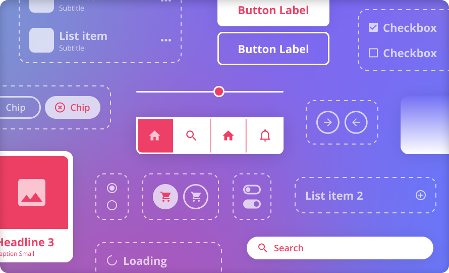
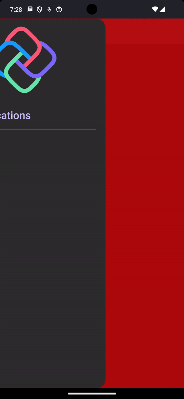
Anatomy of a DrawerFlyoutPresenter
Android
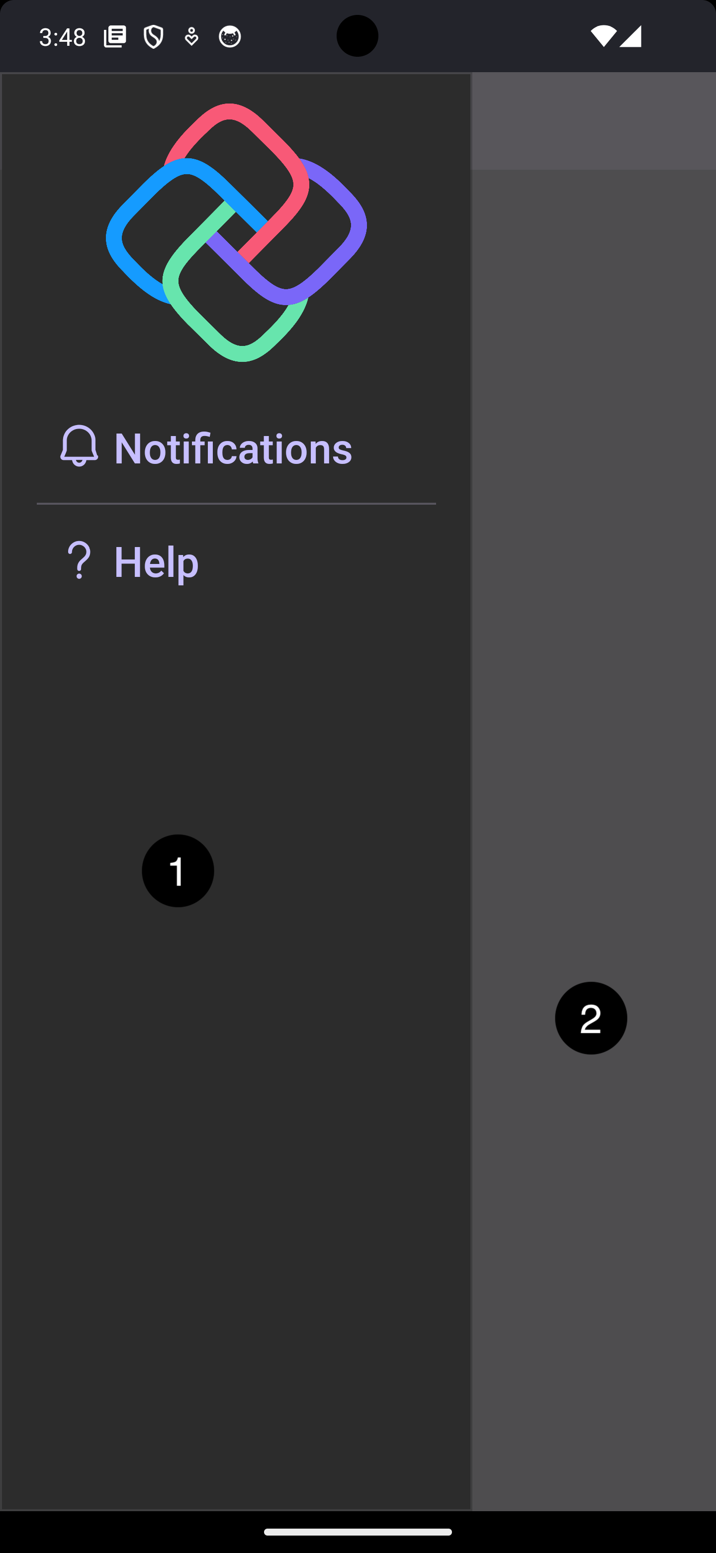
WASM
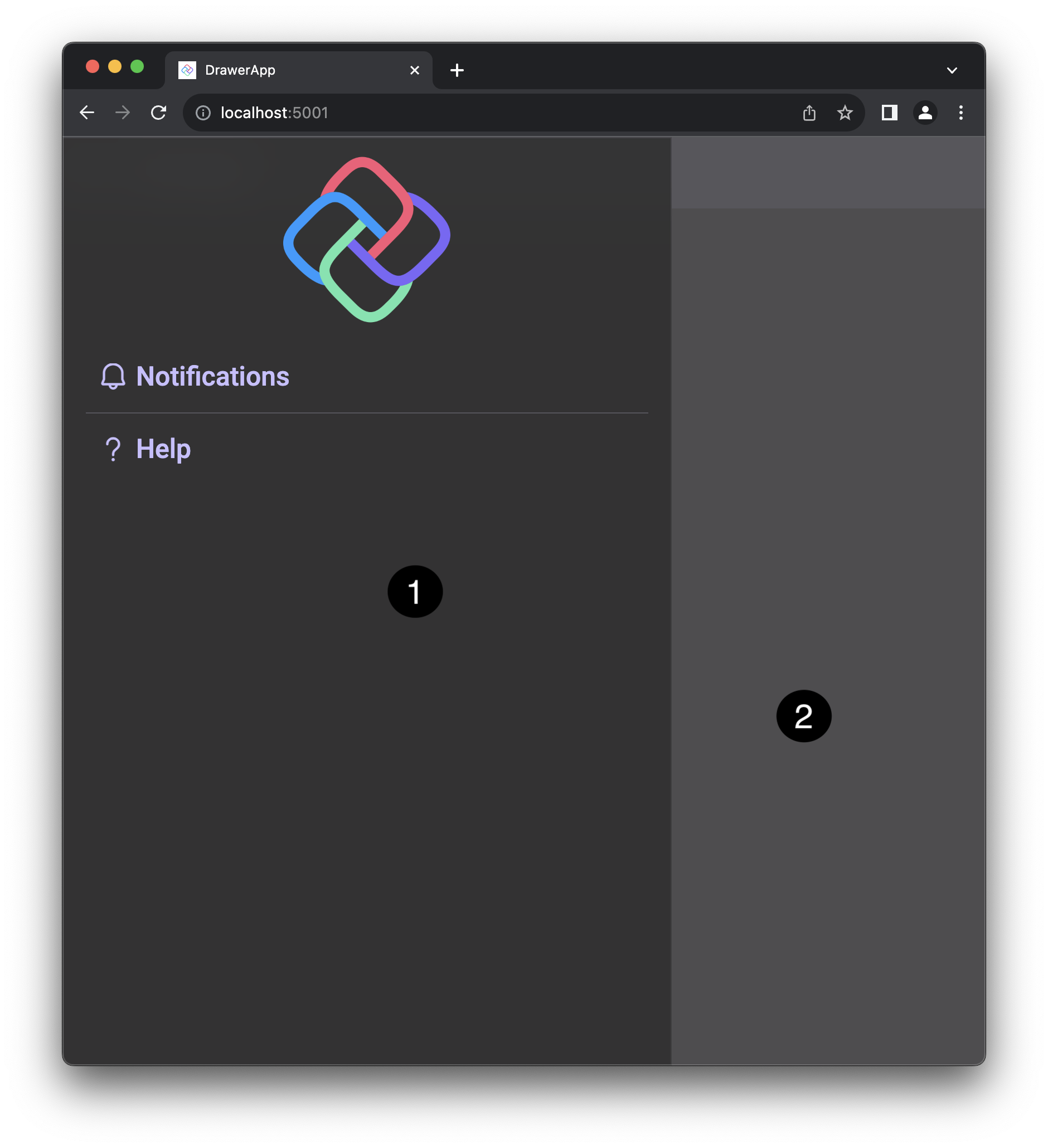
- Flyout Content
- Light Dismiss Layer
Properties
| Property | Type | Description |
|---|---|---|
OpenDirection |
DrawerOpenDirection=Up |
Gets or sets the direction in which the drawer opens toward. note: The position of drawer when opened is the opposite of this value. |
DrawerLength |
GridLength=0.66* |
Get or sets the length (width or height depending on the OpenDirection) of the drawer. |
LightDismissOverlayBackground |
Brush |
Gets or sets the brush used to paint the light dismiss overlay. The default value is #80808080 (from the default style). |
IsGestureEnabled |
bool=true |
Get or sets a value that indicates whether the user can interact with the control using gesture. |
IsLightDismissEnabled |
bool=true |
Gets or sets a value that indicates whether the drawer flyout can be light-dismissed. |
All properties can be used both as a dependency property or as an attached property, much like the ScrollViewer properties
Styles
The Uno Toolkit provides a set of pre-built styles that can be used as the FlyoutPresenterStyle of a Flyout to create a drawer-like experience. These styles are:
LeftDrawerFlyoutPresenterStyle(OpenDirection=Right)TopDrawerFlyoutPresenterStyle(OpenDirection=Down)RightDrawerFlyoutPresenterStyle(OpenDirection=Left)BottomDrawerFlyoutPresenterStyle(OpenDirection=Up)
These styles set the OpenDirection property of the DrawerFlyoutPresenter to the appropriate value and set the DrawerLength to 0.66* (66% of the screen width/height). They also set some defaults for the LightDismissOverlayBackground. You can also use these styles as a base to create your own custom styles, which is what we will be doing later on in this article!
Usage
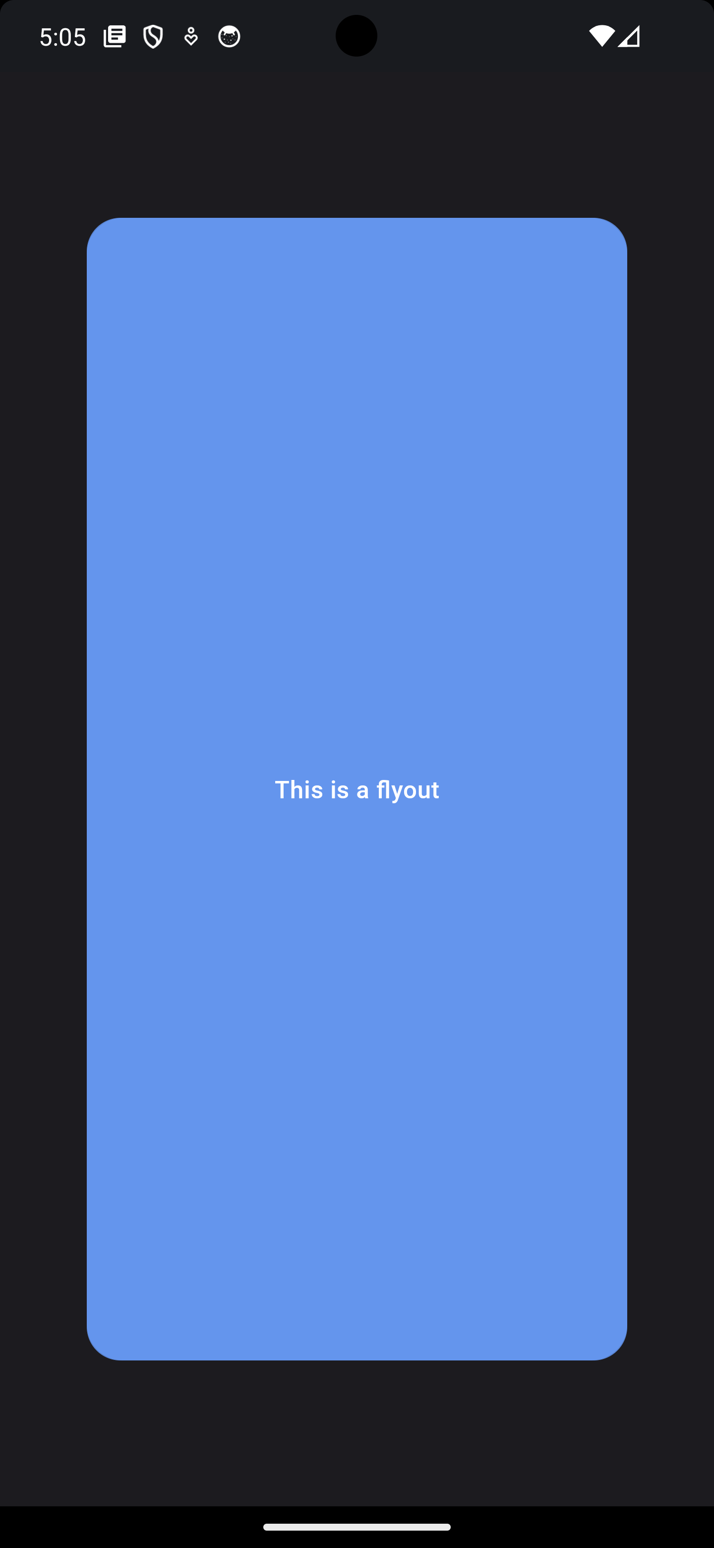
Let’s start by creating a simple Flyout that will open with the click of a Button and a Grid to display the content of the Flyout.
1
2
3
4
5
6
7
8
9
10
11
12
13
14
15
16
<Grid>
    <Button HorizontalAlignment="Center"
            VerticalAlignment="Center"
            Content="Open Flyout">
        <Button.Flyout>
            <Flyout Placement="Full">
                <Grid Background="CornflowerBlue"
                        Margin="50">
                    <TextBlock VerticalAlignment="Center"
                                HorizontalAlignment="Center"
                                Text="This is a flyout" />
                </Grid>
            </Flyout>
        </Button.Flyout>
    </Button>
</Grid>
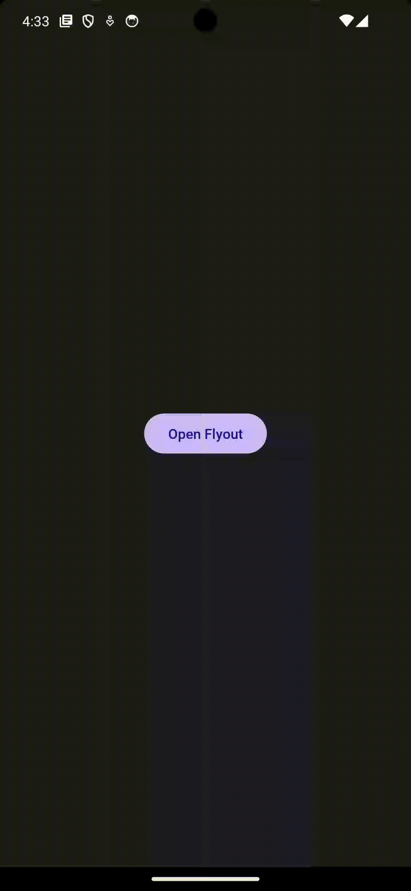
Breathtaking.
What if we want to anchor the Flyout to the edge of the screen?
What if we want to be able to drag the Flyout using a gesture?
What if we want to be able to control the size of the flyout relative to its content?
This is where the Uno Toolkit comes to the rescue. The Toolkit provides a specialized FlyoutPresenter called the DrawerFlyouterPresenter that can be used to customize the way your Flyout content behaves.
FlyoutPresenters are used as a means to style the content of a Flyout. You typically don’t need to use them directly. Instead, you would normally set the FlyoutPresenterStyle property on the Flyout to a custom Style whose TargetType is set to FlyoutPresenter. For example, say we wanted the original example’s Flyout to have some nice rounded corners and we can also move the Margin and Background properties to the FlyoutPresenterStyle:
1
2
3
4
5
6
7
8
9
10
11
12
13
14
15
16
17
18
19
20
<Button HorizontalAlignment="Center"
        VerticalAlignment="Center"
        Content="Open Flyout">
    <Button.Flyout>
        <Flyout Placement="Full">
            <Flyout.FlyoutPresenterStyle>
                <Style TargetType="FlyoutPresenter">
                    <Setter Property="Background" Value="CornflowerBlue" />
                    <Setter Property="Margin" Value="50" />
                    <Setter Property="CornerRadius" Value="20" />
                </Style>
            </Flyout.FlyoutPresenterStyle>
            <Grid>
                <TextBlock VerticalAlignment="Center"
                           HorizontalAlignment="Center"
                           Text="This is a flyout" />
            </Grid>
        </Flyout>
    </Button.Flyout>
</Button>
Now that we have a better understanding of how FlyoutPresenter works, let’s take a look at what you can do with the DrawerFlyoutPresenter from the Uno Toolkit!
So, let’s build that Navigation Drawer experience that was shown earlier on in the Anatomy section.
Navigation Drawer
We can use the DrawerFlyoutPresenter to build a navigation drawer experience. Complete with gesture support, light dismiss, and integration with other Uno Toolkit controls.
Here’s what we are looking to build by the end of this section (both Android and WASM are shown):

You may have noticed that we are opening the navigation drawer by clicking on the MainCommand of a NavigationBar. This is a custom control from the Uno Toolkit and one that we have previously covered.
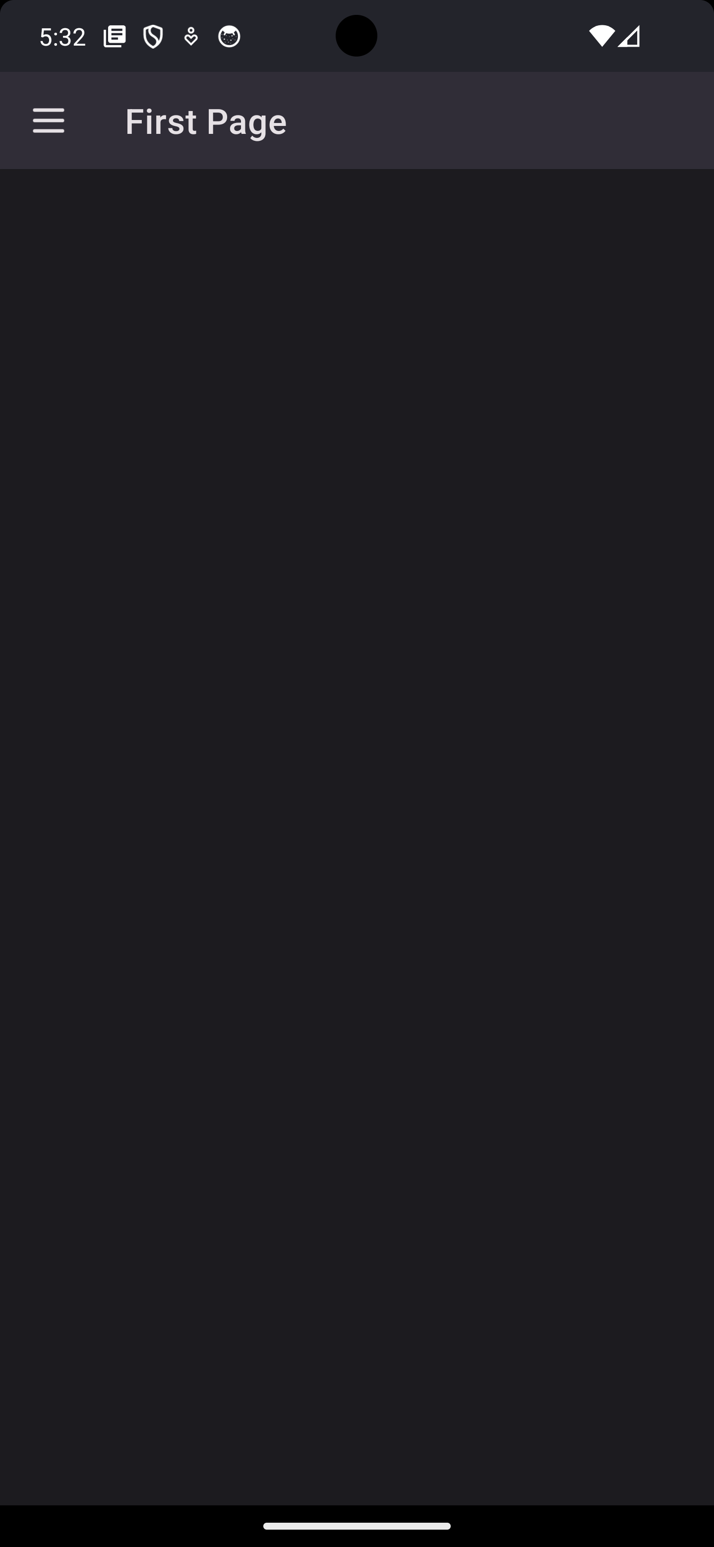
So, let’s add a NavigationBar to our Page and set the MainCommandMode to Action so it will always be visible. We will also set the MainCommand.Icon to a burger menu icon:
1
2
3
4
5
6
7
8
9
10
11
12
13
14
15
16
17
18
19
20
21
22
23
<Page x:Class="DrawerApp.MainPage"
      xmlns="http://schemas.microsoft.com/winfx/2006/xaml/presentation"
      xmlns:x="http://schemas.microsoft.com/winfx/2006/xaml"
      xmlns:local="using:DrawerApp"
      xmlns:utu="using:Uno.Toolkit.UI"
      Background="{ThemeResource BackgroundBrush}">
    <Grid>
        <Grid.RowDefinitions>
            <RowDefinition Height="Auto" />
            <RowDefinition Height="*" />
        </Grid.RowDefinitions>
        <utu:NavigationBar Content="First Page"
                           MainCommandMode="Action">
            <utu:NavigationBar.MainCommand>
                <AppBarButton>
                    <AppBarButton.Icon>
                        <BitmapIcon UriSource="ms-appx:///DrawerApp/Assets/Icons/burger.png" />
                    </AppBarButton.Icon>
                </AppBarButton>
            </utu:NavigationBar.MainCommand>
        </utu:NavigationBar>
    </Grid>
</Page>
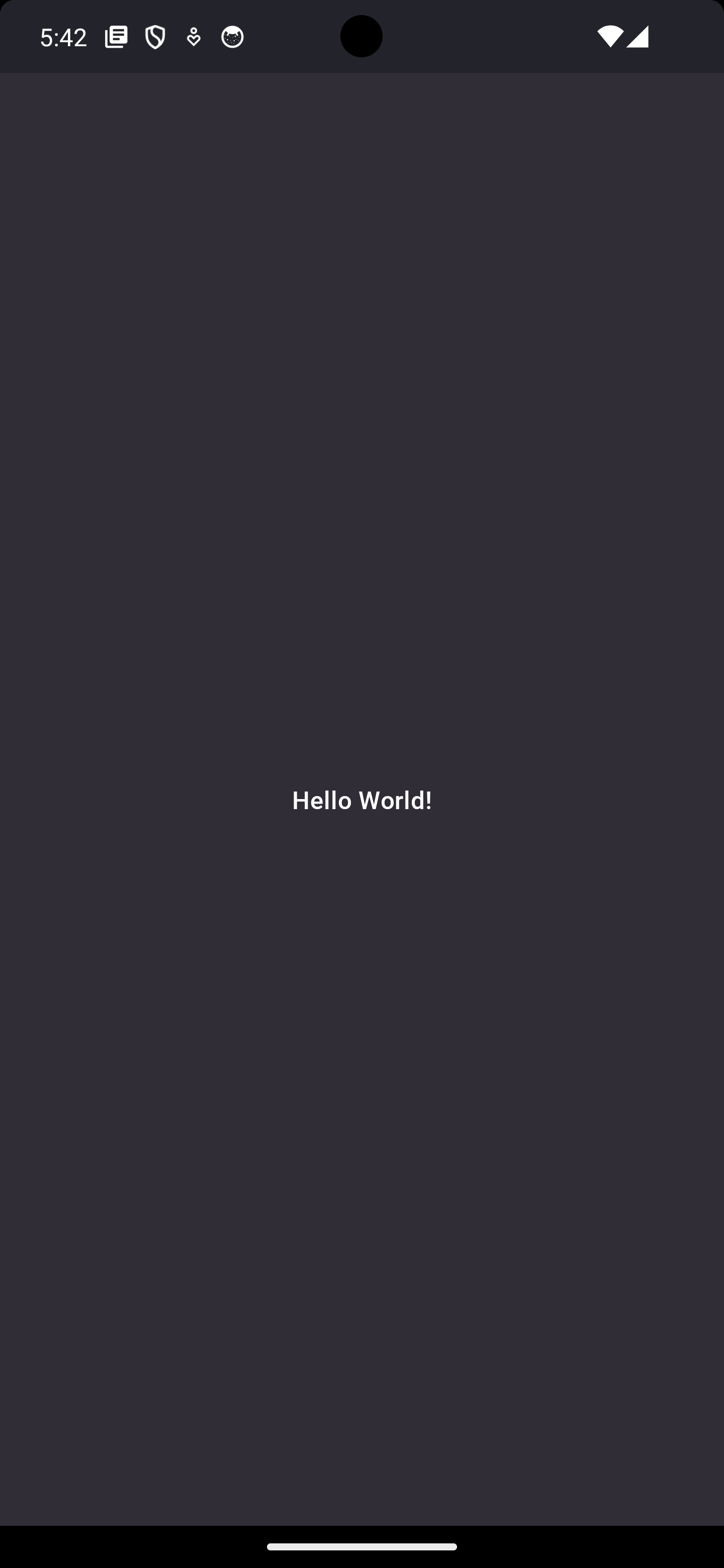
Now, we can have the MainCommand open a Flyout with Placement="Full" when clicked. We will add some dummy content to get started:
1
2
3
4
5
6
7
8
9
10
11
12
13
14
15
16
17
18
19
 <utu:NavigationBar Content="First Page"
                    MainCommandMode="Action">
     <utu:NavigationBar.MainCommand>
         <AppBarButton>
             <AppBarButton.Icon>
                 <BitmapIcon UriSource="ms-appx:///DrawerApp/Assets/Icons/burger.png" />
             </AppBarButton.Icon>
+           <AppBarButton.Flyout>
+               <Flyout Placement="Full">
+                   <Grid Background="{ThemeResource SurfaceBrush}">
+                       <TextBlock Text="Hello World!"
+                                  HorizontalAlignment="Center"
+                                  VerticalAlignment="Center" />
+                   </Grid>
+               </Flyout>
+           </AppBarButton.Flyout>
         </AppBarButton>
     </utu:NavigationBar.MainCommand>
 </utu:NavigationBar>
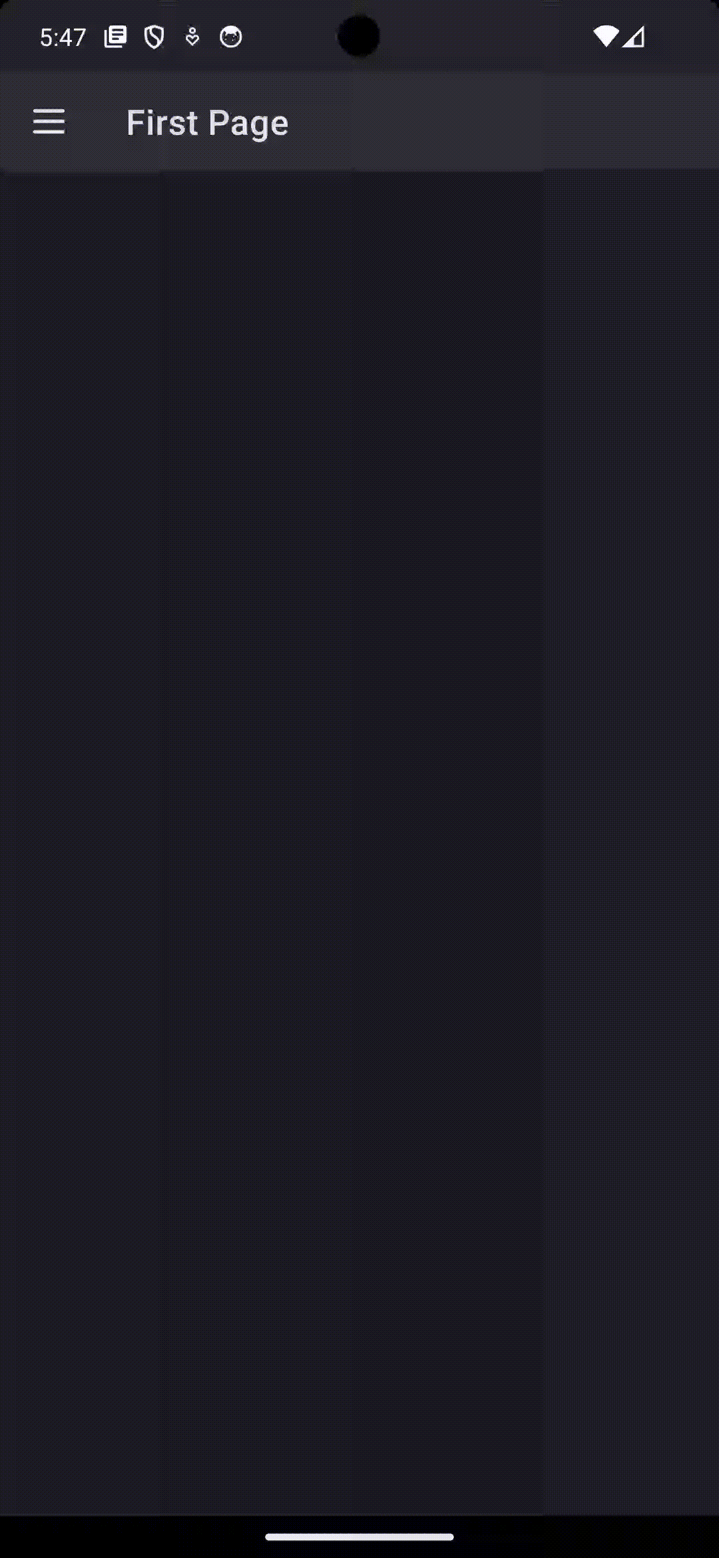
Setting the Placement to Full is required to ensure the Flyout takes up the entire screen. This is important because the DrawerFlyoutPresenter will be anchored to the edge of the screen and will not behave properly if the Flyout is not taking up the entire screen.
Now here is what the Flyout looks like once we press on the MainCommand:
Let’s now use one of the pre-built styles that we covered earlier and set the FlyoutPresenterStyle to LeftDrawerFlyoutPresenterStyle:
1
2
3
4
5
6
7
8
9
10
11
12
13
14
15
16
17
18
19
20
 <utu:NavigationBar Content="First Page"
                    MainCommandMode="Action">
     <utu:NavigationBar.MainCommand>
         <AppBarButton>
             <AppBarButton.Icon>
                 <BitmapIcon UriSource="ms-appx:///DrawerApp/Assets/Icons/burger.png" />
             </AppBarButton.Icon>
             <AppBarButton.Flyout>
                 <Flyout Placement="Full"
+                        FlyoutPresenterStyle="{StaticResource LeftDrawerFlyoutPresenterStyle}">
                     <Grid Background="{ThemeResource SurfaceBrush}">
                         <TextBlock Text="Hello World!"
                                    HorizontalAlignment="Center"
                                    VerticalAlignment="Center" />
                     </Grid>
                 </Flyout>
             </AppBarButton.Flyout>
         </AppBarButton>
     </utu:NavigationBar.MainCommand>
 </utu:NavigationBar>
Now when we press on the MainCommand, we should have a Flyout open from the left side of the screen. We can also drag the Flyout to close it:
Starting to look good!
Next up, let’s extract the Flyout into a separate XAML file to clean up our MainPage.xaml:
NavFlyout.xaml:
1
2
3
4
5
6
7
8
9
10
11
12
13
14
15
16
<Flyout x:Class="DrawerApp.NavFlyout"
        xmlns="http://schemas.microsoft.com/winfx/2006/xaml/presentation"
        xmlns:x="http://schemas.microsoft.com/winfx/2006/xaml"
        xmlns:local="using:DrawerApp"
        xmlns:d="http://schemas.microsoft.com/expression/blend/2008"
        xmlns:mc="http://schemas.openxmlformats.org/markup-compatibility/2006"
        mc:Ignorable="d"
        Placement="Full"
        FlyoutPresenterStyle="{StaticResource LeftDrawerFlyoutPresenterStyle}">

    <Grid Background="{ThemeResource SurfaceBrush}">
        <TextBlock Text="Hello World!"
                   HorizontalAlignment="Center"
                   VerticalAlignment="Center" />
    </Grid>
</Flyout>
MainPage.xaml:
1
2
3
4
5
6
7
8
9
10
11
12
13
14
15
16
17
18
19
20
21
22
23
24
25
26
27
28
29
30
31
32
33
34
35
 <Page x:Class="DrawerApp.MainPage"
       xmlns="http://schemas.microsoft.com/winfx/2006/xaml/presentation"
       xmlns:x="http://schemas.microsoft.com/winfx/2006/xaml"
       xmlns:local="using:DrawerApp"
       xmlns:utu="using:Uno.Toolkit.UI"
       xmlns:um="using:Uno.Material"
       Background="{ThemeResource BackgroundBrush}">
     <Grid>
         <Grid.RowDefinitions>
             <RowDefinition Height="Auto" />
             <RowDefinition Height="*" />
         </Grid.RowDefinitions>
         <utu:NavigationBar Content="First Page"
                            MainCommandMode="Action">
             <utu:NavigationBar.MainCommand>
                 <AppBarButton>
                     <AppBarButton.Icon>
                         <BitmapIcon UriSource="ms-appx:///DrawerApp/Assets/Icons/burger.png" />
                     </AppBarButton.Icon>
                     <AppBarButton.Flyout>
-                       <Flyout Placement="Full"
-                               FlyoutPresenterStyle="{StaticResource LeftDrawerFlyoutPresenterStyle}">
-                           <Grid Background="{ThemeResource SurfaceBrush}">
-                               <TextBlock Text="Hello World!"
-                                          HorizontalAlignment="Center"
-                                          VerticalAlignment="Center" />
-                           </Grid>
-                       </Flyout>
+                        <local:NavFlyout />
                     </AppBarButton.Flyout>
                 </AppBarButton>
             </utu:NavigationBar.MainCommand>
         </utu:NavigationBar>
     </Grid>
 </Page>
Let’s pause and take a look at what this looks like on another platform, maybe one with a different screen size like the browser:
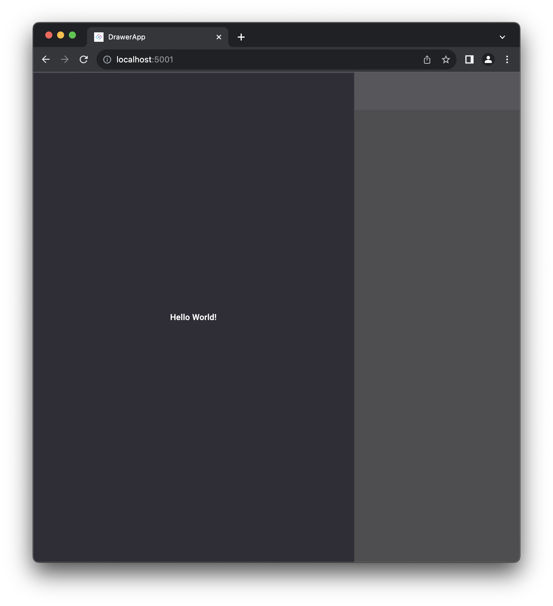
You’ll notice that the navigation drawer is much wider in this case. This is because the DrawerLength is set to 0.66* by default. This means that the drawer will take up 66% of the screen width.
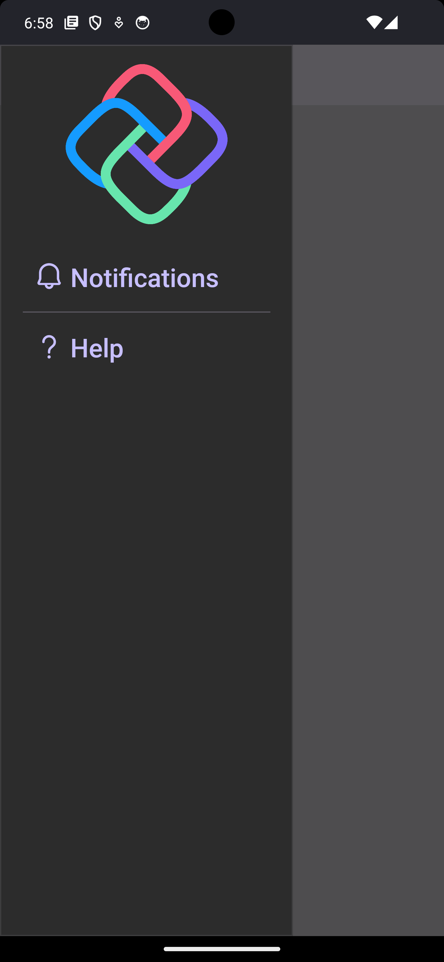
Next, let’s add some nice navigation-like content to our NavFlyout:
1
2
3
4
5
6
7
8
9
10
11
12
13
14
15
16
17
18
19
20
21
22
23
24
25
26
27
28
29
30
31
32
33
34
35
36
37
38
39
40
41
42
43
44
45
46
47
48
49
50
51
52
53
54
55
56
57
58
59
<Flyout x:Class="DrawerApp.NavFlyout"
xmlns="http://schemas.microsoft.com/winfx/2006/xaml/presentation"
xmlns:x="http://schemas.microsoft.com/winfx/2006/xaml"
xmlns:local="using:DrawerApp"
xmlns:d="http://schemas.microsoft.com/expression/blend/2008"
xmlns:mc="http://schemas.openxmlformats.org/markup-compatibility/2006"
+ xmlns:um="using:Uno.Material"
+ xmlns:utu="using:Uno.Toolkit.UI"
mc:Ignorable="d"
Placement="Full"
FlyoutPresenterStyle="{StaticResource LeftDrawerFlyoutPresenterStyle}">
- <Grid Background="{ThemeResource SurfaceBrush}">
- <TextBlock Text="Hello World!"
- HorizontalAlignment="Center"
- VerticalAlignment="Center" />
- </Grid>
+ <Grid RowSpacing="12"
+ Margin="20,0">
+ <Grid.RowDefinitions>
+ <RowDefinition Height="Auto" />
+ <RowDefinition Height="Auto" />
+ <RowDefinition Height="Auto" />
+ <RowDefinition Height="Auto" />
+ </Grid.RowDefinitions>
+
+ <Image HorizontalAlignment="Center"
+ Height="150"
+ Width="150"
+ Source="ms-appx:///DrawerApp/Assets/Icons/unologo.png"
+ Margin="0,16" />
+
+ <Button Grid.Row="1"
+ FontSize="24"
+ Content="Notifications"
+ Style="{StaticResource TextButtonStyle}"
+ HorizontalContentAlignment="Left"
+ HorizontalAlignment="Stretch">
+ <um:ControlExtensions.Icon>
+ <FontIcon FontWeight="Bold"
+ FontSize="24"
+ Glyph="" />
+ </um:ControlExtensions.Icon>
+ </Button>
+ <utu:Divider Grid.Row="2" />
+ <Button Grid.Row="3"
+ Content="Help"
+ FontSize="24"
+ Style="{StaticResource TextButtonStyle}"
+ HorizontalContentAlignment="Left"
+ HorizontalAlignment="Stretch">
+ <um:ControlExtensions.Icon>
+ <FontIcon FontWeight="Bold"
+ FontSize="24"
+ Glyph="" />
+ </um:ControlExtensions.Icon>
+ </Button>
+ </Grid>
</Flyout>
Almost there!
Only differences left are the rounded corners. We can add these by creating a custom Style for the FlyoutPresenter that is based on the LeftDrawerFlyoutPresenterStyle. In our AppResources.xaml, we can add the following:
1
2
3
4
5
<Style x:Key="NavFlyoutPresenterStyle"
       TargetType="FlyoutPresenter"
       BasedOn="{StaticResource LeftDrawerFlyoutPresenterStyle}">
    <Setter Property="CornerRadius" Value="0,20,20,0" />
</Style>
Then, we set the FlyoutPresenterStyle on our Flyout accordingly:
1
2
3
4
5
6
 <Flyout x:Class="DrawerApp.NavFlyout"
         ...
-        FlyoutPresenterStyle="{StaticResource LeftDrawerFlyoutPresenterStyle}">
+        FlyoutPresenterStyle="{StaticResource NavFlyoutPresenterStyle}">
         ...
 </Flyout>

And there we go! We have a nice navigation drawer experience that is consistent across platforms:
We can even get spicy and use some of the DrawerFlyoutPresenter attached properties to customize the experience further. For example, we can set the DrawerLength to 0.9* to make the drawer take up 90% of the screen width and use a ridiculous LightDismissOverlayBackground:
1
2
3
4
5
6
7
 <Style x:Key="NavFlyoutPresenterStyle"
        TargetType="FlyoutPresenter"
        BasedOn="{StaticResource LeftDrawerFlyoutPresenterStyle}">
     <Setter Property="CornerRadius" Value="0,20,20,0" />
+    <Setter Property="utu:DrawerFlyoutPresenter.DrawerLength" Value="0.9*" />
+    <Setter Property="utu:DrawerFlyoutPresenter.LightDismissOverlayBackground" Value="Red" />
 </Style>
Now that we know how to build a beautiful navigation drawer, we can apply these skills to build a bottom sheet experience!
Bottom Sheet
Here’s what we are looking to build by the end of this section (both Android and WASM are shown):
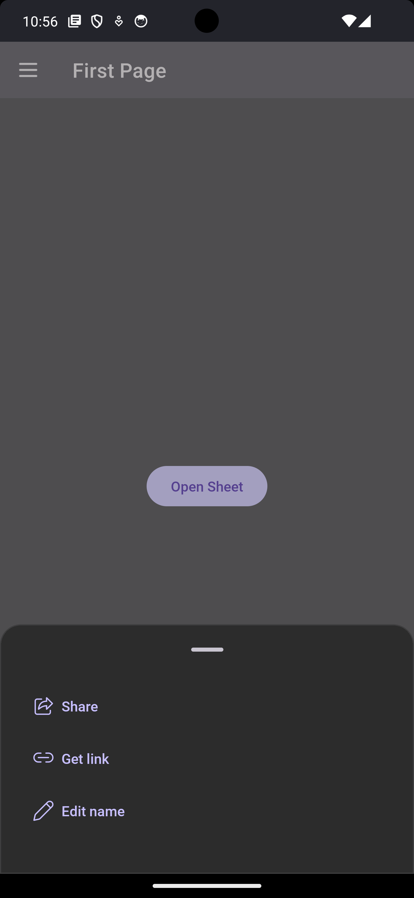
Since we just went through the whole process of transforming a Flyout into a navigation drawer, we can use the same process to transform it into a bottom sheet. First things first, let’s create a new custom flyout called BottomSheetFlyout:
BottomSheetFlyout.xaml:
1
2
3
4
5
6
7
8
9
10
11
12
13
14
15
16
17
18
19
20
21
22
23
24
25
26
27
28
29
30
31
32
33
34
35
36
37
38
39
40
41
42
43
44
45
46
47
48
49
50
51
52
53
54
55
<Flyout x:Class="DrawerApp.BottomSheetFlyout"
        xmlns="http://schemas.microsoft.com/winfx/2006/xaml/presentation"
        xmlns:x="http://schemas.microsoft.com/winfx/2006/xaml"
        xmlns:local="using:DrawerApp"
        xmlns:d="http://schemas.microsoft.com/expression/blend/2008"
        xmlns:mc="http://schemas.openxmlformats.org/markup-compatibility/2006"
        mc:Ignorable="d"
        xmlns:um="using:Uno.Material"
        xmlns:utu="using:Uno.Toolkit.UI"
        Placement="Full"
        FlyoutPresenterStyle="{StaticResource BottomDrawerFlyoutPresenterStyle}">

    <Grid RowSpacing="12"
          Margin="20,0">
        <Grid.RowDefinitions>
            <RowDefinition Height="Auto" />
            <RowDefinition Height="Auto" />
            <RowDefinition Height="Auto" />
            <RowDefinition Height="Auto" />
        </Grid.RowDefinitions>
        <Border Margin="22"
                Height="4"
                Width="32"
                Background="{ThemeResource OnSurfaceVariantBrush}"
                CornerRadius="2"
                HorizontalAlignment="Center" />
        <Button Grid.Row="1"
                Content="Share"
                Style="{StaticResource TextButtonStyle}"
                HorizontalAlignment="Stretch"
                HorizontalContentAlignment="Stretch">
            <um:ControlExtensions.Icon>
                <SymbolIcon Symbol="Share" />
            </um:ControlExtensions.Icon>
        </Button>
        <Button Grid.Row="2"
                Content="Get link"
                Style="{StaticResource TextButtonStyle}"
                HorizontalAlignment="Stretch"
                HorizontalContentAlignment="Stretch">
            <um:ControlExtensions.Icon>
                <SymbolIcon Symbol="Link" />
            </um:ControlExtensions.Icon>
        </Button>
        <Button Grid.Row="3"
                Content="Edit name"
                Style="{StaticResource TextButtonStyle}"
                HorizontalAlignment="Stretch"
                HorizontalContentAlignment="Stretch">
            <um:ControlExtensions.Icon>
                <SymbolIcon Symbol="Edit" />
            </um:ControlExtensions.Icon>
        </Button>
    </Grid>
</Flyout>
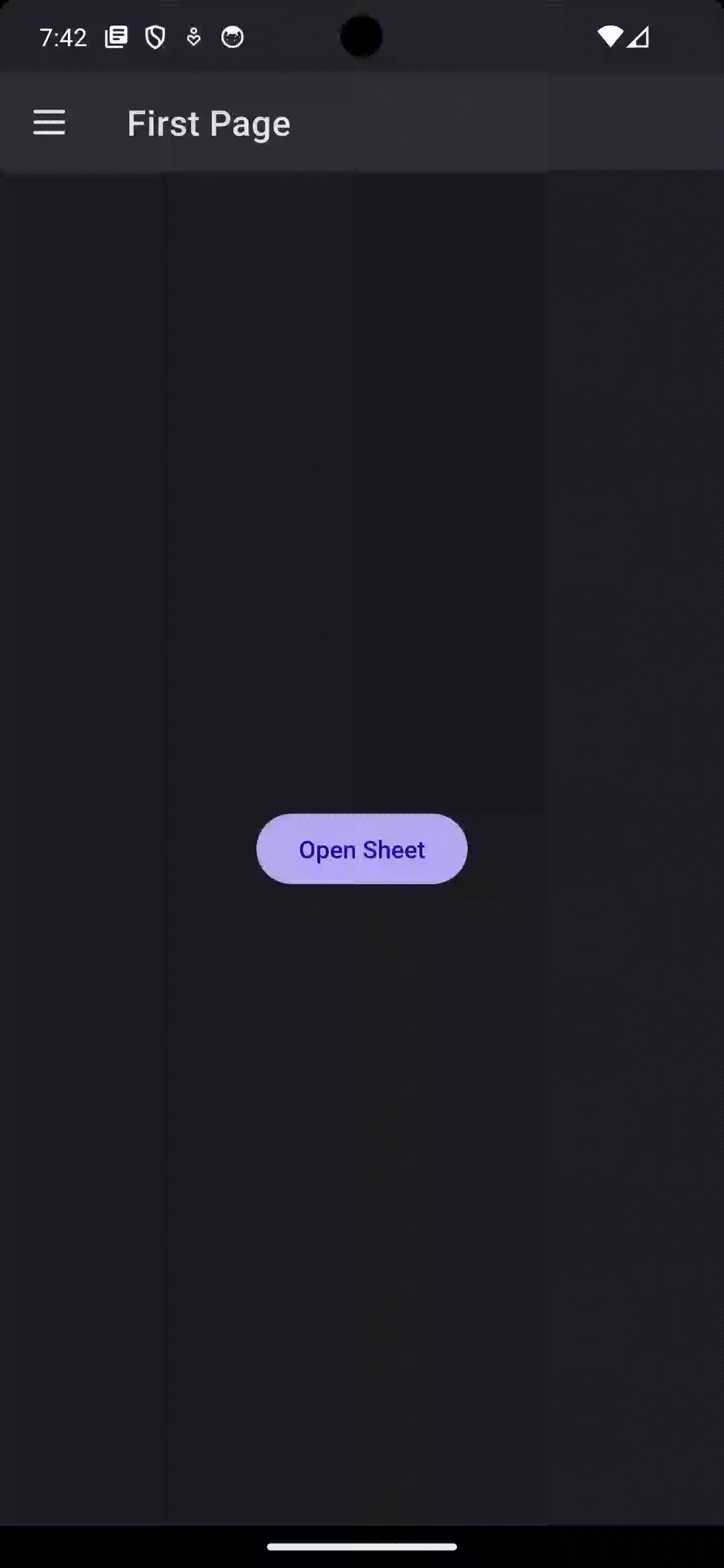
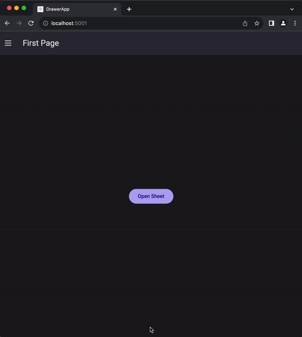
Now, we can add a Button to our MainPage.xaml that will open the BottomSheetFlyout:
1
2
3
4
5
6
7
8
9
10
11
12
13
14
15
16
17
18
19
20
21
22
23
24
25
26
27
28
29
30
31
32
33
34
35
36
 <Page x:Class="DrawerApp.MainPage"
       xmlns="http://schemas.microsoft.com/winfx/2006/xaml/presentation"
       xmlns:x="http://schemas.microsoft.com/winfx/2006/xaml"
       xmlns:local="using:DrawerApp"
       xmlns:utu="using:Uno.Toolkit.UI"
       xmlns:um="using:Uno.Material"
       Background="{ThemeResource BackgroundBrush}">
     <Grid>
         <Grid.RowDefinitions>
             <RowDefinition Height="Auto" />
             <RowDefinition Height="*" />
         </Grid.RowDefinitions>
         <utu:NavigationBar Content="First Page"
                            MainCommandMode="Action">
             <utu:NavigationBar.MainCommand>
                 <AppBarButton>
                     <AppBarButton.Icon>
                         <BitmapIcon UriSource="ms-appx:///DrawerApp/Assets/Icons/burger.png" />
                     </AppBarButton.Icon>
                     <AppBarButton.Flyout>
                         <local:NavFlyout />
                     </AppBarButton.Flyout>
                 </AppBarButton>
             </utu:NavigationBar.MainCommand>
         </utu:NavigationBar>

+        <Button Grid.Row="1"
+                HorizontalAlignment="Center"
+                VerticalAlignment="Center"
+                Content="Open Sheet">
+            <Button.Flyout>
+                <local:BottomSheetFlyout />
+            </Button.Flyout>
+        </Button>
     </Grid>
 </Page>
Almost there, but if we look at the bottom sheet guidance from Material Design, we can see the the sheet should have some rounded corners and shouldn’t open up too high. We can achieve this by creating a custom Style for the FlyoutPresenter that is based on the BottomDrawerFlyoutPresenterStyle. In our AppResources.xaml, we can add the following:
1
2
3
4
5
6
<Style x:Key="BottomSheetFlyoutPresenterStyle"
       TargetType="FlyoutPresenter"
       BasedOn="{StaticResource BottomDrawerFlyoutPresenterStyle}">
    <Setter Property="CornerRadius" Value="20,20,0,0" />
    <Setter Property="utu:DrawerFlyoutPresenter.DrawerLength" Value="0.33*" />
</Style>
Then, we set the FlyoutPresenterStyle on our BottomSheetFlyout accordingly:
1
2
3
4
5
6
 <Flyout x:Class="DrawerApp.BottomSheetFlyout"
         ...
-        FlyoutPresenterStyle="{StaticResource BottomDrawerFlyoutPresenterStyle}">
+        FlyoutPresenterStyle="{StaticResource BottomSheetFlyoutPresenterStyle}">
     ...
 </Flyout>
And there we go! We were able to customize the CornerRadius as well as ensure that the sheet only takes up 33% of the screen height.
Conclusion
In this article, we covered how to use the DrawerFlyoutPresenter to create a navigation drawer and a bottom sheet experience. We also learned how to use the pre-built styles and how to create custom styles to further customize the experience.
The Uno Toolkit also provides a standalone control called DrawerControl that shares much of the same logic with the DrawerFlyoutPresenter. The DrawerControl is a ContentControl that can be used to create a drawer-like experience without the need for a Flyout. It is a container with two views: one view for the main content, and another view that can be revealed with a swipe gesture. Be sure to check out the docs in the links below.
If you want to take a look at the full source code for the examples above, you can find it on this GitHub repo.
I hope you enjoyed this edition of Toolkit Tuesdays! There is even more to learn about the DrawerFlyoutPresenter so I hope you will continue to explore it on your own.
I encourage you to consult the full documentation for the DrawerFlyoutPresenter using the links below. I also want to welcome you to contribute to making DrawerFlyoutPresenter even better! Whether you have discovered some bugs, want to make improvements, or want to enhance the documentation, please jump into the fun on the Uno Toolkit GitHub repo!
