
Toolkit Tuesdays: NavigationBar
Welcome to the first post in my new series, Toolkit Tuesdays! In this series, I’ll be highlighting some of the controls and helpers in the Uno Toolkit library. This library is a collection of controls and helpers that we’ve created to make life easier when building apps with Uno Platform. I hope you find them useful too!
This week we are covering the NavigationBar control. This control has a simple purpose with a complex and interesting implementation across the multiple platforms that Uno supports. On Android and iOS/Catalyst, the NavigationBar serves as a sort of proxy to the native Android Toolbar and iOS UINavigationBar. On all other platforms, its functionality and UI are driven by a customized CommandBar.
Anatomy of a NavigationBar
The XAML for the following usage of NavigationBar can be seen further along in the Complex Usage section.
Android
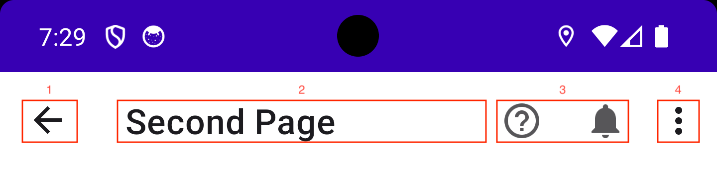
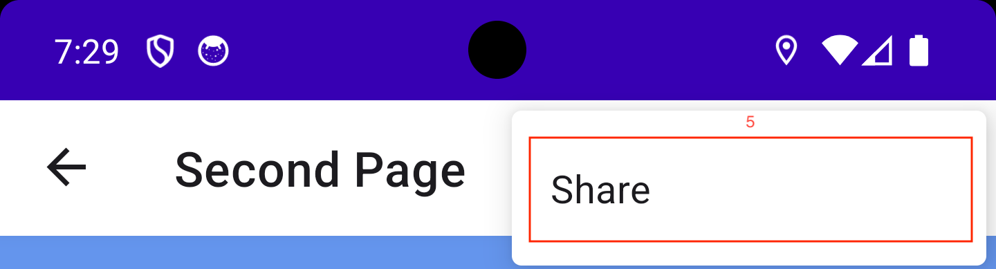
- Main Command
- Content
- Primary Commands
- Overflow button for Secondary Commands
- Secondary Commands
iOS
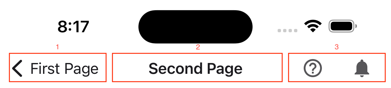
- Main Command
- Content
- Primary Commands
MainCommand
The crown jewel of the NavigationBar is the MainCommand property, which automatically hooks itself to the back button on Android and iOS/Catalyst. This allows you to easily set up a back button in your app without having to write any platform-specific code. The NavigationBar is smart enough to know when it is displayed within a Frame that currently contains items in the BackStack and will automatically show the back button. If the Frame is at the root of the navigation stack, the back button will be hidden.
Content
The Content property is what is typically used to display your page title within the NavigationBar. The property itself is of type object and supports any instance of UIElement if you want to display rich content within the NavigationBar instead of a simple string.
PrimaryCommands and SecondaryCommands
The NavigationBar also supports the PrimaryCommands and SecondaryCommands properties, which are collections of AppBarButton controls. PrimaryCommands are displayed on the right side of the NavigationBar, given there is enough space to display them. SecondaryCommands, along with PrimaryCommands that don’t fit in the bar, are placed in an “overflow” popup menu accessible from an ellipsis button at the end of the bar (not supported on iOS).
The NavigationBar will automatically adjust the layout of these buttons based on the available space. On Android and iOS/Catalyst, the buttons will be displayed in the native Toolbar/UINavigationBar. On all other platforms, the buttons will be displayed in a CommandBar.
MainCommandMode
Of course, the NavigationBar is built is customizability in mind. You can override all of this built-in navigation logic by setting the MainCommandMode property to Action instead of the default Back. Using Action tells the NavigationBar to short-circuit the built-in navigation logic and simply execute the command that is set to the MainCommand property. This is useful if you want to have a hamburger menu or other navigation pattern that doesn’t rely on the built-in back button.
Examples
Let’s see it in action and jump into some code!
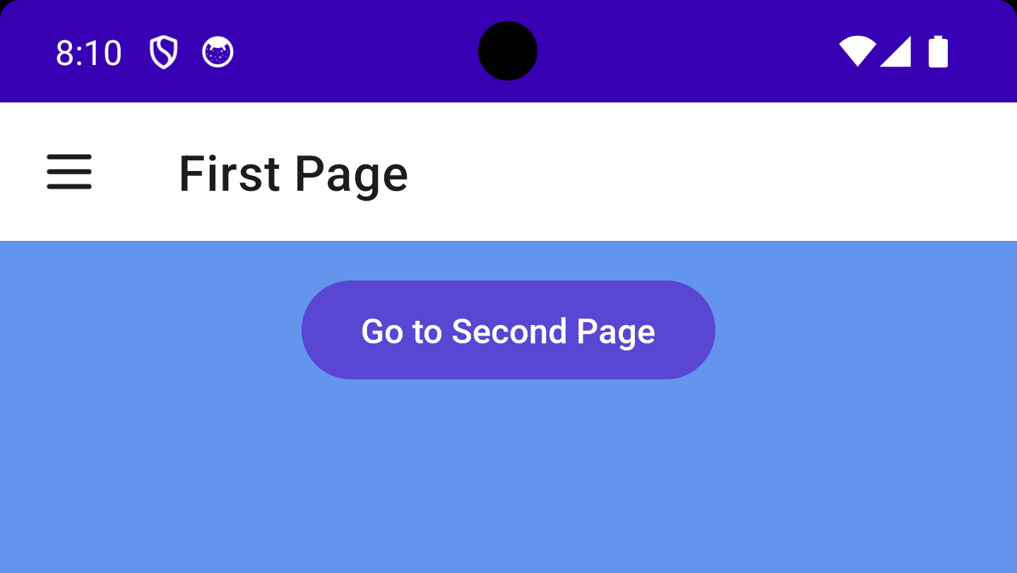
Basic Usage
 |
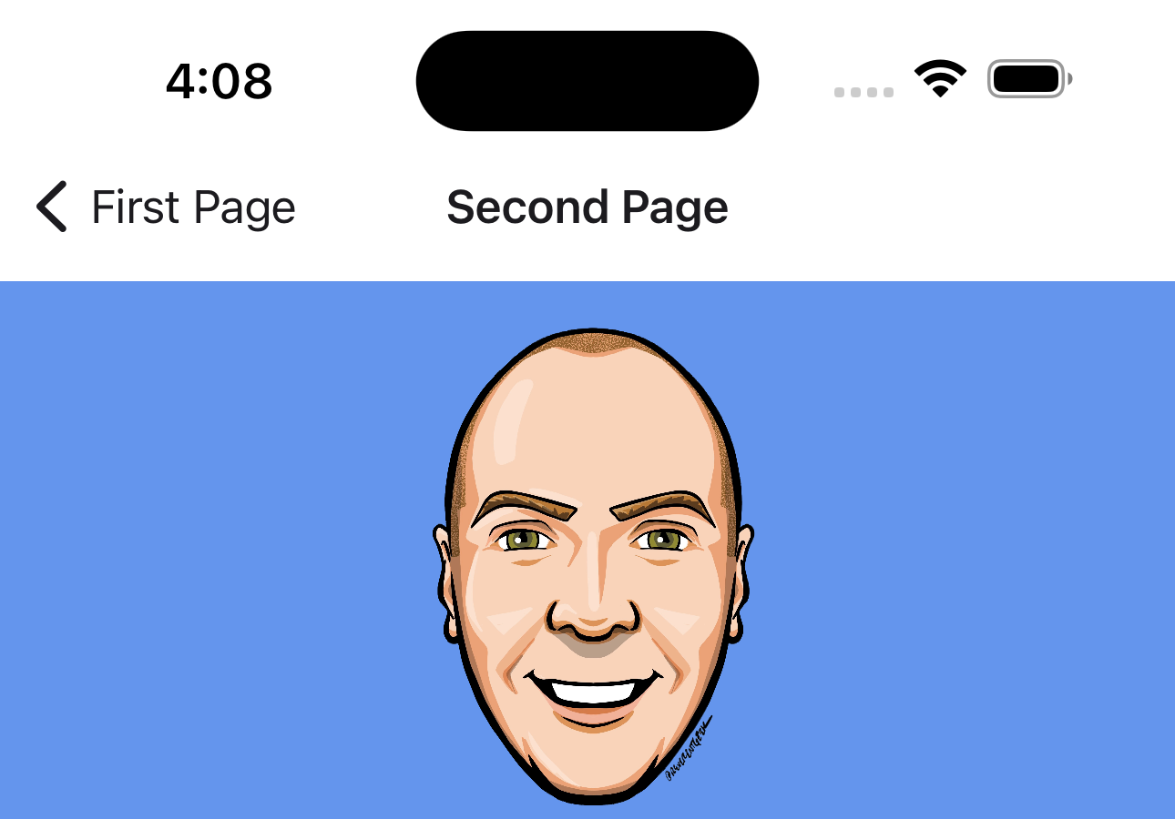 |
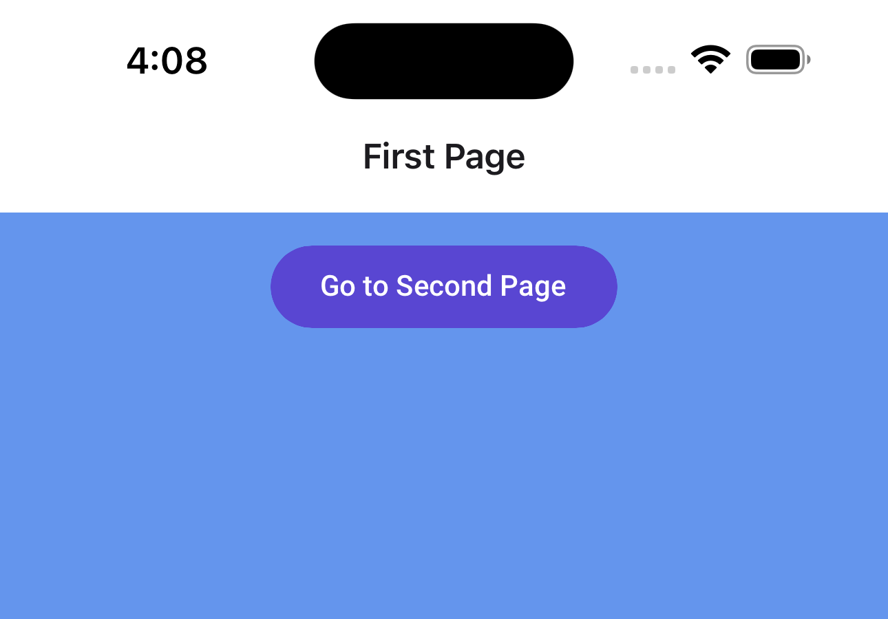
Here we see the most basic usage of NavigationBar, which is to just place it as the topmost element on your page and set the Content property to the title of the page. The NavigationBar will automatically display a back button if the page is not at the root of the navigation stack. Below is the XAML for the content of both pages used in the above example:
First Page
1
2
3
4
5
6
7
8
9
10
11
12
13
14
15
16

xmlns:utu="using:Uno.Toolkit.UI"
...
<Grid>
    <Grid.RowDefinitions>
        <RowDefinition Height="Auto" />
        <RowDefinition />
    </Grid.RowDefinitions>
    <utu:NavigationBar Content="First Page" />

    <Button Grid.Row="1"
            Margin="16"
            HorizontalAlignment="Center"
            VerticalAlignment="Top"
            Command="{Binding GoToSecond}"
            Content="Go to Second Page" />
</Grid>
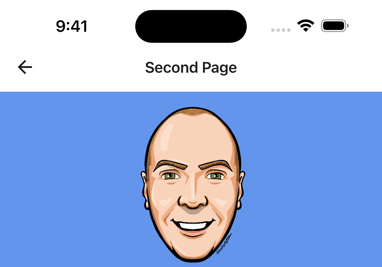
Second Page
1
2
3
4
5
6
7
8
9
10
11
12
13
14
15
16
17
18

xmlns:utu="using:Uno.Toolkit.UI"
...
<Grid>
    <Grid.RowDefinitions>
        <RowDefinition Height="Auto" />
        <RowDefinition />
    </Grid.RowDefinitions>

    <utu:NavigationBar Content="Second Page" />

    <Image Grid.Row="1"
           Width="200"
           Height="200"
           Margin="16"
           VerticalAlignment="Top"
           Source="ms-appx:///NavBarApp/Assets/Images/steve.png" />

</Grid>
Not much to it!
Most of the heavy lifting is done for you by the underlying implementation so you don’t have to worry about when to hide/show the back button. On top of that, the back button actually works out of the box! You don’t even need to hook the button to any click handler or command. The NavigationBar will fire any custom ICommand that may be set on the MainCommand but will also take care of the actual navigation for you!
MainCommand Customization
If you’re like me, you may also think that the native iOS behavior of keeping the previous page’s title as the back button text is stupid and ugly.
Let’s fix that by removing the back button text altogether. The NavigationBar on our SecondPage should now look something like this:
1
2
3
4
5

<utu:NavigationBar Content="Second Page">
    <utu:NavigationBar.MainCommand>
        <AppBarButton Content="" />
    </utu:NavigationBar.MainCommand>
</utu:NavigationBar>
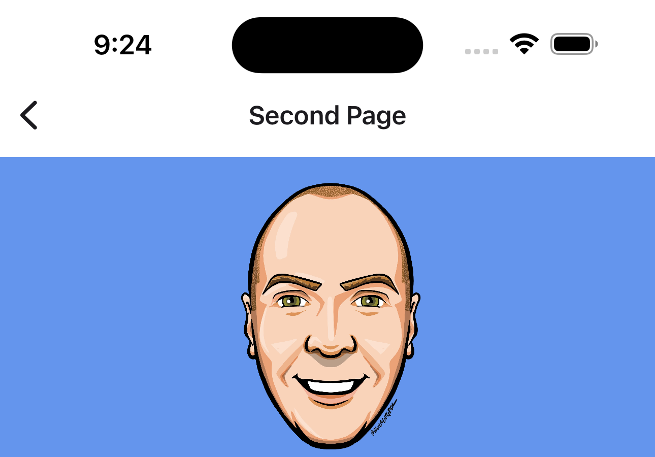
Much better!
Notice how we have now set our MainCommand to an AppBarButton with an empty string as its Content. Another noteworthy feature is the fact that we have now defined our own MainCommand, yet we are still seeing the default native back icon. Since we haven’t actually set the Icon on our AppBarButton, the NavigationBar allows the native iOS UINavigationBar to continue showing its default icon.
Let’s get spicy and change that icon to something more interesting 
1
2
3
4
5
6
7
8
9

<utu:NavigationBar Content="Second Page">
    <utu:NavigationBar.MainCommand>
        <AppBarButton Content="">
            <AppBarButton.Icon>
                <BitmapIcon UriSource="ms-appx:///NavBarApp/Assets/Icons/back.png" />
            </AppBarButton.Icon>
        </AppBarButton>
    </utu:NavigationBar.MainCommand>
</utu:NavigationBar>
Perfection 
Now what about our first page? Looking at it, we aren’t displaying anything for the MainCommand. This is to be expected since we are at the root of the navigation stack and the MainCommandMode is still set to its default value of MainCommandMode.Back.
What if we had a hamburger menu or some other navigation pattern that didn’t rely on the built-in back button? We can easily change the MainCommandMode to Action and set our own logic to handle the interaction with the MainCommand, either through a command or a click handler.
The XAML for our new NavigationBar on the first page would look something like this:
1
2
3
4
5
6
7
8
9
10

<utu:NavigationBar Content="First Page"
                   MainCommandMode="Action">
    <utu:NavigationBar.MainCommand>
        <AppBarButton Click="Burger_Click">
            <AppBarButton.Icon>
                <BitmapIcon UriSource="ms-appx:///NavBarApp/Assets/Icons/burger.png" />
            </AppBarButton.Icon>
        </AppBarButton>
    </utu:NavigationBar.MainCommand>
</utu:NavigationBar>
Complex Usage
Now we can take a look at how to create the NavigationBar that we saw earlier in the Anatomy of a NavigationBar section.
Let’s jump to Android for this portion just because iOS doesn’t support SecondaryCommands and we want to see that nice overflow menu available on all other platforms.
In the following XAML we are adding PrimaryCommands and SecondaryCommands to the NavigationBar
1
2
3
4
5
6
7
8
9
10
11
12
13
14
15
16
17
18
19
20
21
22
23
24
25
26
27
28
29
30
31
32
33

<utu:NavigationBar Content="Second Page">
    <!-- MainCommand -->
    <utu:NavigationBar.MainCommand>
        <AppBarButton Content="">
            <AppBarButton.Icon>
                <BitmapIcon UriSource="ms-appx:///NavBarApp/Assets/Icons/back.png" />
            </AppBarButton.Icon>
        </AppBarButton>
    </utu:NavigationBar.MainCommand>

    <!-- PrimaryCommands -->
    <utu:NavigationBar.PrimaryCommands>
        <AppBarButton Command="{Binding HelpCommand}">
            <AppBarButton.Icon>
                <BitmapIcon UriSource="ms-appx:///NavBarApp/Assets/Icons/help_outline.png" />
            </AppBarButton.Icon>
        </AppBarButton>
        <AppBarButton Command="{Binding NotificationsCommand}">
            <AppBarButton.Icon>
                <BitmapIcon UriSource="ms-appx:///NavBarApp/Assets/Icons/notifications.png" />
            </AppBarButton.Icon>
        </AppBarButton>
    </utu:NavigationBar.PrimaryCommands>

    <!-- SecondaryCommands -->
    <utu:NavigationBar.SecondaryCommands>
        <AppBarButton Content="Share" Command="{Binding ShareCommand}">
            <AppBarButton.Icon>
                <BitmapIcon UriSource="ms-appx:///NavBarApp/Assets/Icons/share.png" />
            </AppBarButton.Icon>
        </AppBarButton>
    </utu:NavigationBar.SecondaryCommands>
</utu:NavigationBar>

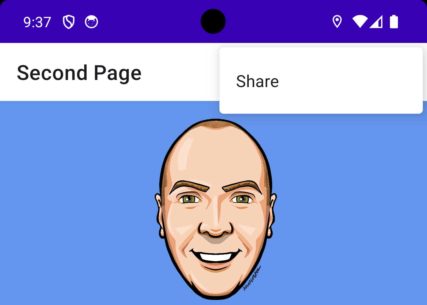
It’s important to note here that we are using BitmapIcon as our Icon on the AppBarButton. Currently, NavigationBar only supports BitmapIcon on Android and iOS as the underlying native bar is expecting a bitmap image. There is currently work underway to allow support for other IconElement types but, at the time of writing this, it has not yet been released.
Conclusion
I’m sure you’re sick of seeing my dumb smiling face staring into your soul with every screenshot so I will wrap this up and point you to some resources for more information.
One final note, although we featured the NavigationBar being used mostly on iOS and Android, it is also fully supported on all other Uno platforms.
I encourage you to consult the full documentation for NavigationBar using the links below. I also want to welcome you to contribute to making NavigationBar even better! Whether you have discovered some bugs, want to make improvements, or wanted to enhance the documentation, please jump into the fun on the Uno Toolkit GitHub repo!
