
Uno Tidbit: Building a Carousel Experience

Welcome to another edition of Uno Tidbits! In this series, we will be covering small, bite-sized topics that are useful to know when working with Uno Platform. These will be quick reads that you can consume in a few minutes and will cover a wide range of topics. Today, we are going to cover how you can quickly get a carousel type of experience built into your app with very little code.
The Problem
Need a nice onboarding experience for your app? Perhaps an initial set of tutorial pages that the user can swipe through on the first run? Or maybe you just want to show off some images in a nice, responsive carousel. You could build this from scratch, but that’s a lot of work for something that’s been done a million times before.
The Solution
This is actually quite simple to achieve, and even Microsoft has some documentation on how to do this with the FlipView control and a PipsPager. The FlipView control is a great way to display a collection of items that the user can flip through. While that guidance is good, there are a couple of neat tricks you can do to make this experience even better.
The Code
Let’s start with a basic FlipView with some hardcoded items:
1
2
3
4
5
6
7
8
9
10
11
12
13
14
15
16
17
18
19
20
21
22
23
24
25
26
27
28
29
30
31
32
33
34
35
36
37
38
39
40
41
42
43
44
45
46
47
48
49
50
51
52
53
54
55
56
57
58
59
60
61

<FlipView>
    <FlipView.Items>
        <Grid>
            <Grid.RowDefinitions>
                <RowDefinition Height="*"/>
                <RowDefinition Height="*"/>
            </Grid.RowDefinitions>

            <Grid Background="Tomato">
                <TextBlock Text="Item 1"
                           HorizontalAlignment="Center"
                           VerticalAlignment="Center"/>
            </Grid>

            <TextBlock Grid.Row="1"
                       TextWrapping="Wrap"
                       Margin="20"
                       Text="Lorem ipsum dolor sit amet, consectetur adipiscing elit. Pellentesque at imperdiet lorem, ut vehicula tellus. Duis faucibus   vehicula erat, a ullamcorper diam placerat eget."
                       HorizontalAlignment="Center"
                       VerticalAlignment="Center"/>
        </Grid>
        <Grid>
            <Grid.RowDefinitions>
                <RowDefinition Height="*"/>
                <RowDefinition Height="*"/>
            </Grid.RowDefinitions>

            <Grid Background="CornflowerBlue">
                <TextBlock Text="Item 2"
                           HorizontalAlignment="Center"
                           VerticalAlignment="Center"/>
            </Grid>

            <TextBlock Grid.Row="1"
                       TextWrapping="Wrap"
                       Margin="20"
                       Text="Curabitur blandit leo in libero mollis posuere. Suspendisse luctus magna erat, et dapibus velit fringilla vel. Vivamus porttitor   sodales ante, sit amet condimentum enim facilisis vitae."
                       HorizontalAlignment="Center"
                       VerticalAlignment="Center"/>
        </Grid>
        <Grid>
            <Grid.RowDefinitions>
                <RowDefinition Height="*"/>
                <RowDefinition Height="*"/>
            </Grid.RowDefinitions>

            <Grid Background="Goldenrod">
                <TextBlock Text="Item 3"
                           HorizontalAlignment="Center"
                           VerticalAlignment="Center"/>
            </Grid>

            <TextBlock Grid.Row="1"
                       TextWrapping="Wrap"
                       Margin="20"
                       Text="Nam bibendum a justo eu luctus. Aliquam sagittis risus non consequat aliquam. Donec mattis ante sit amet dui interdum, et   condimentum metus viverra."
                       HorizontalAlignment="Center"
                       VerticalAlignment="Center"/>
        </Grid>
    </FlipView.Items>
</FlipView>
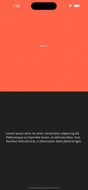
With this, we should have a nice swipeable carousel with some basic content
Now, what we can do here is introduce the PipsPager to our page that will eventually work as a context indicator for the FlipView. This will show the user how many items are in the FlipView and which one they are currently on. I think it makes sense to have this at the bottom of the page, so let’s wrap our FlipView in a Grid and overlay the PipsPager at the bottom:
1
2
3
4
5
6
7
8
9
10
11

<Grid utu:SafeArea.Insets="Bottom">
    <FlipView>
        ...
    </FlipView>
    <PipsPager x:Name="pipsPager"
               Margin="0,0,0,10"
               NumberOfPages="3"
               HorizontalAlignment="Center"
               VerticalAlignment="Bottom"
               Orientation="Horizontal"/>
</Grid>
Notice that I have added utu:SafeArea.Insets="Bottom" to the Grid. This is something coming from the Uno Toolkit that we have previously covered.
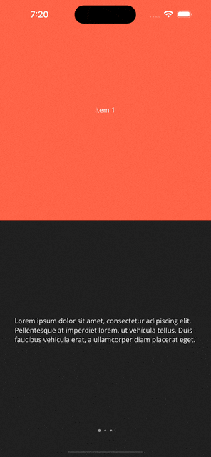
Now we have this nice PipsPager at the bottom of our page:

Connecting The Dots
Unfortunately, the PipsPager doesn’t actually do anything yet. We need to wire it up to the FlipView so that it updates as the user swipes through the items. Luckily, the Uno Toolkit actually provides some nice helpers for this. We can use the SelectorExtensions to easily bind the PipsPager to any type of Selector. Since FlipView is a Selector, we can use this to bind the PipsPager to the FlipView and synchronize the NumberOfPages property and the SelectedIndex property.
On our Selector, we can do the following:
1
2
3
4
5
6
7
8
9
10
11
12

 <Grid utu:SafeArea.Insets="Bottom">
-    <FlipView>
+    <FlipView utu:SelectorExtensions.PipsPager="{Binding ElementName=pipsPager}">
         ...
     </FlipView>
     <PipsPager x:Name="pipsPager"
                Margin="0,0,0,10"
-               NumberOfPages="3"
                HorizontalAlignment="Center"
                VerticalAlignment="Bottom"
                Orientation="Horizontal"/>
 </Grid>
We should now have a fully functional carousel experience with a PipsPager at the bottom of the page. You should be able to swipe through the items or tap on one of the “pips” to navigate to that item.
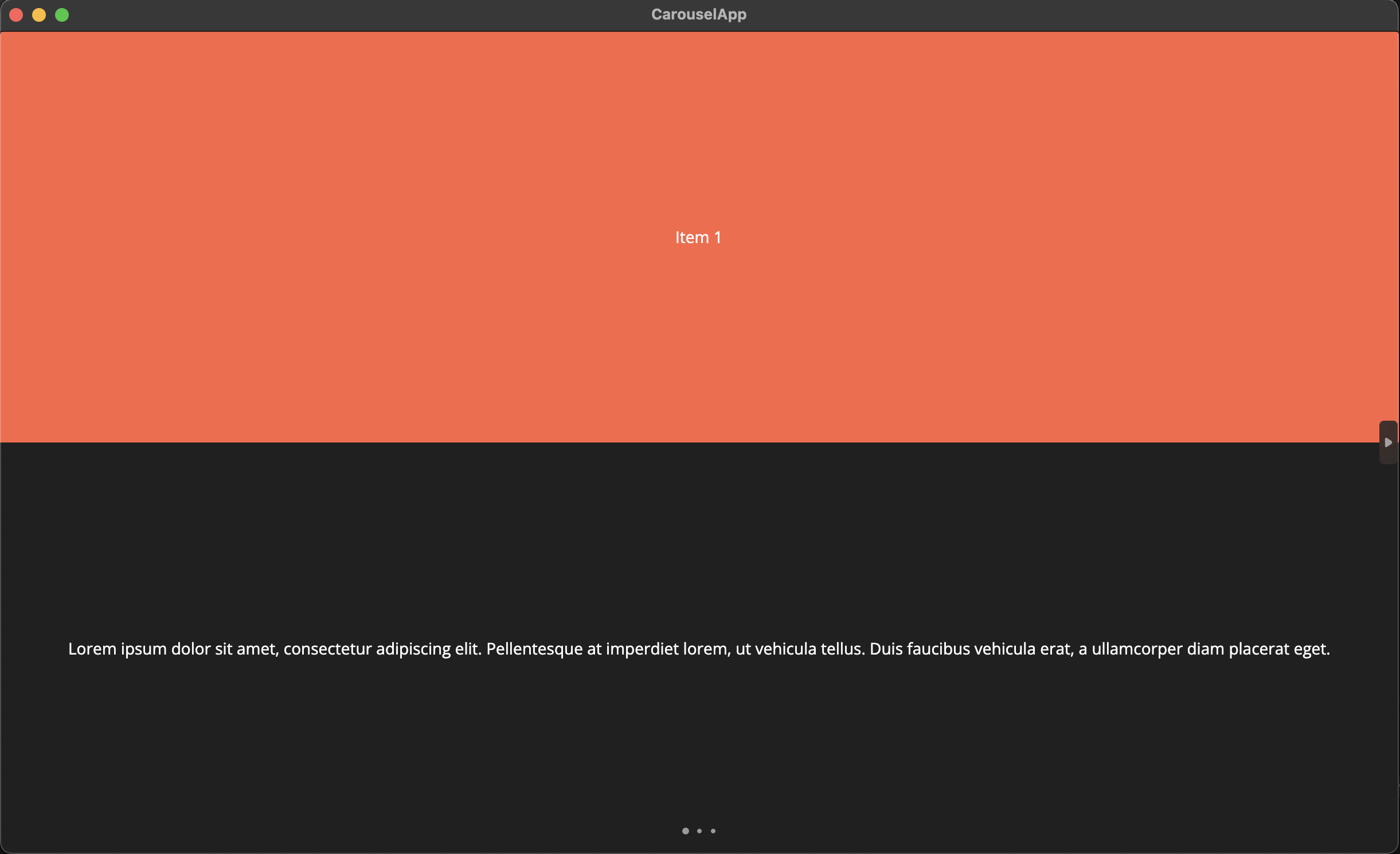
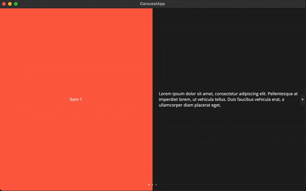
Before we wrap up, let’s make sure this also looks good for other platforms. Especially desktop/web targets where we have a lot more screen real estate.
Running this on the macOS Desktop target currently looks like this:
…

Making it Responsive
To make this look better on larger screens, we can use the Responsive markup extensions from Uno Toolkit. We have previously covered this in a Toolkit Tuesday post. We can use the Responsive markup extension to change the layout of our FlipView items based on the window width.
Here’s what an example of this might look like:
1
2
3
4
5
6
7
8
9
10
11
12
13
14
15
16
17
18
19
20
21
22
23
24
25
26
27
28
29
30
31
32
33
34
35
36
37
38
39
40
41
42
43
44
45
46
47
48
49
50
51
52
53
54
55
56
57
58
59
60
61
62
63
64
65
66
67
68
69
70
71
72
73
74
75
76
77
78
79
80
81
82
83
84
85

<Grid utu:SafeArea.Insets="Bottom">
    <FlipView utu:SelectorExtensions.PipsPager="{Binding ElementName=pipsPager}">
        <FlipView.Items>
            <Grid>
                <Grid.RowDefinitions>
                    <RowDefinition Height="*"/>
                    <RowDefinition Height="{utu:Responsive Wide='0', Narrow='*'}"/>
                </Grid.RowDefinitions>
                <Grid.ColumnDefinitions>
                    <ColumnDefinition Width="*"/>
                    <ColumnDefinition Width="{utu:Responsive Wide='*', Narrow='0'}"/>
                </Grid.ColumnDefinitions>

                <Grid Background="Tomato">
                    <TextBlock Text="Item 1"
                               HorizontalAlignment="Center"
                               VerticalAlignment="Center"/>
                </Grid>

                <TextBlock Grid.Row="{utu:Responsive Wide=0, Narrow=1}"
                           Grid.Column="{utu:Responsive Wide=1, Narrow=0}"
                           TextWrapping="Wrap"
                           Margin="20"
                           Text="Lorem ipsum dolor sit amet, consectetur adipiscing elit. Pellentesque at imperdiet lorem, ut vehicula tellus. Duis faucibus vehicula erat, a ullamcorper diam placerat eget."
                           HorizontalAlignment="Center"
                           VerticalAlignment="Center"/>
            </Grid>
            <Grid>
                <Grid.RowDefinitions>
                    <RowDefinition Height="*"/>
                    <RowDefinition Height="{utu:Responsive Wide='0', Narrow='*'}"/>
                </Grid.RowDefinitions>
                <Grid.ColumnDefinitions>
                    <ColumnDefinition Width="*"/>
                    <ColumnDefinition Width="{utu:Responsive Wide='*', Narrow='0'}"/>
                </Grid.ColumnDefinitions>

                <Grid Background="CornflowerBlue">
                    <TextBlock Text="Item 2"
                               HorizontalAlignment="Center"
                               VerticalAlignment="Center"/>
                </Grid>

                <TextBlock Grid.Row="{utu:Responsive Wide=0, Narrow=1}"
                           Grid.Column="{utu:Responsive Wide=1, Narrow=0}"
                           TextWrapping="Wrap"
                           Margin="20"
                           Text="Curabitur blandit leo in libero mollis posuere. Suspendisse luctus magna erat, et dapibus velit fringilla vel. Vivamus porttitor sodales ante, sit amet condimentum enim facilisis vitae."
                           HorizontalAlignment="Center"
                           VerticalAlignment="Center"/>
            </Grid>
            <Grid>
                <Grid.RowDefinitions>
                    <RowDefinition Height="*"/>
                    <RowDefinition Height="{utu:Responsive Wide='0', Narrow='*'}"/>
                </Grid.RowDefinitions>
                <Grid.ColumnDefinitions>
                    <ColumnDefinition Width="*"/>
                    <ColumnDefinition Width="{utu:Responsive Wide='*', Narrow='0'}"/>
                </Grid.ColumnDefinitions>

                <Grid Background="Goldenrod">
                    <TextBlock Text="Item 3"
                               HorizontalAlignment="Center"
                               VerticalAlignment="Center"/>
                </Grid>

                <TextBlock Grid.Row="{utu:Responsive Wide=0, Narrow=1}"
                           Grid.Column="{utu:Responsive Wide=1, Narrow=0}"
                           TextWrapping="Wrap"
                           Margin="20"
                           Text="Nam bibendum a justo eu luctus. Aliquam sagittis risus non consequat aliquam. Donec mattis ante sit amet dui interdum, et condimentum metus viverra."
                           HorizontalAlignment="Center"
                           VerticalAlignment="Center"/>
            </Grid>
        </FlipView.Items>
    </FlipView>

    <PipsPager x:Name="pipsPager"
               Margin="0,0,0,10"
               HorizontalAlignment="Center"
               VerticalAlignment="Bottom"
               Orientation="Horizontal"/>

</Grid>
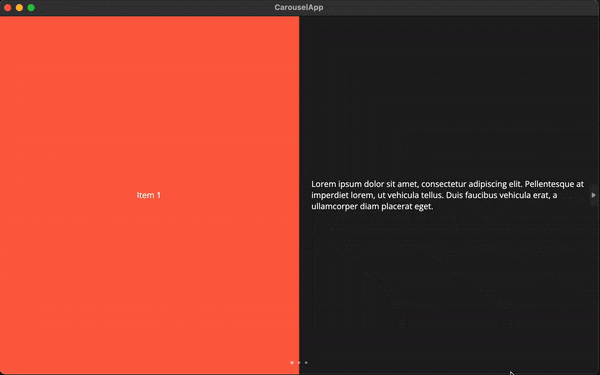
Here we are using some extra Grids and the Responsive markup extension to fiddle with the rows and columns. Now we should have more of a horizontal layout on wider screens and a vertical layout on narrower screens. So, if we were to re-run this on the macOS Desktop target, we should be able to transition between both layouts:
For non-touch platforms, you can flip through the views by using the built-in navigation buttons on the FlipView:

Or, by clicking on the individual pips:
Conclusion
That’s it! We now have a fancy carousel experience that works on all platforms and screen sizes.
You can check out a working example of this in the CarouselApp repository on GitHub.
Catch you in the next one 
