
Uno Tidbit: Extending Your Resources

Welcome to another edition of Uno Tidbits! In this series, we will be covering small, bite-sized topics that are useful to know when working with Uno Platform. These will be quick reads that you can consume in a few minutes and will cover a wide range of topics. Today, we are going to cover how you can do more with your ResourceDictionary in Uno Platform.
The Problem
Ever wanted to make a slight modification to a control’s appearance only to find out that there’s no public property to drive that change? Maybe you want to change the color of a Button when it’s disabled, or you want to change the foreground color of a TextBox when it’s focused. These changes would be buried deep in the control’s template, perhaps as part of the beautiful mess that is the VisualStateManager.
The Solution?
Good news! There already exists a half-baked solution for you!
Thanks to Lightweight Styling you have the ability to override resources that are referenced in a control’s template. These overrides can be scoped to a specific control, a page, or even the entire app.
Now what if you wanted to include those overrides for specific instances of the control across your app? What if you wanted to package up these overrides into a reusable style that you could apply anywhere you want?
Well, now you’re just getting greedy.
The REAL Solution
Luckily for you, I am also greedy and I have a solution for you!
Ideally, we would be able to package up any resource overrides as part of a custom Style. Unfortunately, the Resources property of a FrameworkElement is not a DependencyProperty and, therefore, cannot be set using a Style.Setter.
This is where the Uno Toolkit comes in! Within the Uno Toolkit, there is a ResourceExtensions class that provides a Resources Attached Property that forwards the provided ResourceDictionary to the FrameworkElement.Resources but comes with all of that DependencyProperty goodness. This allows you to package up your resource overrides into a ResourceDictionary and use it within a Setter of a Style.
Example
Let’s say you want to edit some of the Button styles from Uno Material. You might have a specific flow or section in your app that requires a different color for the Button when it’s at rest and when it’s in the PointerOver state. Your favorite colors just happen to be CornflowerBlue and LightSeaGreen. Except those clash with the app while it’s in Dark Mode. So you want to use Red and Orange in that case instead. Just go with me here.
You can define your own Style based on the FilledButtonStyle and use your favorite colors:
1
2
3
4
5
6
7
8
9
10
11
12
13
14
15
16
17
18
19
20

<Style TargetType="Button"
       x:Key="MyCustomButtonStyle"
       BasedOn="{StaticResource FilledButtonStyle}">
    <Setter Property="utu:ResourceExtensions.Resources">
        <Setter.Value>
            <ResourceDictionary>
                <ResourceDictionary.ThemeDictionaries>
                    <ResourceDictionary x:Key="Light">
                        <SolidColorBrush x:Key="FilledButtonBackground" Color="LightSeaGreen" />
                        <SolidColorBrush x:Key="FilledButtonBackgroundPointerOver" Color="CornflowerBlue" />
                    </ResourceDictionary>
                    <ResourceDictionary x:Key="Dark">
                        <SolidColorBrush x:Key="FilledButtonBackground" Color="Red" />
                        <SolidColorBrush x:Key="FilledButtonBackgroundPointerOver" Color="Orange" />
                    </ResourceDictionary>
                </ResourceDictionary.ThemeDictionaries>
            </ResourceDictionary>
        </Setter.Value>
    </Setter>
</Style>
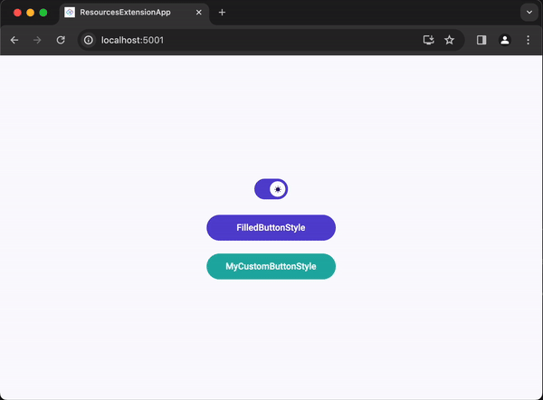
A completely customized button without needing to re-template the control!
Conclusion
That’s it! We now have the ability to package up our resource overrides into a Style and apply them anywhere we want.
You can check out a working example of this in the ResourceExtensionsApp repository on GitHub.
Catch you in the next one 
Special thanks to Fons Sonnemans for the original inspiration for the ResourceExtensions
