
Toolkit Tuesdays: Responsive
Welcome to another edition of Toolkit Tuesdays! In this series, I’ll be highlighting some of the controls and helpers in the Uno Toolkit library. This library is a collection of controls and helpers that we’ve created to make life easier when building apps with Uno Platform. I hope you find them useful too!
This week we are covering the brand-new Responsive components that are part of the 5.1 Uno Toolkit release. The Responsive components encompass two new additions to the Uno Toolkit library: a new ResponsiveView control and a new Responsive markup extension.
ResponsiveView
The ResponsiveView control is a new control that is used to help build responsive layouts. It is a container control that can be used to define different layouts for different screen sizes. It is similar to how VisualStateManager.AdaptiveTrigger allows you to define breakpoints for different screen sizes, but it is much more powerful and flexible without needing to rely on VisualStates.
ResponsiveView adapts to the current screen width and applies the appropriate layout template. Since not all templates need to be defined, the control ensures a smooth user experience by picking the smallest defined template that satisfies the width requirements. If no match is found, it defaults to the largest defined template.
Properties
| Property | Type | Description |
|---|---|---|
NarrowestTemplate |
DataTemplate |
Template to be displayed on the narrowest screen size. |
NarrowTemplate |
DataTemplate |
Template to be displayed on a narrow screen size. |
NormalTemplate |
DataTemplate |
Template to be displayed on a normal screen size. |
WideTemplate |
DataTemplate |
Template to be displayed on a wide screen size. |
WidestTemplate |
DataTemplate |
Template to be displayed on the widest screen size. |
ResponsiveLayout |
ResponsiveLayout |
Overrides the screen size threshold/breakpoints. |
The ResponsiveLayout property is used to override the default screen size threshold/breakpoints. We will cover this in more detail later.
Usage
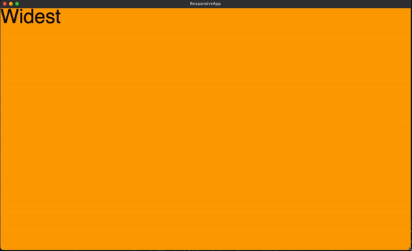
So, let’s take the following XAML as an example:
1
2
3
4
5
6
7
8
9
10
11
12
13
14
15
16
17
18
19
20
21
22
23
24
25
26
27
28
29
30
31
32
33
34
35
36
37
38
39
40
41
42
43
44
45
46
47
48
49
50
<Page xmlns="http://schemas.microsoft.com/winfx/2006/xaml/presentation"
xmlns:x="http://schemas.microsoft.com/winfx/2006/xaml"
xmlns:local="using:ResponsiveApp"
xmlns:utu="using:Uno.Toolkit.UI"
x:Class="ResponsiveApp.MainPage"
Background="{ThemeResource ApplicationPageBackgroundThemeBrush}">
<utu:ResponsiveView>
<utu:ResponsiveView.NarrowestTemplate>
<DataTemplate>
<Grid Background="Red">
<TextBlock TextWrapping="WrapWholeWords"
Text="Narrowest Template"
FontSize="32" />
</Grid>
</DataTemplate>
</utu:ResponsiveView.NarrowestTemplate>
<utu:ResponsiveView.NarrowTemplate>
<DataTemplate>
<Grid Background="Green">
<TextBlock Text="Narrow Template"
FontSize="32" />
</Grid>
</DataTemplate>
</utu:ResponsiveView.NarrowTemplate>
<utu:ResponsiveView.NormalTemplate>
<DataTemplate>
<Grid Background="Blue">
<TextBlock Text="Normal Template"
FontSize="32" />
</Grid>
</DataTemplate>
</utu:ResponsiveView.NormalTemplate>
<utu:ResponsiveView.WideTemplate>
<DataTemplate>
<Grid Background="Purple">
<TextBlock Text="Wide Template"
FontSize="32" />
</Grid>
</DataTemplate>
</utu:ResponsiveView.WideTemplate>
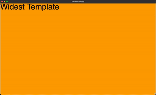
<utu:ResponsiveView.WidestTemplate>
<DataTemplate>
<Grid Background="Orange">
<TextBlock Text="Widest Template"
FontSize="32" />
</Grid>
</DataTemplate>
</utu:ResponsiveView.WidestTemplate>
</utu:ResponsiveView>
</Page>
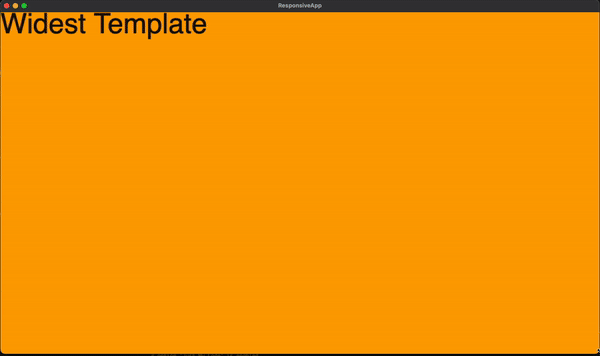
You can see here how each template is applied as the screen width changes. But, what if we don’t define a template for a certain screen width? Let’s remove the NarrowTemplate and WideTemplate from the above example and see what happens:
1
2
3
4
5
6
7
8
9
10
11
12
13
14
15
16
17
18
19
20
21
22
23
24
25
26
27
28
29
30
31
32
33
34
35
36
37
38
39
40
41
42
43
  <utu:ResponsiveView>
      <utu:ResponsiveView.NarrowestTemplate>
          <DataTemplate>
              <Grid Background="Red">
                  <TextBlock TextWrapping="WrapWholeWords"
                            Text="Narrowest Template"
                            FontSize="32" />
              </Grid>
          </DataTemplate>
      </utu:ResponsiveView.NarrowestTemplate>
-        <utu:ResponsiveView.NarrowTemplate>
-            <DataTemplate>
-                <Grid Background="Green">
-                    <TextBlock Text="Narrow Template"
-                               FontSize="32" />
-                </Grid>
-            </DataTemplate>
-        </utu:ResponsiveView.NarrowTemplate>
      <utu:ResponsiveView.NormalTemplate>
          <DataTemplate>
              <Grid Background="Blue">
                  <TextBlock Text="Normal Template"
                            FontSize="32" />
              </Grid>
          </DataTemplate>
      </utu:ResponsiveView.NormalTemplate>
-        <utu:ResponsiveView.WideTemplate>
-            <DataTemplate>
-                <Grid Background="Purple">
-                    <TextBlock Text="Wide Template"
-                               FontSize="32" />
-                </Grid>
-            </DataTemplate>
-        </utu:ResponsiveView.WideTemplate>
      <utu:ResponsiveView.WidestTemplate>
          <DataTemplate>
              <Grid Background="Orange">
                  <TextBlock Text="Widest Template"
                            FontSize="32" />
              </Grid>
          </DataTemplate>
      </utu:ResponsiveView.WidestTemplate>
  </utu:ResponsiveView>
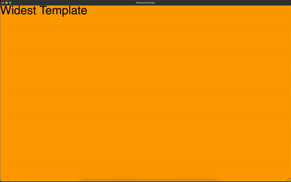
Notice now how we stay in certain templates for longer as the screen width changes. This is because the ResponsiveView control will always pick the smallest defined template that satisfies the width requirements. Since we removed the WideTemplate and NarrowTemplate, the ResponsiveView control will default to the NormalTemplate and the NarrowestTemplate for the Wide and Narrow screen widths, respectively.
More information on the template resolution logic can be found in the official documentation
Responsive Markup Extension
The Responsive markup extension is a new markup extension that is used to help build responsive layouts. It is similar to the ResponsiveView control in that it shares the resolution logic for the current window width. However, it is different in that it is not a container control and it does not require the definition of multiple templates. Instead, it enables finer-grained control over the value of a single property on a control based on the current window width.
Properties
| Property | Type | Description |
|---|---|---|
Narrowest |
object |
Value to be used when the screen size is at its narrowest. |
Narrow |
object |
Value to be used when the screen size is narrow. |
Normal |
object |
Value to be used when the screen size is normal. |
Wide |
object |
Value to be used when the screen size is wide. |
Widest |
object |
Value to be used when the screen size is at its widest. |
Layout |
ResponsiveLayout |
Overrides the screen size thresholds/breakpoints. |
The ResponsiveLayout property is used to override the default screen size threshold/breakpoints. We will cover this in more detail later.
Usage
Let’s take the previous example using ReponsiveView and convert it to use the Responsive markup extension instead:
1
2
3
4
5
6
7
8
9
10
11
12
<Page xmlns="http://schemas.microsoft.com/winfx/2006/xaml/presentation"
      xmlns:x="http://schemas.microsoft.com/winfx/2006/xaml"
      xmlns:local="using:ResponsiveApp"
      xmlns:utu="using:Uno.Toolkit.UI"
      x:Class="ResponsiveApp.MainPage"
      Background="{ThemeResource ApplicationPageBackgroundThemeBrush}">
    <Grid Background="{utu:Responsive Narrowest=Red, Narrow=Green, Normal=Blue, Wide=Purple, Widest=Orange}">
            <TextBlock TextWrapping="WrapWholeWords"
                       Text="{utu:Responsive Narrowest='Narrowest', Narrow='Narrow', Normal='Normal', Wide='Wide', Widest='Widest'}"
                       FontSize="32" />
    </Grid>
</Page>
Much simpler, right? The Responsive markup extension is a great way to quickly adapt a single property value based on the current window width. It is also a great way to quickly prototype a responsive layout without having to define multiple templates.
Now, what about if we wanted to customize the threshold values for the screen sizes? You’ll notice that for both ResponsiveView and the Responsive markup extension, we have a property available to us of type ResponsiveLayout. This property allows us to override the default screen size threshold/breakpoints in multiple ways.
ResponsiveLayout
The ResponsiveView control has a property called ResponsiveLayout and the Responsive markup extension has a property called Layout. These properties are of type ResponsiveLayout and have the following default values:
Properties
| Property | Type | Description |
|---|---|---|
Narrowest |
double |
Default value is 150. |
Narrow |
double |
Default value is 300. |
Normal |
double |
Default value is 600. |
Wide |
double |
Default value is 800. |
Widest |
double |
Default value is 1080. |
The default ResponsiveLayout can be overridden from different locations. In the following order of precedence:
- From the
ResponsiveLayout/Layoutproperty - In the property owner’s parent
.Resourceswithx:Key="DefaultResponsiveLayout", or the property owner’s ancestor’s.Resources - In
Application.Resourceswithx:Key="DefaultResponsiveLayout"
For more information on the ResponsiveLayout properties, check out the official documentation.
Examples
Let’s take the following ResponsiveLayout instance defined in our Application.Resources:
1
<utu:ResponsiveLayout x:Key="CustomLayout" Narrowest="0" Narrow="0" Normal="0" Wide="100" Widest="1200" />
This ridiculous example will cause the responsive resolution logic to stay in Wide mode for most configurations until the screen width is at least 1200 pixels wide. Let’s see what that looks like:
The way you could achieve this would look different depending on whether you are using ResponsiveView or the Responsive markup extension. Let’s take a look at both examples:
ResponsiveView
1
2
3
4
5
<utu:ResponsiveView ResponsiveLayout="{StaticResource CustomLayout}">

    ...

</utu:ResponsiveView>
Responsive Markup Extension
1
2
3
4
5
<Grid Background="{utu:Responsive Layout={StaticResource CustomLayout}, Narrowest=Red, Narrow=Green, Normal=Blue, Wide=Purple, Widest=Orange}">
        <TextBlock TextWrapping="WrapWholeWords"
                    Text="{utu:Responsive Layout={StaticResource CustomLayout}, Narrowest='Narrowest', Narrow='Narrow', Normal='Normal', Wide='Wide', Widest='Widest'}"
                    FontSize="32" />
</Grid>
Another approach would be to override the default ResponsiveLayout resource using the resource key DefaultResponsiveLayout. The beauty of this technique is that you can scope the resource to a specific control, the current page, or the entire application. Let’s take a look at an example:
1
2
3
4
5
6
7
8
9
10
11
12
<Page ...>
    <Page.Resources>
         <utu:ResponsiveLayout x:Key="DefaultResponsiveLayout"
                          Narrow="400"
                          Wide="800" />
    </Page.Resources>
    <utu:ResponsiveView>

        ...

    </utu:ResponsiveView>
</Page>
Conclusion
If you want to take a look at the full source code for the examples above, you can find it on this GitHub repo.
I hope you enjoyed this edition of Toolkit Tuesdays! There is even more to learn about Responsive so I hope you will continue to explore it on your own.
I encourage you to consult the full documentation for ResponsiveView and the Responsive markup extension using the links below. I also want to welcome you to contribute to making Responsive even better! Whether you have discovered some bugs, want to make improvements, or want to enhance the documentation, please jump into the fun on the Uno Toolkit GitHub repo!
