Toolkit Tuesdays: ExtendedSplashScreen
Welcome to another edition of Toolkit Tuesdays! In this series, I’ll be highlighting some of the controls and helpers in the Uno Toolkit library. This library is a collection of controls and helpers that we’ve created to make life easier when building apps with Uno Platform. I hope you find them useful too!
This week we are covering the ExtendedSplashScreen control. This control can be used to prolong the display of the native platform’s splash screen while your app continues to load. Not only that, it also enables you to overlay the extended splash screen with custom content such as a ProgressRing and/or custom branding. This is a great way to provide a more seamless experience to your users while your app is loading.
As always, these components require some extra setup since they are part of the Uno Toolkit library. You can refer to the Getting Started documentation to get everything set up and ready to go.
c
Anatomy of ExtendedSplashScreen
The ExtendedSplashScreen is basically a presenter for three separate layers:
- App Content: This would be the actual content of your app that you want to display after the app has loaded and the splash screen is finally dismissed. This is what we set as the
Contentproperty of theExtendedSplashScreencontrol. This layer is hidden while the app is loading. - Native Splash Screen Content: On top of the App Content layer is the native splash screen content. This is the spot where the
ExtendedSplashScreencontrol is doing most of its heavy lifting. The control will build an image representation of the native splash screen, either through native APIs or by extracting information from the app manifest. Once the image is built, it is displayed on top of the App Content layer as long as we are still in a “loading” state. - Loading Content: This is an optional layer that can be displayed on top of the Native Splash Screen Content layer. This is where you can add a
ProgressRingor any other custom branding that you would like to display while the app is loading. Both this and the Native Splash Screen Content layers are dismissed once the app has finished loading and the App Content layer is displayed.
You can imagine the ExtendedSplashScreen as a sort of “shell” control that wraps your app content and sandwiches the native splash screen content between the loading content and the app content.
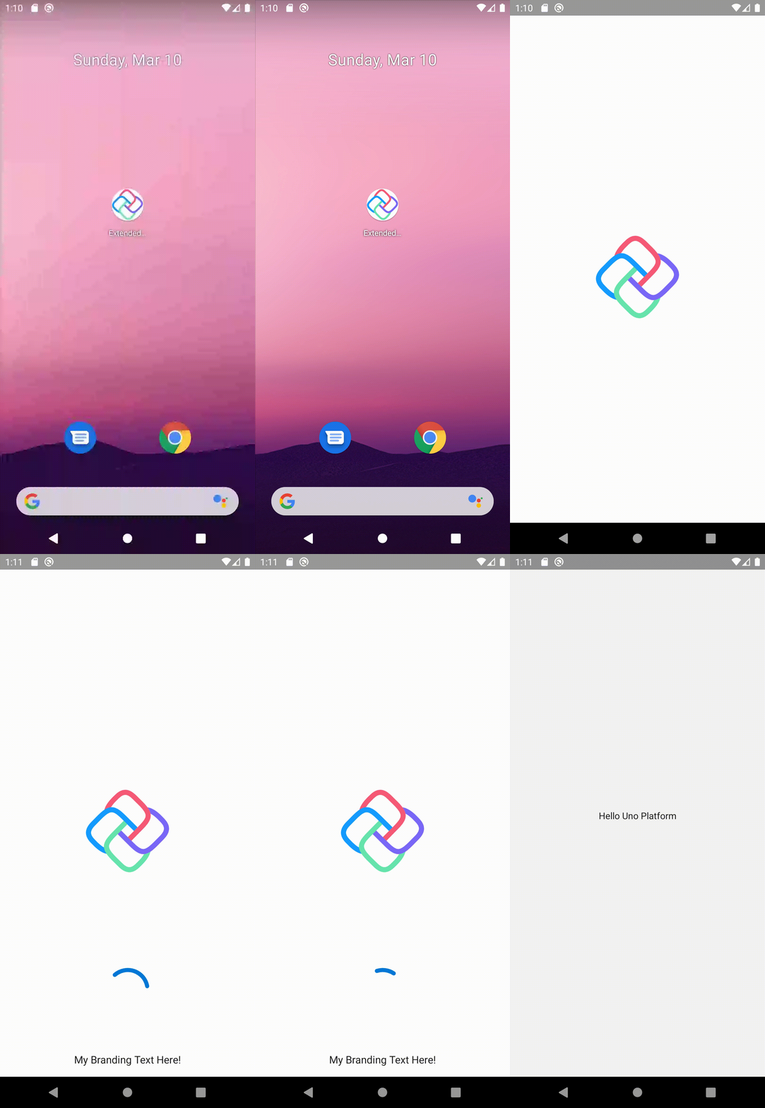
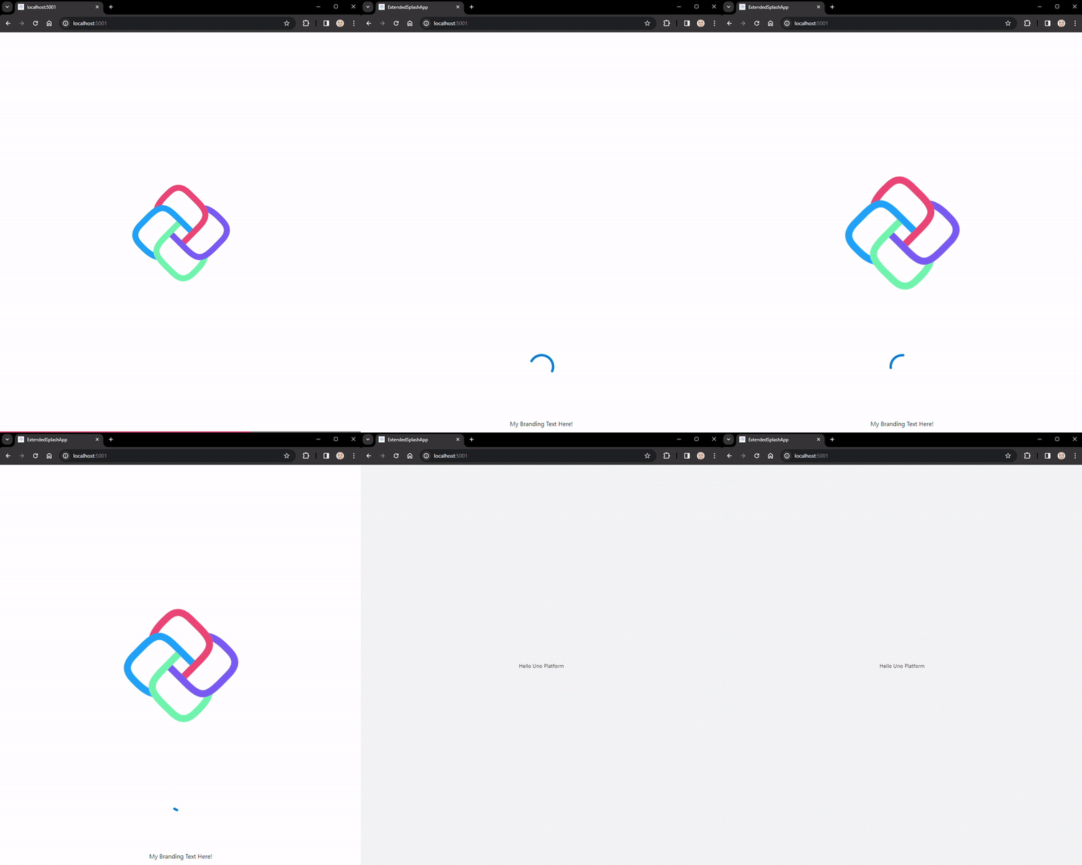
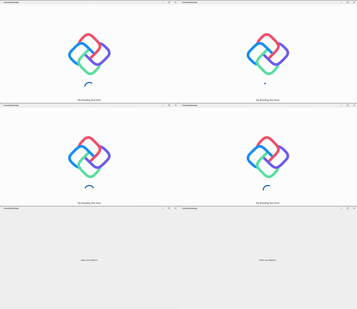
In the example GIFs below, you can see that the ExtendedSplashScreen control is displaying a ProgressRing and some branding text on top of the native splash screen content while the app is loading. Once the app has finished loading, the loading content is dismissed and the app content is displayed.
Android
WASM
To be clear, the ExtendedSplashScreen does not enable customization of the initial native splash screen. It simply allows you to prolong the display of the native splash screen while your app continues to load. During this prolonged display, you can overlay the native splash screen with custom content.
Getting to know ILoadable
The ExtendedSplashScreen control is actually derived from another public control in the Uno Toolkit library called LoadingView. This control is a specialized ContentControl that exposes a Source property of type ILoadable. The ILoadable interface is a simple interface that has an IsExecuting property and an IsExecutingChanged event. The ExtendedSplashScreen control uses this interface to determine when to dismiss the loading content and display the app content.
LoadingView itself is a very useful control that can be used to display any content while its ILoadable source is executing. This is the provider for our Loading Content layer that we discussed earlier in the Anatomy section. Make sure to check out the official documentation for more information on LoadingView and ILoadable.
Usage
Let’s take a look at how we can use the ExtendedSplashScreen control in our app. We’ll start with a brand new Uno Platform app and add the ExtendedSplashScreen control to it. The first step is to use the dotnet new commands to create a new Uno Platform app:
1
dotnet new unoapp -toolkit -o ExtendedSplashApp
This will give us a brand new application with the Uno Toolkit library already installed.
If we were to launch this app right now, we would see this:
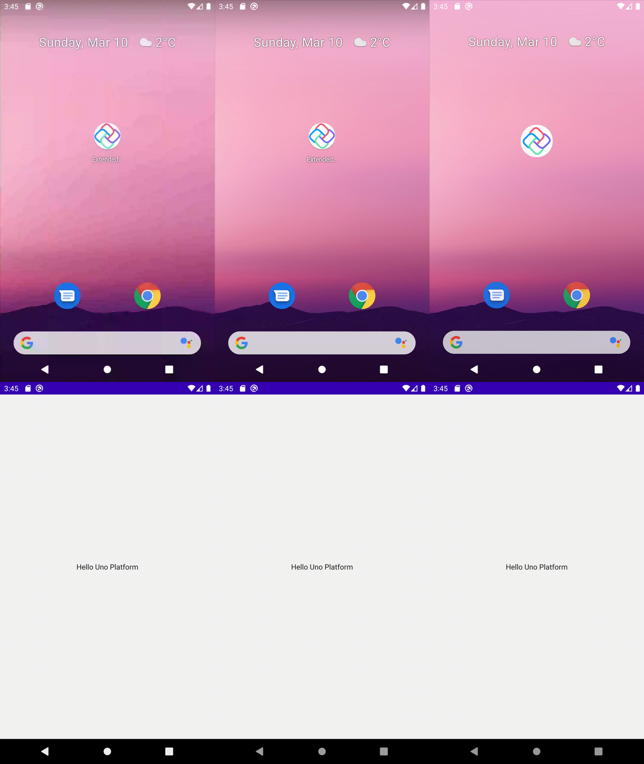
This is the default native splash screen that is displayed while the app is loading. It’s a simple white screen with the Uno Platform logo in the center. Those assets are generated for you by the Uno Resizetizer tooling. If you wanted to customize the native splash screen, you could do so by replacing the assets in the Splash folder of the ExtendedSplashApp.Shared.csproj.
Now, enough about customizing the splash screen, we’re focusing on EXTENDING it! Let’s add an ExtendedSplashScreen control to our app. We’ll start by adding a new UserControl to our app and call it Shell. I’ll explain why in a moment.
Shell.xaml:
1
2
3
4
5
6
7
8
9
10
11
12
13
14
15
16
17
18
19
20
21
22
23
24
25
26
27
28
29
30
31
32
33
34
35
36
37
38
39
40
41
42
43
<UserControl x:Class="ExtendedSplashApp.Shell"
             xmlns="http://schemas.microsoft.com/winfx/2006/xaml/presentation"
             xmlns:x="http://schemas.microsoft.com/winfx/2006/xaml"
             xmlns:local="using:ExtendedSplashApp"
             xmlns:d="http://schemas.microsoft.com/expression/blend/2008"
             xmlns:mc="http://schemas.openxmlformats.org/markup-compatibility/2006"
             xmlns:utu="using:Uno.Toolkit.UI"
             mc:Ignorable="d">

    <utu:ExtendedSplashScreen x:Name="Splash">

        <!-- Loading Content "layer" -->
        <utu:ExtendedSplashScreen.LoadingContent>
            <Grid>
                <Grid.RowDefinitions>
                    <RowDefinition Height="2*" />
                    <RowDefinition />
                </Grid.RowDefinitions>

                <ProgressRing IsActive="True"
                              Grid.Row="1"
                              Background="Transparent"
                              VerticalAlignment="Center"
                              HorizontalAlignment="Center"
                              Height="75"
                              Width="75" />

                <TextBlock Text="My Branding Text Here!"
                           Grid.Row="1"
                           Margin="16"
                           FontSize="16"
                           VerticalAlignment="Bottom"
                           HorizontalAlignment="Center" />
            </Grid>
        </utu:ExtendedSplashScreen.LoadingContent>

        <!-- App Content "layer" -->
        <utu:ExtendedSplashScreen.Content>
            <Frame x:Name="ShellFrame" />
        </utu:ExtendedSplashScreen.Content>

    </utu:ExtendedSplashScreen>
</UserControl>
A lot going on here, so let’s break it down. We have a UserControl that contains the ExtendedSplashScreen control. The ExtendedSplashScreen control has two properties set: LoadingContent and Content.
-
The
LoadingContentcontains what we were referring to as the Loading Content layer earlier. This is where we can add aProgressRingand any other custom content that will be overlayed on top of the splash screen content. Notice that there is no Uno logo image here, this is because that is part of the native splash screen content displayed underneath. This is why our first row of theGridis “unused” and simply takes up the top two-thirds of the screen (2*). -
The
Contentproperty is where we set the actual content of our app. In this case, we are using aFramecontrol to host ourMainPage. This is why we called theUserControlShell. We are using it as a sort of “shell” to host the content of our app.
Let’s take a look at the code-behind for the Shell:
Shell.xaml.cs:
1
2
3
4
5
6
7
8
9
10
11
12
13
14
15
16
17
18
19
20
public sealed partial class Shell : UserControl
{
    public Frame RootFrame => ShellFrame;

    private MyLoadableSource _loadable = new();

    public Shell()
    {
        this.InitializeComponent();

        Splash.Source = _loadable;

        Loaded += OnLoaded;
    }

    private async void OnLoaded(object sender, RoutedEventArgs e)
    {
        await _loadable.Execute();
    }
}
Here we are publicly exposing the Frame as a property called RootFrame, which we will eventually use to navigate to our MainPage from the App.cs. We are also setting the Source property of the ExtendedSplashScreen to a new instance of a custom ILoadable implementation called MyLoadableSource. This is a simple class that implements the ILoadable interface and has a Task that simulates some loading time.
Here is my ILoadable implementation:
1
2
3
4
5
6
7
8
9
10
11
12
13
14
15
16
17
18
19
20
21
22
23
24
25
26
27
28
29
30
31
public class MyLoadableSource : ILoadable
{
    public event EventHandler? IsExecutingChanged;

    private bool _isExecuting;
    public bool IsExecuting
    {
        get => _isExecuting;
        set
        {
            if (_isExecuting != value)
            {
                _isExecuting = value;
                IsExecutingChanged?.Invoke(this, new());
            }
        }
    }

    public async Task Execute()
    {
        try
        {
            IsExecuting = true;
            await Task.Delay(5000);
        }
        finally
        {
            IsExecuting = false;
        }
    }
}
This would be what you would use to notify the ExtendedSplashScreen to show/hide itself. Perhaps you would be firing off a command on your initial View Model or loading some data from a service. Either way, as long as you can connect that logic to some implementation of ILoadable, you can use it with the ExtendedSplashScreen.
Finally, let’s make some edits to the App.cs bootstrapping code to use our new Shell control:
App.cs:
1
2
3
4
5
6
7
8
9
10
11
12
13
14
15
16
17
18
19
20
21
22
23
24
25
26
27
28
29
30
31
32
33
34
35
36
37
38
39
40
41
42
43
 protected override void OnLaunched(LaunchActivatedEventArgs args)
 {
 #if NET6_0_OR_GREATER && WINDOWS && !HAS_UNO
     MainWindow = new Window();
 #else
     MainWindow = Microsoft.UI.Xaml.Window.Current;
 #endif

 #if DEBUG
     MainWindow.EnableHotReload();
 #endif


     // Do not repeat app initialization when the Window already has content,
     // just ensure that the window is active
-    if (MainWindow.Content is not Frame rootFrame)
+    if (MainWindow.Content is not Shell shell)
     {
-        // Create a Frame to act as the navigation context and navigate to the first page
-        rootFrame = new Frame();
+        shell = new Shell();

-        // Place the frame in the current Window
-        MainWindow.Content = rootFrame;
+        MainWindow.Content = shell;

-        rootFrame.NavigationFailed += OnNavigationFailed;
+        shell.RootFrame.NavigationFailed += OnNavigationFailed;
     }

-    if (rootFrame.Content == null)
+    if (shell.RootFrame.Content == null)
     {
         // When the navigation stack isn't restored navigate to the first page,
         // configuring the new page by passing required information as a navigation
         // parameter
-        rootFrame.Navigate(typeof(MainPage), args.Arguments);
+        shell.RootFrame.Navigate(typeof(MainPage), args.Arguments);
     }

     // Ensure the current window is active
     MainWindow.Activate();
 }
Here we are making the Shell the main content of the application and navigating to the MainPage from the Shell’s RootFrame. This way, once the app has finished loading, the MainPage will already be displayed.
Now, if we were to run the app, we would see the ExtendedSplashScreen control in action:
Android

WASM

Windows
Conclusion
In this article, we covered how to use the ExtendedSplashScreen control along with the ILoadable interface to prolong the display of the native platform’s splash screen while your app continues to load. We also learned how to overlay the extended splash screen with custom content such as a ProgressRing and/or custom branding. This is a great way to provide a more seamless experience to your users while your app is loading.
If you want to take a look at the full source code for the examples above, you can find it on this GitHub repo.
I hope you enjoyed this edition of Toolkit Tuesdays! There is even more to learn about the ExtendedSplashScreen so I hope you will continue to explore it on your own.
I encourage you to consult the full documentation for the ExtendedSplashScreen using the links below. I also want to welcome you to contribute to making ExtendedSplashScreen and LoadingView even better! Whether you have discovered some bugs, want to make improvements, or want to enhance the documentation, please jump into the fun on the Uno Toolkit GitHub repo!
Further Reading
Pending Work
Keep an eye out for some nice PRs to merge for ExtendedSplashScreen soon as well:

