
Toolkit Tuesdays: TabBar
Welcome to another edition of Toolkit Tuesdays! In this series, I’ll be highlighting some of the controls and helpers in the Uno Toolkit library. This library is a collection of controls and helpers that we’ve created to make life easier when building apps with Uno Platform. I hope you find them useful too!
This week we are covering the TabBar control. This control is used to display a collection of TabBarItems and supports selection, commanding, selection indicator customization, etc. A TabBar is typically used to organize groups of related content that are at the same level of hierarchy.
Anatomy of a TabBar
The following XAML will produce the TabBar seen in the figure below:
1
2
3
4
5
6
7
8
9
10
11
12
13
14
15
16
17
18
19
20
21
22
23
24
25
26
27
28
29
xmlns:utu="using:Uno.Toolkit.UI"
<utu:TabBar Background="White">
<utu:TabBar.SelectionIndicatorContent>
<Border Width="100"
Height="5"
HorizontalAlignment="Center"
VerticalAlignment="Bottom"
Background="Green" />
</utu:TabBar.SelectionIndicatorContent>
<utu:TabBar.Items>
<utu:TabBarItem Content="Home">
<utu:TabBarItem.Icon>
<SymbolIcon Symbol="Home" />
</utu:TabBarItem.Icon>
</utu:TabBarItem>
<utu:TabBarItem Content="Support"
IsSelected="True">
<utu:TabBarItem.Icon>
<FontIcon Glyph="" />
</utu:TabBarItem.Icon>
</utu:TabBarItem>
<utu:TabBarItem Content="About">
<utu:TabBarItem.Icon>
<FontIcon Glyph="" />
</utu:TabBarItem.Icon>
</utu:TabBarItem>
</utu:TabBar.Items>
</utu:TabBar>
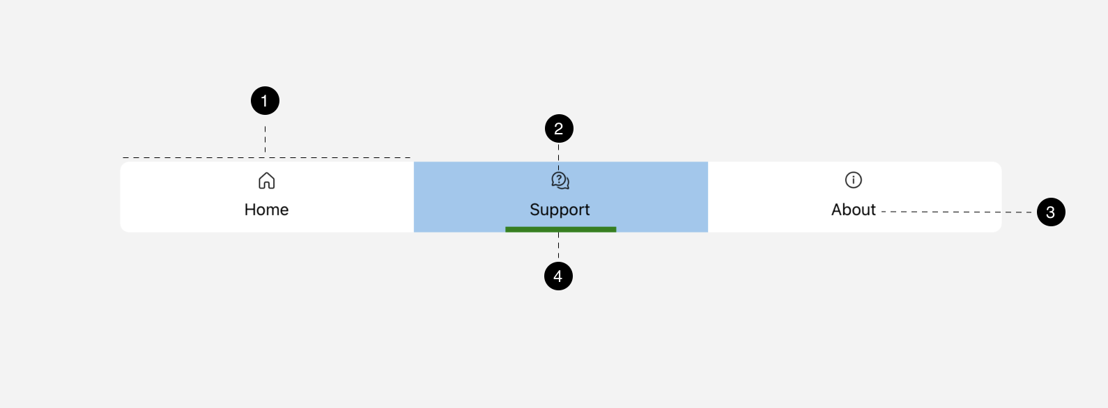
- TabBarItem
- TabBarItem Icon
- TabBarItem Content
- Custom Selection Indicator Content
TabBar
The TabBar contains properties for things like SelectedItem, SelectedIndex, Orientation, and many other properties relating to selection indicators which will be covered later on in the article.
NOTE: TabBar currently only supports single-selection
TabBarItem
A TabBar is composed of one or more TabBarItem instances. Each TabBarItem has an Icon as well as a Content property, as seen in the anatomy figure above. There are also several other properties available such as Command, Flyout, IsSelectable, etc.
Usage
Let’s take a look at how we could use a TabBar as a means of changing the main content that we want to display on our page. We’ll start with a simple page that contains a TabBar and a collection of Grid objects:
1
2
3
4
5
6
7
8
9
10
11
12
13
14
15
16
17
18
19
20
21
22
23
24
25
26
27
28
29
30
31
32
33
34
35
36
37
38
39
40
41
42
43
44
45
46
47
48
49
50
51
52
53
54
55
56
57
58
59
60
61
<Page x:Class="TabBarApp.MainPage"
xmlns="http://schemas.microsoft.com/winfx/2006/xaml/presentation"
xmlns:x="http://schemas.microsoft.com/winfx/2006/xaml"
xmlns:local="using:TabBarApp"
xmlns:utu="using:Uno.Toolkit.UI"
utu:SafeArea.Insets="Top"
Background="{ThemeResource ApplicationPageBackgroundThemeBrush}">
<Grid>
<Grid.RowDefinitions>
<RowDefinition Height="Auto" />
<RowDefinition Height="*" />
</Grid.RowDefinitions>
<utu:TabBar Background="White">
<utu:TabBar.Items>
<utu:TabBarItem Content="Home"
Tag="Home"
IsSelected="True">
<utu:TabBarItem.Icon>
<SymbolIcon Symbol="Home" />
</utu:TabBarItem.Icon>
</utu:TabBarItem>
<utu:TabBarItem Content="Support"
Tag="Support">
<utu:TabBarItem.Icon>
<FontIcon Glyph="" />
</utu:TabBarItem.Icon>
</utu:TabBarItem>
<utu:TabBarItem Content="About"
Tag="About">
<utu:TabBarItem.Icon>
<FontIcon Glyph="" />
</utu:TabBarItem.Icon>
</utu:TabBarItem>
</utu:TabBar.Items>
</utu:TabBar>
<Grid x:Name="pageContainer"
Grid.Row="1">
<Grid x:Name="Home"
Visibility="Collapsed">
<TextBlock Text="Home"
FontSize="30"
VerticalAlignment="Center"
HorizontalAlignment="Center" />
</Grid>
<Grid x:Name="Support"
Visibility="Collapsed">
<TextBlock Text="Support"
FontSize="30"
VerticalAlignment="Center"
HorizontalAlignment="Center" />
</Grid>
<Grid x:Name="About"
Visibility="Collapsed">
<TextBlock Text="About"
FontSize="30"
VerticalAlignment="Center"
HorizontalAlignment="Center" />
</Grid>
</Grid>
</Grid>
</Page>
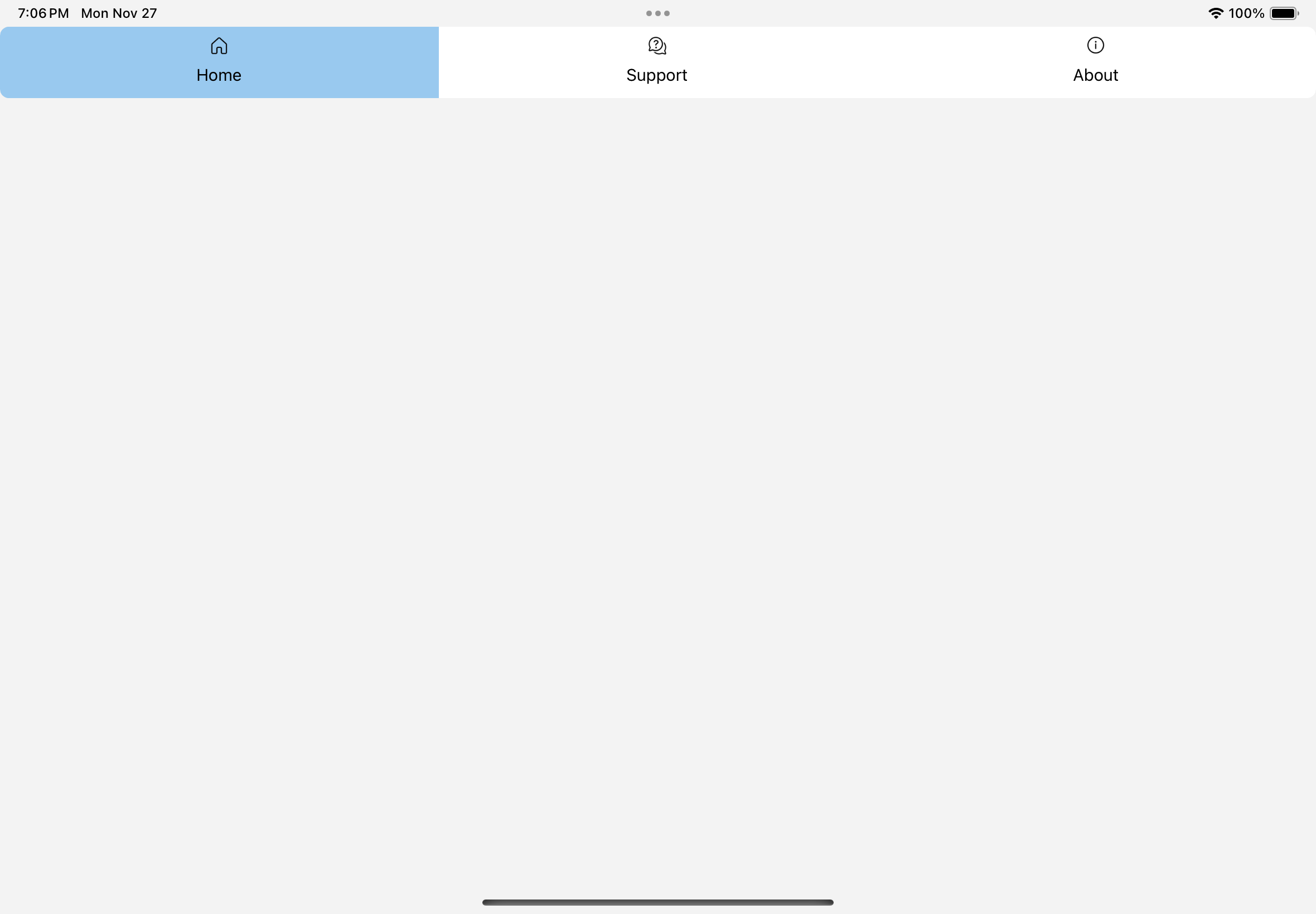
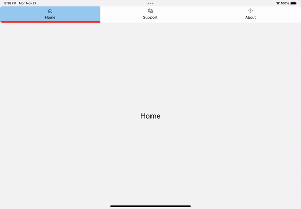
Nothing fancy and we don’t see anything at this point.
Notice that I have set the name of each child Grid of pageContainer to the same value as the Tag property for each TabBarItem. These will come in handy in the next step where we will jump over to the code-behind to sync the TabBar selection to the visibility of the corresponding Grid.
Our code-behind for our page should now look something like this:
1
2
3
4
5
6
7
8
9
10
11
12
13
14
15
16
17
18
19
20
21
22
23
24
25
26
27
28
29
30
31
32
33
using Uno.Toolkit.UI;

namespace TabBarApp;

public sealed partial class MainPage : Page
{
    public MainPage()
    {
        this.InitializeComponent();

        SyncSelection(tabBar.SelectedItem as TabBarItem);
        tabBar.SelectionChanged += OnSelectionChanged;
    }

    private void OnSelectionChanged(TabBar sender, TabBarSelectionChangedEventArgs args)
    {
        SyncSelection(args.NewItem as TabBarItem);
    }

    private void SyncSelection(TabBarItem? tabBarItem)
    {
        if (tabBarItem is TabBarItem item)
        {
            foreach (var page in pageContainer.Children)
            {
                if (page is Grid pageGrid)
                {
                    pageGrid.Visibility = pageGrid.Name == (string)item.Tag ? Visibility.Visible : Visibility.Collapsed;
                }
            }
        }
    }
}
Yes, I know this is probably not bulletproof and not the most efficient. This is quick and dirty coding and that’s how we like things around here.
We should now be seeing something like this:
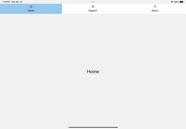
It works!
But, wouldn’t it be nice to be able to have some sort of helper logic that would do most of this heavy lifting for us? How about something the could automatically sync the TabBar selection to the SelectedIndex of anything that inherits from Selector, such as ListView or even FlipView?
WELL, HAVE I GOT NEWS FOR YOU!
We can reset our code-behind to look like this:
1
2
3
4
5
6
7
8
9
namespace TabBarApp;

public sealed partial class MainPage : Page
{
    public MainPage()
    {
        this.InitializeComponent();
    }
}
And here is where all the magic happens:
1
2
3
4
5
6
7
8
9
10
11
12
13
14
15
16
17
18
19
20
21
22
23
24
25
26
27
28
29
30
31
32
33
34
35
36
37
38
39
40
41
42
43
44
45
46
47
48
49
50
51
52
53
54
55
56
57
58
<Grid>
<Grid.RowDefinitions>
<RowDefinition Height="Auto" />
<RowDefinition Height="*" />
</Grid.RowDefinitions>
<utu:TabBar x:Name="tabBar"
Background="White"
utu:TabBarSelectorBehavior.Selector="{Binding ElementName=pageFlipView}">
<utu:TabBar.Items>
<utu:TabBarItem Content="Home"
Tag="Home"
IsSelected="True">
<utu:TabBarItem.Icon>
<SymbolIcon Symbol="Home" />
</utu:TabBarItem.Icon>
</utu:TabBarItem>
<utu:TabBarItem Content="Support"
Tag="Support">
<utu:TabBarItem.Icon>
<FontIcon Glyph="" />
</utu:TabBarItem.Icon>
</utu:TabBarItem>
<utu:TabBarItem Content="About"
Tag="About">
<utu:TabBarItem.Icon>
<FontIcon Glyph="" />
</utu:TabBarItem.Icon>
</utu:TabBarItem>
</utu:TabBar.Items>
</utu:TabBar>
<FlipView x:Name="pageFlipView"
Grid.Row="1">
<FlipViewItem>
<Grid>
<TextBlock Text="Home"
FontSize="30"
VerticalAlignment="Center"
HorizontalAlignment="Center" />
</Grid>
</FlipViewItem>
<FlipViewItem>
<Grid>
<TextBlock Text="Support"
FontSize="30"
VerticalAlignment="Center"
HorizontalAlignment="Center" />
</Grid>
</FlipViewItem>
<FlipViewItem>
<Grid>
<TextBlock Text="About"
FontSize="30"
VerticalAlignment="Center"
HorizontalAlignment="Center" />
</Grid>
</FlipViewItem>
</FlipView>
</Grid>
Notice that we now have a FlipView instead of our pageContainer. Most importantly, take a look at our TabBar declaration. You’ll see a new line there: utu:TabBarSelectorBehavior.Selector="{Binding ElementName=pageFlipView}". This is a special behavior that is available to you from Uno Toolkit that will tell the TabBar to sync its SelectedIndex to the SelectedIndex of whatever Selector that you bind it to. In this case, we are binding it to our FlipView and it will automatically sync the TabBar selection to the FlipView selection.
You can see in the example below, no matter if I am tapping on an individual TabBarItem:

Or swiping through the FlipView:

The selection is always in sync!
Selection Indicator Customization
As you may have noticed from the above animations, we are simply using the default ItemsControl and SelectorItem styling when it comes to highlighting the selected TabBarItem. The TabBar also comes with the ability for you to provide custom content that will display for the currently selected TabBarItem. This content is driven by the SelectionIndicatorContent and SelectionIndicatorContentTemplate properties.
Let’s go ahead and display a thin red line at the bottom of our selected TabBarItem. To do so, simply add the following code to your TabBar declaration in the XAML:
1
2
3
4
5
6
7
8
9
<utu:TabBar Background="White"
            utu:TabBarSelectorBehavior.Selector="{Binding ElementName=pageFlipView}">
    <utu:TabBar.SelectionIndicatorContent>
        <Border VerticalAlignment="Bottom"
                Height="5"
                Background="Red" />
    </utu:TabBar.SelectionIndicatorContent>
    ...
</utu:TabBar>
Conclusion
Once again, I encourage you to consult the full documentation for TabBar using the links below. I also want to welcome you to contribute to making TabBar even better! Whether you have discovered some bugs, want to make improvements, or want to enhance the documentation, please jump into the fun on the Uno Toolkit GitHub repo!
