
Uno Chefs Walkthrough - Login Page

Let’s continue our walkthrough of Uno Chefs, our new flagship reference implementation when it comes to building cross-platform apps. This time, we’ll be covering the Login Page. This is the next page after navigating from the Welcome Page, which we covered last time.
Anatomy of the Login Page
I know an article on a login page sounds boring. But, there’s actually a lot of good stuff packed into this simple screen.
We don’t need to separate the anatomy based on our wide/narrow layouts. This is one of the few pages that we simply lock to a MaxWidth so it looks good enough for both layout breakpoints.
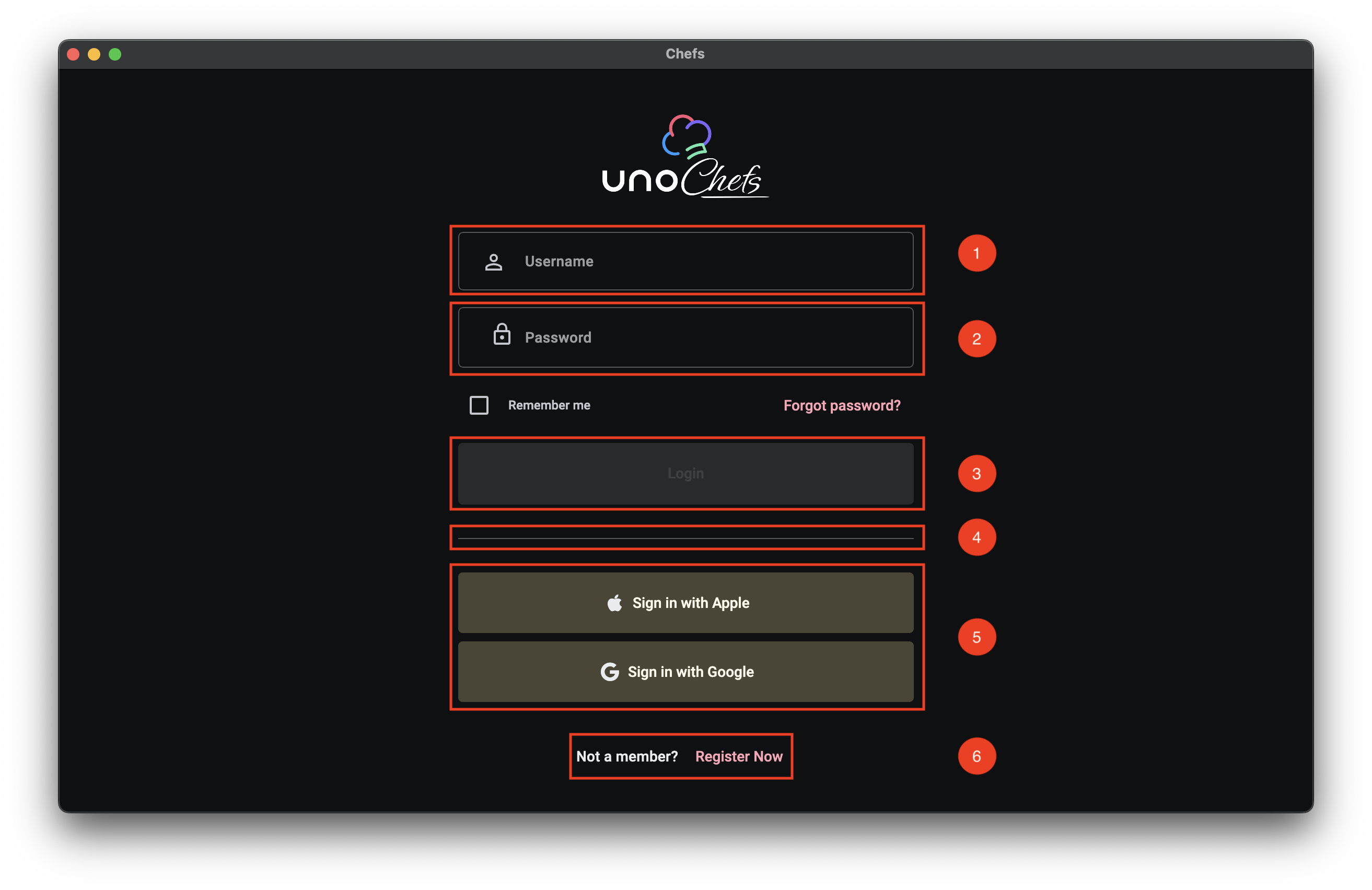
- Username TextBox
- Password PasswordBox
- Login Button
- Divider
- Social Login Buttons
- Registration Text Button
The first, and most important, part of any login experience are the Username/Password fields. Not only should they be clearly indicated, it should be easy to quickly navigate between the two fields and invoke a form submission without using your mouse at all.
Custom Icons
Along with using the PlaceholderText property for the Username TextBox and the PasswordBox controls, we are using the ControlExtensions.Icon Attached Property from Uno Themes to add a nice leading icon image for each control. For more info on the ControlExtensions.Icon Attached Property you can check out the related Uno Tech Bite:
As a quick recap, the Icon Attached Property from Uno Themes’ ControlExtensions class provides the ability to define any type of IconElement and displays it in many situations as part of the custom styles coming from Uno Themes.
The ControlExtensions Attached Properties must be properly referenced inside of the control’s ControlTemplate. They do not work with the out-of-the-box Fluent styles from the core Uno library.
Keyboard Navigation
We are also using the InputExtensions set of Attached Properties from Uno Toolkit in order to facilitate keyboard navigation support for tabbing through the input controls and invoking the Login command on Enter key press. Once again, we have a couple of Uno Tech Bite videos specifically on this topic :)
The XAML
We can take a look now at the XAML for the Login Page. I extracted a snippet of the most relevant parts, but you can find the full XAML in the Uno Chefs repository.
1
2
3
4
5
6
7
8
9
10
11
12
13
14
15
16
17
18
19
20
21
22
23
24
25
26
27
28
29
30
31
32
33
34
35
36
37
38
39
40
41
42
43
44
45
46
47
48
49
50
51
52
53
54
55
56
57
58
59
60
61
62
63
64
65
66
67
68
69
70
71
72
73
74
75
76
77
78
79
80
81
82
83
84
85
86
87
88
89
90

<utu:AutoLayout Spacing="32"
                MaxWidth="500"
                PrimaryAxisAlignment="Center"
                Padding="32">
    <Image utu:AutoLayout.CounterAlignment="Center"
            Width="160"
            Height="90"
            Source="{ThemeResource ChefsLogoWithIcon}"
            Stretch="Uniform" />
    <utu:AutoLayout Spacing="16"
                    PrimaryAxisAlignment="Center">
        <TextBox PlaceholderText="Username"
                  x:Name="LoginUsername"
                  AutomationProperties.AutomationId="LoginUsername"
                  Style="{StaticResource ChefsPrimaryTextBoxStyle}"
                  utu:InputExtensions.ReturnType="Next"
                  utu:InputExtensions.AutoFocusNextElement="{Binding ElementName=LoginPassword}"
                  IsSpellCheckEnabled="False"
                  Text="{Binding UserCredentials.Username, Mode=TwoWay, UpdateSourceTrigger=PropertyChanged}">
            <ut:ControlExtensions.Icon>
                <PathIcon Data="{StaticResource Icon_Person_Outline}" />
            </ut:ControlExtensions.Icon>
        </TextBox>
        <PasswordBox x:Name="LoginPassword"
                      AutomationProperties.AutomationId="LoginPassword"
                      utu:InputExtensions.ReturnType="Done"
                      utu:CommandExtensions.Command="{Binding Login}"
                      Password="{Binding UserCredentials.Password, Mode=TwoWay, UpdateSourceTrigger=PropertyChanged}"
                      PlaceholderText="Password"
                      Style="{StaticResource OutlinedPasswordBoxStyle}"
                      BorderBrush="{ThemeResource OutlineVariantBrush}">
            <ut:ControlExtensions.Icon>
                <PathIcon Data="{StaticResource Icon_Lock}" />
            </ut:ControlExtensions.Icon>
        </PasswordBox>
        <utu:AutoLayout Spacing="24"
                        Orientation="Horizontal"
                        CounterAxisAlignment="Center"
                        Justify="SpaceBetween"
                        PrimaryAxisAlignment="Stretch">
            <CheckBox Content="Remember me"
                      utu:AutoLayout.PrimaryAlignment="Auto"
                      IsChecked="{Binding UserCredentials.SaveCredentials, Mode=TwoWay}" />
            <Button Content="Forgot password?"
                    Style="{StaticResource TextButtonStyle}" />
        </utu:AutoLayout>
        <Button Content="Login"
                x:Name="LoginButton"
                AutomationProperties.AutomationId="LoginButton"
                Style="{StaticResource ChefsPrimaryButtonStyle}"
                Command="{Binding Login}" />
    </utu:AutoLayout>

    <utu:Divider Style="{StaticResource DividerStyle}" />

    <utu:AutoLayout Spacing="8"
                    PrimaryAxisAlignment="Center">
        <Button Content="Sign in with Apple"
                Command="{Binding LoginWithApple}"
                Style="{StaticResource ChefsTonalButtonStyle}">
            <ut:ControlExtensions.Icon>
                <FontIcon Style="{StaticResource FontAwesomeBrandsFontIconStyle}"
                          Glyph="{StaticResource Icon_Apple_Brand}"
                          FontSize="18"
                          Foreground="{ThemeResource OnSurfaceBrush}" />
            </ut:ControlExtensions.Icon>
        </Button>
        <Button Content="Sign in with Google"
                Command="{Binding LoginWithGoogle}"
                Style="{StaticResource ChefsTonalButtonStyle}">
            <ut:ControlExtensions.Icon>
                <FontIcon Style="{StaticResource FontAwesomeBrandsFontIconStyle}"
                          Glyph="{StaticResource Icon_Google_Brand}"
                          FontSize="18"
                          Foreground="{ThemeResource OnSurfaceBrush}" />
            </ut:ControlExtensions.Icon>
        </Button>
    </utu:AutoLayout>
    <utu:AutoLayout PrimaryAxisAlignment="Center"
                    CounterAxisAlignment="Center"
                    Orientation="Horizontal"
                    Spacing="4">
        <TextBlock Text="Not a member?"
                    Foreground="{ThemeResource OnSurfaceBrush}"
                    Style="{StaticResource LabelLarge}" />
        <Button Content="Register Now"
                uen:Navigation.Request="-/Register"
                Style="{StaticResource TextButtonStyle}" />
    </utu:AutoLayout>
</utu:AutoLayout>
ControlExtensions
First thing we want to look at are the ControlExtensions.Icon usages. In the snippet above, check out lines 20-22 and 32-34. This is where we are setting the leading icons for the TextBox and PasswordBox controls. We are using a PathIcon to define the icon shape, which is a vector graphic that scales nicely across different screen sizes and resolutions.
1
2
3
4
5
6
7
8
9

<!-- Username Icon -->
<ut:ControlExtensions.Icon>
    <PathIcon Data="{StaticResource Icon_Person_Outline}" />
</ut:ControlExtensions.Icon>

<!-- Password Icon -->
<ut:ControlExtensions.Icon>
    <PathIcon Data="{StaticResource Icon_Lock}" />
</ut:ControlExtensions.Icon>
InputExtensions
Next, we have the InputExtensions Attached Properties. This is where we are defining the keyboard navigation behavior. There are actually two properties we are using here: ReturnType and AutoFocusNextElement.
1
2
3
4
5
6

<TextBox ...
         utu:InputExtensions.ReturnType="Next"
         utu:InputExtensions.AutoFocusNextElement="{Binding ElementName=LoginPassword}" />
<PasswordBox x:Name="LoginPassword"
             ...
             utu:InputExtensions.ReturnType="Done" />
The ReturnType property is set to Next for the TextBox. Which means that when the software keyboard is displayed while the Username TextBox is focused, the Next button will be shown in the spot for the Return key. For the PasswordBox, we set the ReturnType to Done, which should show a Done button instead.
The AutoFocusNextElement property is set to the LoginPassword element. Which means that when the Next button or the Tab key is pressed, the focus will automatically move from the TextBox to the PasswordBox.
CommandExtensions
Finally, we have the CommandExtensions.Command Attached Property on the PasswordBox. This is where we are binding the Login command to the PasswordBox. This means that when the Done button or the Enter key is pressed, it will invoke the Login command and will auto-dismiss the software keyboard.
1
2

<PasswordBox ...
             utu:CommandExtensions.Command="{Binding Login}" />
Putting it all together
Take note in the video below of the Return key changing from Next to Done as we navigate between the two input controls. As well as the Login successfully occurring when the Done button is pressed on the software keyboard.
The MVUX Model
Next, let’s take a look at the MVUX model for the Login Page. The Login Page is a bit more complex than the Welcome Page, so we have a few more properties and commands to look at.
1
2
3
4
5
6
7
8
9
10
11
12
13
14
15
16
17
18
19
20
21
22
23
24

public partial record LoginModel(IDispatcher Dispatcher, INavigator Navigator, IAuthenticationService Authentication)
{
    public IState<Credentials> UserCredentials => State<Credentials>.Value(this, () => new Credentials());

    public ICommand Login => Command.Create(b => b.Given(UserCredentials).When(CanLogin).Then(DoLogin));

    private bool CanLogin(Credentials userCredentials)
    {
        return userCredentials is not null &&
               !string.IsNullOrWhiteSpace(userCredentials.Username) &&
               !string.IsNullOrWhiteSpace(userCredentials.Password);
    }

    private async ValueTask DoLogin(Credentials userCredentials, CancellationToken ct)
    {
        await Authentication.LoginAsync(Dispatcher, new Dictionary<string, string> { { "Username", userCredentials.Username! }, { "Password", userCredentials.Password! } });
        await NavigateToMain(ct);
    }

    ...

    private async ValueTask NavigateToMain(CancellationToken ct)
        => await Navigator.NavigateViewModelAsync<MainModel>(this, qualifier: Qualifiers.ClearBackStack, cancellation: ct);
}
UserCredentials State
First thing’s first, we have the UserCredentials property. This is a simple Credentials object that holds the Username and Password values. We are using an IState<Credentials> here instead of an IFeed<Credentials> since we want to be able to update the observable property as the user types in the input fields and react to the changes accordingly.
Login Command
The Login command is defined using the Command.Create builder method from MVUX. This allows us to build an ICommand in a fluent way. We cover this in the Command Builder Chefs Recipe Book article. You’ll notice the When(CanLogin) method that will properly wire up the CanExecute logic for the ICommand. This will ensure that the Login button is only enabled when both the Username and Password fields are not empty, or whatever validation logic you want to implement.
IAuthenticationService Usage
We can see that the DoLogin method is where we are using the injected IAuthenticationService to handle the authentication logic. If you search the solution for something implementing the IAuthenticationService interface, you’ll find that it is not implemented in Chefs. Instead, it is registered by the UseAuthentication extension method as part of the IHostBuilder in the App.xaml code-behind logic. This is all made available to us through the Uno Extensions Authentication package.
Here is the relevant code snippet from the App code-behind:
1
2
3
4
5
6
7
8
9
10
11
12
13
14
15
16
17
18
19
20
21
22
23
24
25
26
27
28
29
30
31
32
33

...

.Configure(host => host
    .UseAuthentication(auth =>
        auth.AddCustom(
            custom =>
            {
                custom.Login(async (sp, dispatcher, credentials, cancellationToken) => await ProcessCredentials(credentials));
            },
            name: "CustomAuth")
    )

...

private async ValueTask<IDictionary<string, string>?> ProcessCredentials(IDictionary<string, string> credentials)
{
    // Check for username to simulate credential processing
    if (!(credentials?.TryGetValue("Username", out var username) ??
            false && !string.IsNullOrEmpty(username)))
    {
        return null;
    }

    // Simulate successful authentication by creating a dummy token dictionary
    var tokenDictionary = new Dictionary<string, string>
    {
        { TokenCacheExtensions.AccessTokenKey, "SampleToken" },
        { TokenCacheExtensions.RefreshTokenKey, "RefreshToken" },
        { "Expiry", DateTime.Now.AddMinutes(5).ToString("g") } // Set token expiry
    };

    return tokenDictionary;
}
In our case, we are simulating a successful login as long as the Username is not empty. We are achieving this by using the AddCustom method on the IAuthenticationBuilder to register the CustomAuthenticationProvider coming from Uno Extensions. The CustomAuthenticationProvider provides a basic implementation of the IAuthenticationProvider that requires callback methods to be defined for performing login, refresh, and logout actions.
This is where you would typically implement your own authentication logic, such as calling an API to validate the credentials. You can easily swap this out with something like .AddMsal or AddOidc.
Now, when we call the LoginAsync method on the IAuthenticationService inside of the LoginModel, it will automatically call into the ProcessCredentials method to handle the auth request.
Next Steps
In the next article, we’ll get into the real meat of the application and explore the Home Page. In the meantime, I encourage you to check out the Uno Chefs Recipe Book and the Uno Chefs GitHub repository and explore the code for yourself. There are a lot of interesting patterns and techniques used throughout the app that you can learn from.
Hope you learned something and I’ll catch you in the next one 