Toolkit Tuesdays: SafeArea
Welcome to another edition of Toolkit Tuesdays! In this series, I’ll be highlighting some of the controls and helpers in the Uno Toolkit library. This library is a collection of controls and helpers that we’ve created to make life easier when building apps with Uno Platform. I hope you find them useful too!
This is a special Holiday edition of Toolkit Tuesdays as it is part of the .NET Advent Calendar series!
This week we are covering the SafeArea component. SafeArea comes packaged as both a specialized control and as a set of attached properties. The purpose of SafeArea is to ensure that your content is never obscured by certain system UI elements or hardware display cutouts.
Anatomy of SafeArea
| iOS | Android |
|---|---|
 |
 |
The above example depicts the difference in layout when using SafeArea on iOS and Android for the following XAML:
1
2
3
4
5
6
7
8
9
10
11
12
13
14
15
16
17
18
19
20
21
22

<!-- SafeArea Usage: -->
<Grid Background="Purple"
      utu:SafeArea.Insets="Top,Bottom">
    <Grid VerticalAlignment="Top"
            Background="Blue">
        <TextBlock Text="Top Area"
                    FontSize="30"
                    VerticalAlignment="Center"
                    HorizontalAlignment="Center" />
    </Grid>
    <TextBlock Text="Hello, world!"
                FontSize="30"
                VerticalAlignment="Center"
                HorizontalAlignment="Center" />
    <Grid VerticalAlignment="Bottom"
          Background="Blue">
        <TextBlock Text="Bottom Area"
                    FontSize="30"
                    VerticalAlignment="Center"
                    HorizontalAlignment="Center" />
    </Grid>
</Grid>
SafeArea is built on top of Uno Platform’s cross-platform implementation of the ApplicationView.VisibleBounds API from WinUI. This API returns the bounds within the app window that are not occluded by any system UI or display cutouts. SafeArea compares the VisibleBounds to the bounds of the specified control and calculates the insets needed to ensure that the control is not obscured.
By default, SafeArea will attempt to apply the calculated insets to the Padding of the specified control. This behavior can be changed by setting the Mode property to InsetMode.Margin instead. Additionally, through the Insets property, you can specify which sides of the SafeArea should be taken into consideration when calculating the insets.
Properties
Note: SafeArea can be used as a control or as a set of attached properties on another FrameworkElement, much like the ScrollViewer:
1
2
3
4
5
6
7
8
9
10
11

xmlns:utu="using:Uno.Toolkit.UI"

<!-- as attached property on another FrameworkElement -->
<Grid utu:SafeArea.Insets="Left,Top,Right,Bottom">
    <!-- Content -->
</Grid>

<!-- or, as a control -->
<utu:SafeArea Insets="Left,Top,Right,Bottom">
    <!-- Content -->
</utu:SafeArea>
Insets
The Insets property determines which sides of the SafeArea should be considered when calculating the insets. The default value is InsetMask.None.
| Options |
|---|
None |
Left |
Top |
Right |
Bottom |
SoftInput |
VisibleBounds = Left, Top, Right, Bottom
|
All = VisibleBounds, SoftInput
|
SoftInput is used to ensure that the specified area will adapt to any sort of soft-input panel that may appear, such as the on-screen keyboard on touch devices. More on this later.
Mode
The Mode property is used by the SafeArea to determine how the insets should be applied to a control that is in an “unsafe” area. The default value is InsetMode.Padding.
| Options |
|---|
Padding |
Margin |
Examples
Let’s see it in action and jump into some code!
Note: I’ll be using iOS for my example screenshots going forward, but the same concepts apply to Android. This is mostly to make my life easier and not have to take screenshots on multiple devices. Also, the SafeArea is most useful on iOS because of the notch and the home indicator. Android tends to prevent your content from flowing beneath the system UI by default. This behaviour can be altered by using the windowTranslucentStatus and windowTranslucentNavigation system flags.
Let’s start with the example XAML that was used for the Anatomy section above:
1
2
3
4
5
6
7
8
9
10
11
12
13
14
15
16
17
18
19
20
21
22
23
24
25
26
27

<Page x:Class="SafeAreaApp.MainPage"
      xmlns="http://schemas.microsoft.com/winfx/2006/xaml/presentation"
      xmlns:x="http://schemas.microsoft.com/winfx/2006/xaml"
      xmlns:local="using:SafeAreaApp"
      xmlns:utu="using:Uno.Toolkit.UI"
      Background="Yellow">
    <Grid Background="Purple">
        <Grid VerticalAlignment="Top"
              Background="Blue">
            <TextBlock Text="Top Area"
                       FontSize="30"
                       VerticalAlignment="Center"
                       HorizontalAlignment="Center" />
        </Grid>
        <TextBlock Text="Hello, world!"
                   FontSize="30"
                   VerticalAlignment="Center"
                   HorizontalAlignment="Center" />
        <Grid VerticalAlignment="Bottom"
              Background="Blue">
            <TextBlock Text="Bottom Area"
                       FontSize="30"
                       VerticalAlignment="Center"
                       HorizontalAlignment="Center" />
        </Grid>
    </Grid>
</Page>
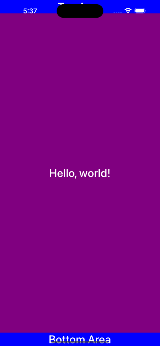
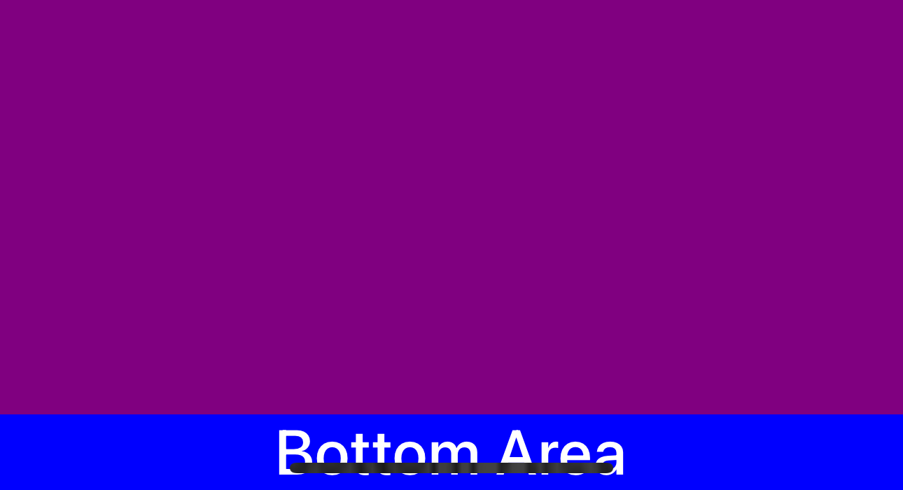
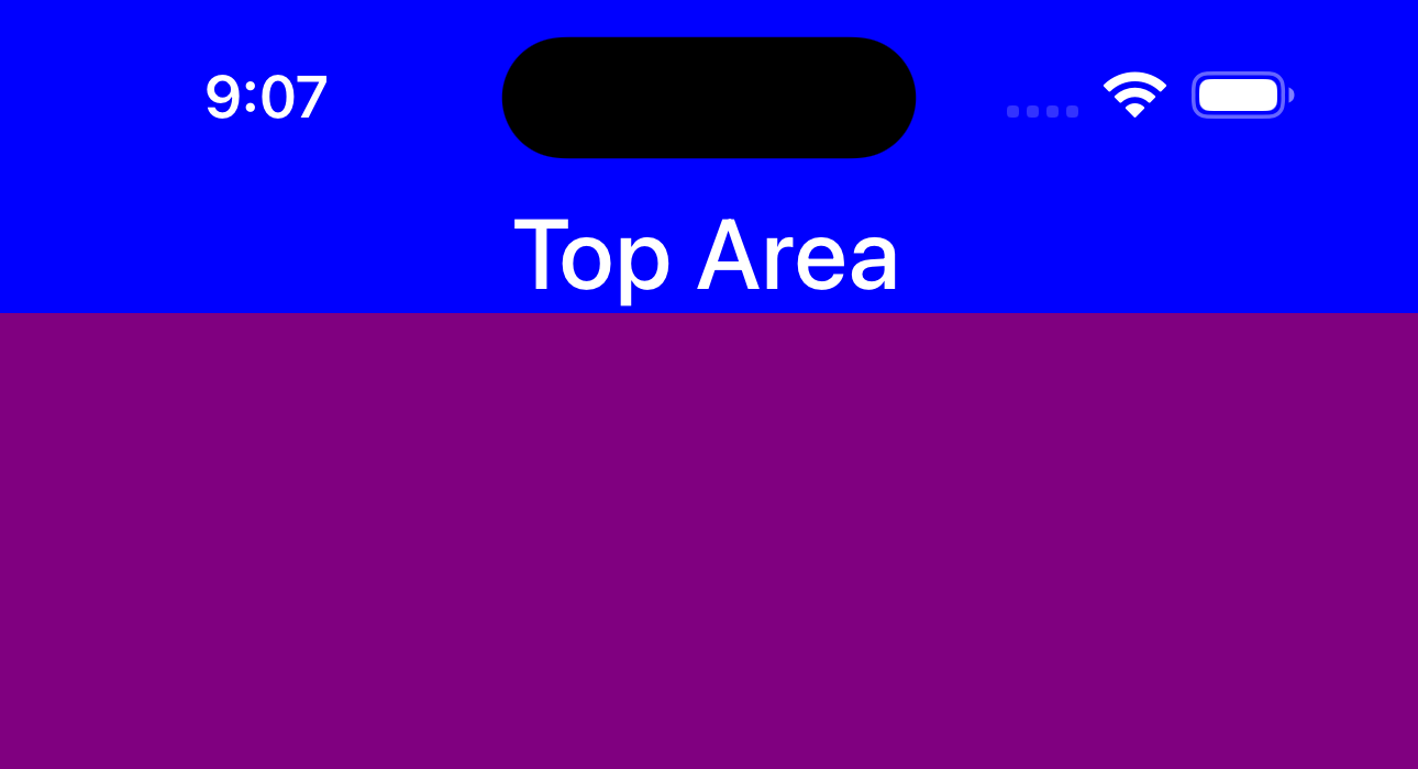
Notice the blue Grid containing the “Top Area” TextBlock is beneath the status bar text and is being obscured by the Dynamic Island area of the iPhone 15:
As well as the blue Grid containing the “Bottom Area” TextBlock being obscured by the Home Indicator:
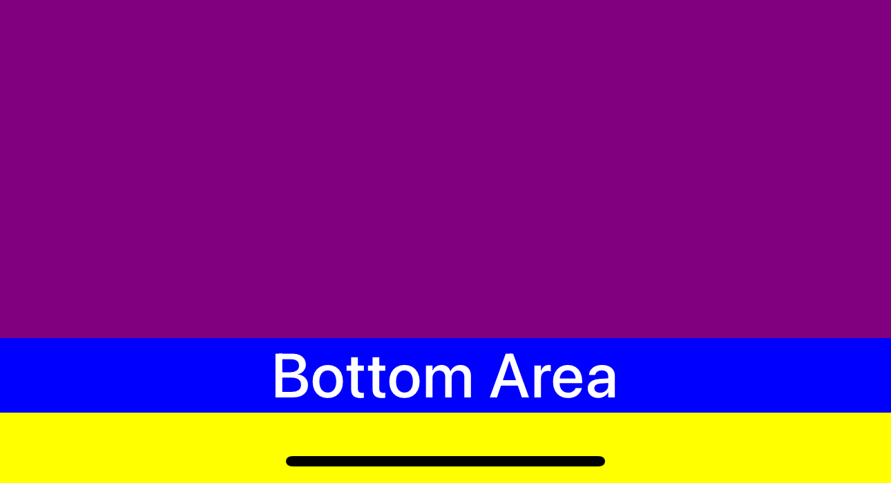
As a first pass to avoid this issue, let’s try setting the SafeArea.Insets attached property on the main purple Grid to Top,Bottom:
1
2
3
4

...
<Grid Background="Purple"
+     utu:SafeArea.Insets="Top,Bottom">
...
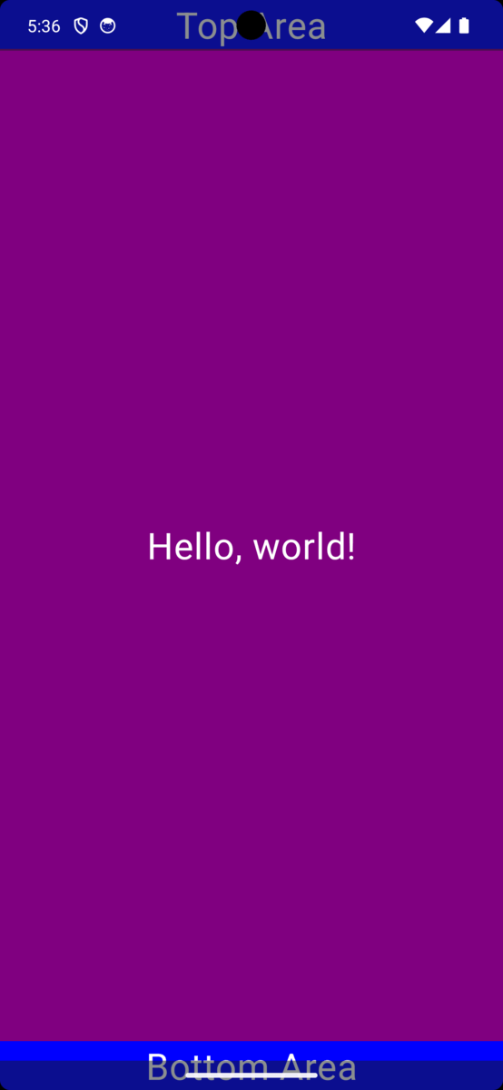
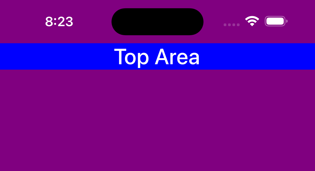
Now we see that the “Top Area” TextBlock is no longer being obscured and is visible beneath the status bar:
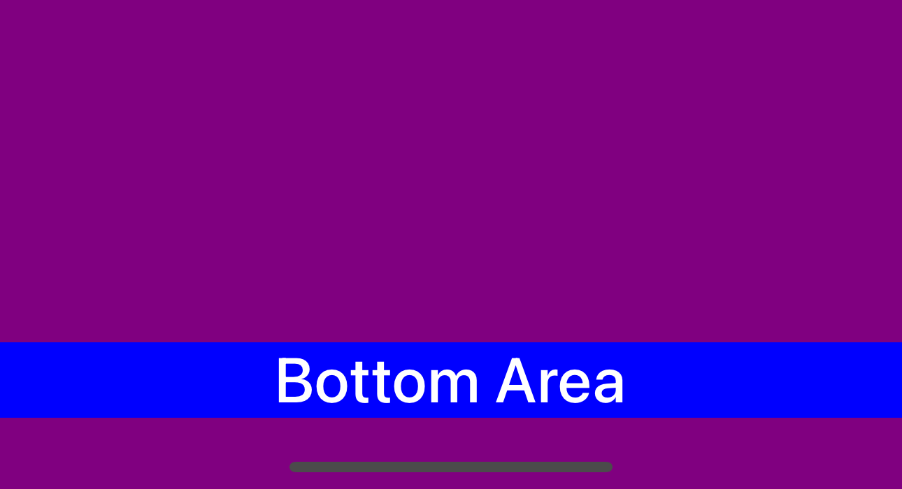
We also see that the “Bottom Area” TextBlock is no longer obscured and is visible above the Home Indicator:
Much better!
We can see that the SafeArea is doing its job and properly applying a Padding to the purple Grid so that any content inside of the Grid will be “inset” from the “unsafe” areas of the screen.
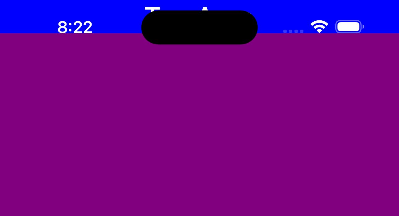
What happens if we were to set the SafeArea.Mode to InsetMode.Margin instead?
1
2
3
4
5

...
<Grid Background="Purple"
+     utu:SafeArea.Mode="Margin"
      utu:SafeArea.Insets="Top,Bottom">
...
| Top | Bottom |
|---|---|
 |
 |
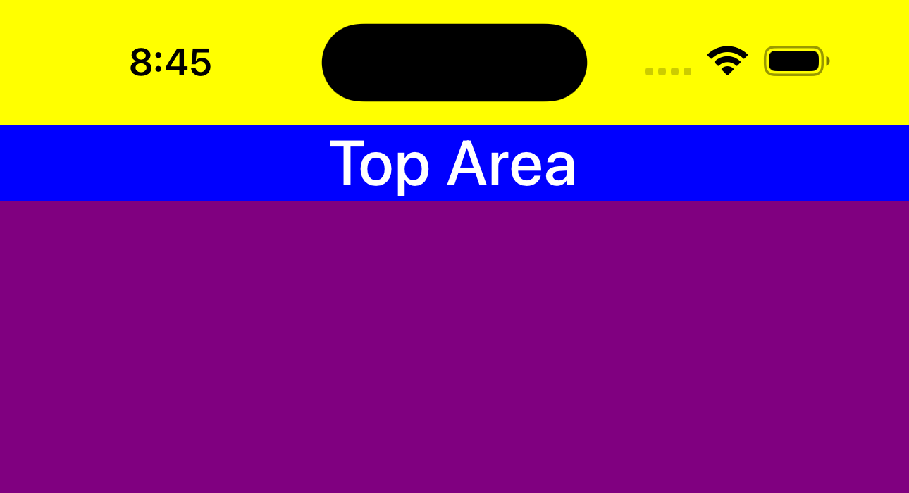
 Holy Yellow Batman! What happened there?
Well, the SafeArea is still doing its job but now it’s applying a Margin to the purple Grid instead of a Padding. This means that the purple Grid is now being pushed down and up by the SafeArea insets. If you look back at the original XAML for the Page, you’ll see that we had set a Background of Yellow on the Page. This is why we see the yellow background of the Page showing through.
I’m not a huge fan of this look, nor do I like the look of the previous Padding approach. I think it looks better when the content is allowed to “bleed” into the unsafe areas and is flush with the top and bottom of the screen. Let’s try something else.
1
2
3
4
5
6
7
8
9
10
11
12
13
14
15
16
17
18
19
20
21
22
23
24

+ <Grid Background="Purple">
-       utu:SafeArea.Mode="Margin"
-       utu:SafeArea.Insets="Top,Bottom">
    <Grid VerticalAlignment="Top"
+         utu:SafeArea.Insets="Top"
          Background="Blue">
        <TextBlock Text="Top Area"
                   FontSize="30"
                   VerticalAlignment="Center"
                   HorizontalAlignment="Center" />
    </Grid>
    <TextBlock Text="Hello, world!"
               FontSize="30"
               VerticalAlignment="Center"
               HorizontalAlignment="Center" />
    <Grid VerticalAlignment="Bottom"
+         utu:SafeArea.Insets="Bottom"
          Background="Blue">
        <TextBlock Text="Bottom Area"
                   FontSize="30"
                   VerticalAlignment="Center"
                   HorizontalAlignment="Center" />
    </Grid>
 </Grid>
We are going to remove the SafeArea attached property setters from the main purple Grid and instead apply them to the “Top Area” and “Bottom Area” Grids. Notice two things here:
- The
SafeArea.Insetsattached property is now set toTopfor the “Top Area”GridandBottomfor the “Bottom Area”Grid - The
SafeArea.Modeattached property is not set on eitherGrid, so it defaults toPadding.
| Top | Bottom |
|---|---|
 |
 |
Looking good!
Now we have both the top and the bottom Grid areas being inset from the unsafe areas using their Padding. This allows for the background of each Grid to show through and gives the appearance that the container is bleeding into the unsafe areas while still ensuring that the actual content is not obscured.
So that’s it, right? We’ll always be able to see our content no matter what, right?…
RIGHT?!?!
Let’s make a small tweak to our UI and see what happens:
1
2
3
4
5
6
7
8
9
10
11
12
13
14
15
16
17
18
19
20
21
22
23

<Grid Background="Purple">
    <Grid VerticalAlignment="Top"
          utu:SafeArea.Insets="Top"
          Background="Blue">
        <TextBlock Text="Top Area"
                   FontSize="30"
                   VerticalAlignment="Center"
                   HorizontalAlignment="Center" />
    </Grid>
-   <TextBlock Text="Hello, world!"
+   <TextBox PlaceholderText="Hello, world!"
             FontSize="30"
             VerticalAlignment="Center"
             HorizontalAlignment="Center" />
    <Grid VerticalAlignment="Bottom"
          utu:SafeArea.Insets="Bottom"
          Background="Blue">
        <TextBlock Text="Bottom Area"
                   FontSize="30"
                   VerticalAlignment="Center"
                   HorizontalAlignment="Center" />
    </Grid>
 </Grid>
Let’s see what happens now if we were to focus on this new TextBox and toggle the keyboard:
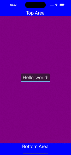
Uh oh!
Our bottom content is now being obscured by the keyboard. This may not be a huge deal in this example, but it could be a big deal in your app. You may have content that you would like to be visible at all times, such as a “Send” button or a “Cancel” button. Let’s see what we can do about this.
SoftInput Example
The SafeArea.Insets property has a special InsetMask value called SoftInput. This value is used to ensure that the specified area will adapt to any sort of soft input panel that may appear, such as the on-screen keyboard on touch devices. Let’s try it out!
1
2
3
4
5
6
7
8
9
10
11
12
13
14
15
16
17
18
19
20
21
22
23

 <Grid Background="Purple">
    <Grid VerticalAlignment="Top"
          utu:SafeArea.Insets="Top"
          Background="Blue">
        <TextBlock Text="Top Area"
                   FontSize="30"
                   VerticalAlignment="Center"
                   HorizontalAlignment="Center" />
    </Grid>
    <TextBox PlaceholderText="Hello, world!"
             FontSize="30"
             VerticalAlignment="Center"
             HorizontalAlignment="Center" />
    <Grid VerticalAlignment="Bottom"
-         utu:SafeArea.Insets="Bottom"
+         utu:SafeArea.Insets="Bottom,SoftInput"
          Background="Blue">
        <TextBlock Text="Bottom Area"
                   FontSize="30"
                   VerticalAlignment="Center"
                   HorizontalAlignment="Center" />
    </Grid>
 </Grid>
Now, when we focus on the TextBox and toggle the keyboard, we see that the bottom content is no longer being obscured:
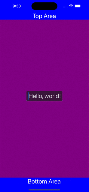
In fact, if you look closely, you’ll notice that the entire area beneath the keyboard panel has become blue. This is because the SafeArea is now applying a Padding to the bottom Grid that is equal to the height of the keyboard panel. This ensures that the bottom content will always be visible. SafeArea basically treats the keyboard area as “unsafe” for any control that has the InsetMask.SoftInput applied.
Warning: The usage of SoftInput is a more advanced use case and comes with some caveats. Using SoftInput should usually be paired with the usage of a ScrollViewer. More information can be found in the official SafeArea documentation.
Conclusion
Notice how I didn’t include my face in the example screenshots this time? 
Let’s add one here, just for good measure:

If you want to take a look at the full source code for the examples above, you can find it on this GitHub repo.
I hope you enjoyed this edition of Toolkit Tuesdays! There is even more to learn about SafeArea so I hope you will continue to explore it on your own.
I encourage you to consult the full documentation for SafeArea using the links below. I also want to welcome you to contribute to making SafeArea even better! Whether you have discovered some bugs, want to make improvements, or want to enhance the documentation, please jump into the fun on the Uno Toolkit GitHub repo!
