
Introducing Uno Chefs (and some other stuff)

Uno Platform 6.0 has been released!
Be sure to check out the release blog as well as the Release Webinar for full details and some really cool demos!
There are some truly amazing features in this release. Biggest of all are the general availability of Hot Design® and the introduction of Skia-based rendering for all platforms. Along with the official release blog, you should also check out Nick’s blog post for further coverage of the new features.
What I’ll be focusing on in this post is the release of Uno Chefs, our new flagship reference implementation when it comes to building cross-platform apps. You better get used to hearing about Chefs, because there is a boatload of content coming your way over the next few months. This means new Tech Bites, blog posts, and a growing collection of companion documentation articles that we’ve dubbed the “Recipe Book”.
What is Uno Chefs?
As the official docs state: Uno Chefs is a modern, responsive, and interactive recipe app built to show what Uno Platform can really do in a real-world, production-ready application. Basically, we took everything we offer in terms of our entire platform and shoved it into a single app. Chefs contains all the bells and whistles you can think of, including:
-
Uno Toolkit: Ranging from complex controls like the
NavigationBarto helpers like theResponsiveMarkup Extensions - Uno Material: A complete Material Design implementation
- Uno Extensions: DI, MVUX, HTTP (Kiota), Auth, Navigation, and more
- Media Player: A fully functional, and free, media player
- Third-Party Controls: LiveCharts2, Mapsui
On top of that, the Chefs app is built against the new Unified Skia Rendering Engine from Uno 6.0. Which means that the app is rendered using SkiaSharp for Every. Single. Platform.
Let’s dive in and take a tour of the app. I’m going to cover one or two pages per article, depending on the complexity of the page(s). We’ll take a look at the general structure of the pages and work our way up from there. Starting from the XAML all the way through the MVUX presentation layer, the Business layer, and finally the Client layer.
Anatomy of the Welcome Page
Upon launching the app, you should find yourself on the Welcome Page. This page presents you with a carousel-like experience to demonstrate how you can build a first-launch onboarding experience that you see in many apps today.
Wide Layout
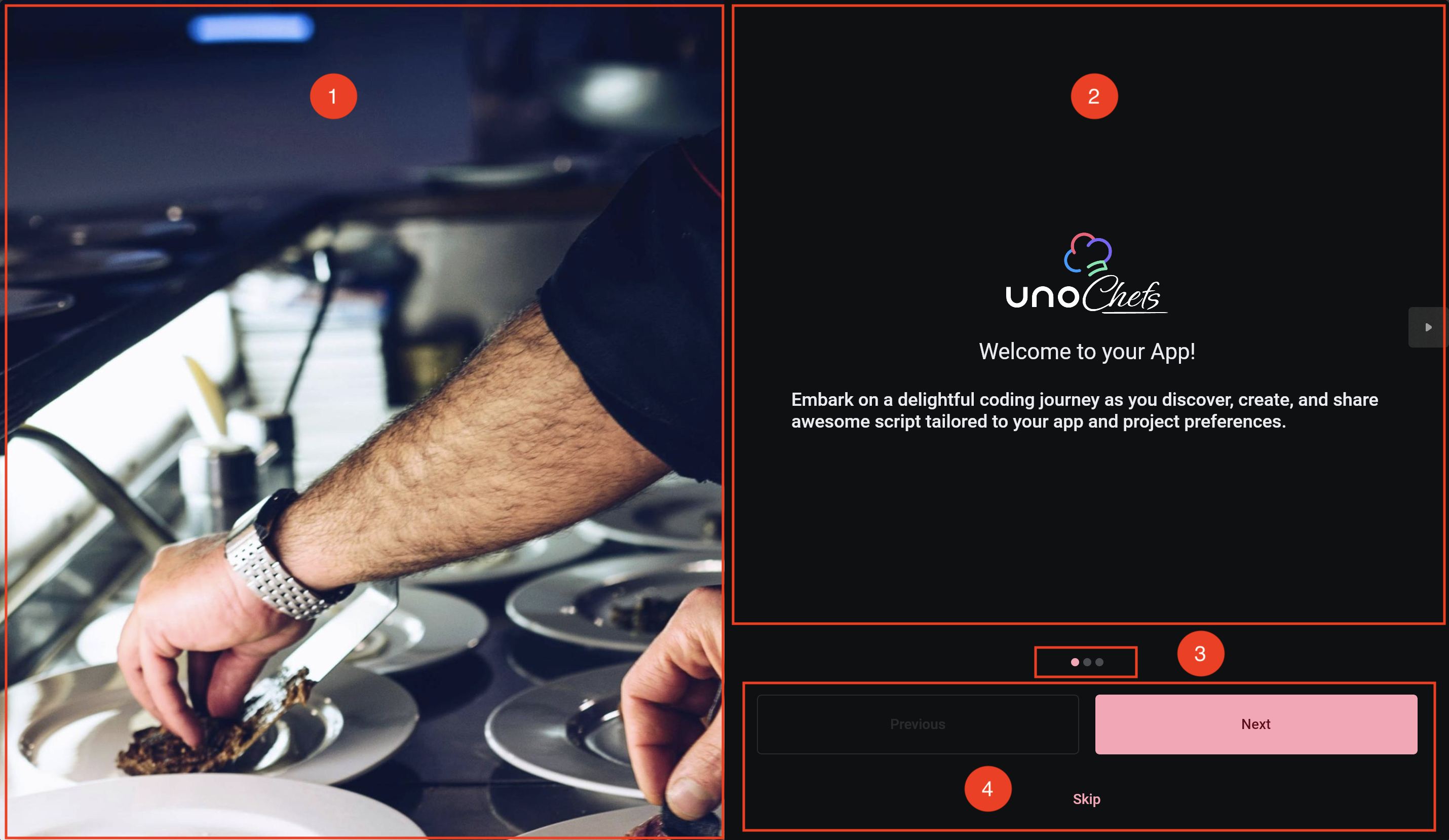
- Hero Image FlipView
- WelcomeView FlipView
- PipsPager
- Navigation Buttons
Narrow Layout
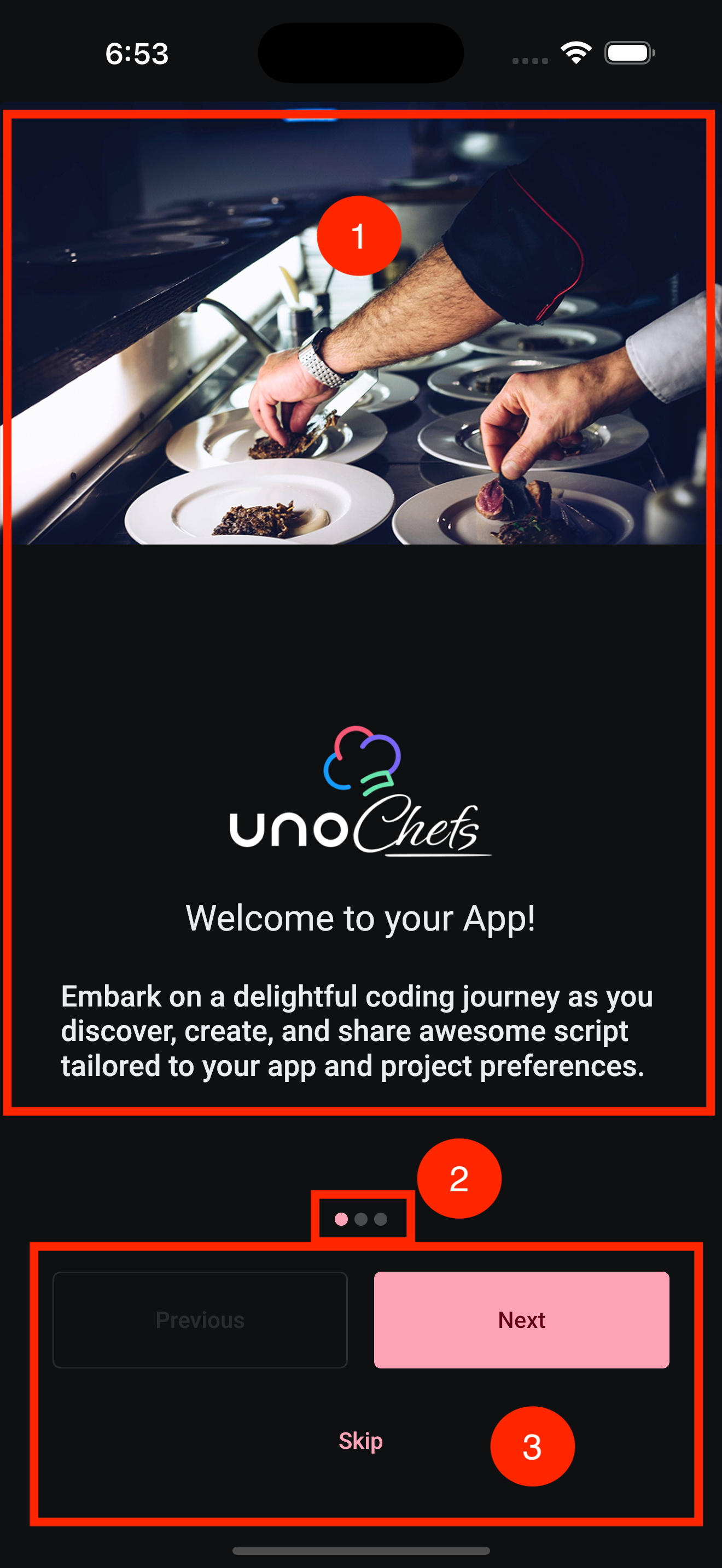
- FlipView with WelcomeView
- PipsPager
- Navigation Buttons
There’s actually a lot going on in this page. We have multiple FlipView controls here that are automatically kept in sync with each other. As well as the PipsPager that represents which of the three FlipView items is currently displayed. Finally, we have the navigation buttons that provide an alternate way of flipping through the items.
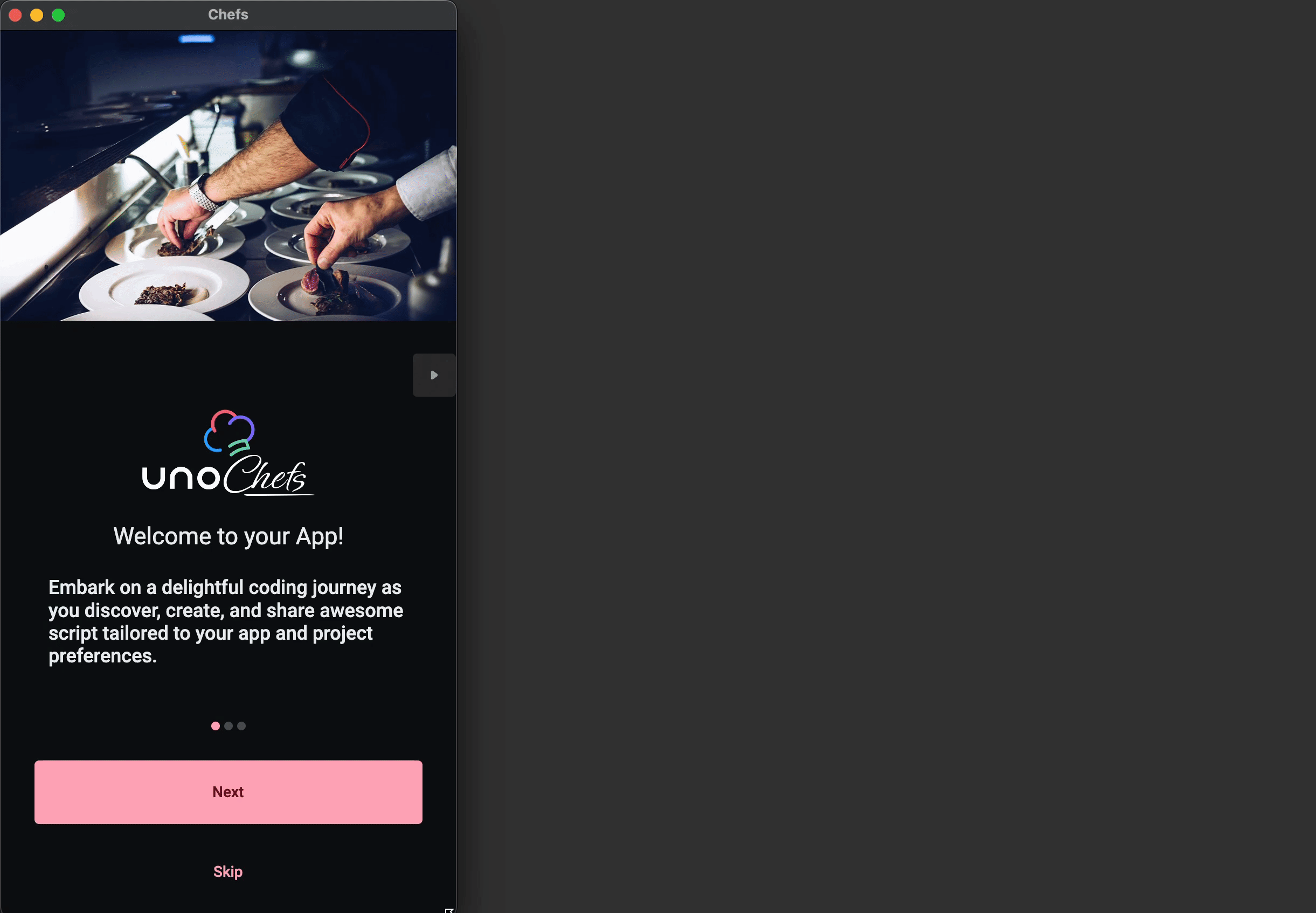
We are using multiple FlipView controls to achieve a seamless transition between the two possible page layouts. This is where developing for multiple platforms can cause some friction. Not only do we need to support narrow layouts for phones, we also need to support wide layouts for tablets, desktops, and browsers. On top of that, certain platforms allow for the window to be resized. So we need an easy way to transition between the two layouts. This is what the end result looks like:
In Chefs, we achieve this with the Responsive Markup Extension from Uno Toolkit. We’ve actually covered this in a previous post so I won’t go into a lot of detail here. But you can expect to find Responsive markup extensions peppered all throughout the app.
The XAML
Let’s dive into the XAML for the Welcome Page and see how it’s all wired up. As mentioned above, we have two FlipView controls. The first one contains the hero images that are displayed in the wide layout:
1
2
3
4
5
6
7
8
9
10
11
12
13
14
15
16
17
18

<FlipView IsEnabled="False"
          Visibility="{utu:Responsive Normal=Collapsed, Wide=Visible}"
          utu:AutoLayout.PrimaryAlignment="Stretch"
          SelectedIndex="{Binding Pages.CurrentIndex}">
  <FlipView.Items>
    <!-- First Splash image -->
    <Image Source="ms-appx:///Assets/Welcome/Wide/first_splash_screen.jpg"
           Stretch="UniformToFill" />

    <!-- Second Splash image -->
    <Image Source="ms-appx:///Assets/Welcome/Wide/second_splash_screen.jpg"
           Stretch="UniformToFill" />

    <!-- Third Splash image -->
    <Image Source="ms-appx:///Assets/Welcome/Wide/third_splash_screen.jpg"
           Stretch="UniformToFill" />
  </FlipView.Items>
</FlipView>
Take note of the Visibility property on the FlipView. We only want this FlipView to be visible when the window is wide enough.
Our second FlipView contains three instances of a small UserControl called WelcomeView. This FlipView is actually always visible. It serves as the main content to the right of the hero image in the wide layout, and as the main content in the narrow (normal) layout.
1
2
3
4
5
6
7
8
9
10
11
12
13
14
15
16
17
18
19
20
<FlipView x:Name="flipView"
utu:AutoLayout.PrimaryAlignment="Stretch"
Background="Transparent"
utu:SelectorExtensions.PipsPager="{Binding ElementName=pipsPager}"
SelectedIndex="{Binding Pages.CurrentIndex, Mode=TwoWay, UpdateSourceTrigger=PropertyChanged}">
<FlipView.Items>
<ctrl:WelcomeView ImageUrl="ms-appx:///Assets/Welcome/first_splash_screen.png"
Title="Welcome to your App!"
VerticalContentAlignment="Bottom"
Description="Embark on a delightful coding journey as you discover, create, and share awesome script tailored to your app and project preferences." />
<ctrl:WelcomeView ImageUrl="ms-appx:///Assets/Welcome/second_splash_screen.png"
VerticalContentAlignment="Bottom"
Title="Explore Thousands of Recipes"
Description="Find your next culinary adventure or last minute lunch from our vast collection of diverse and mouth-watering recipes." />
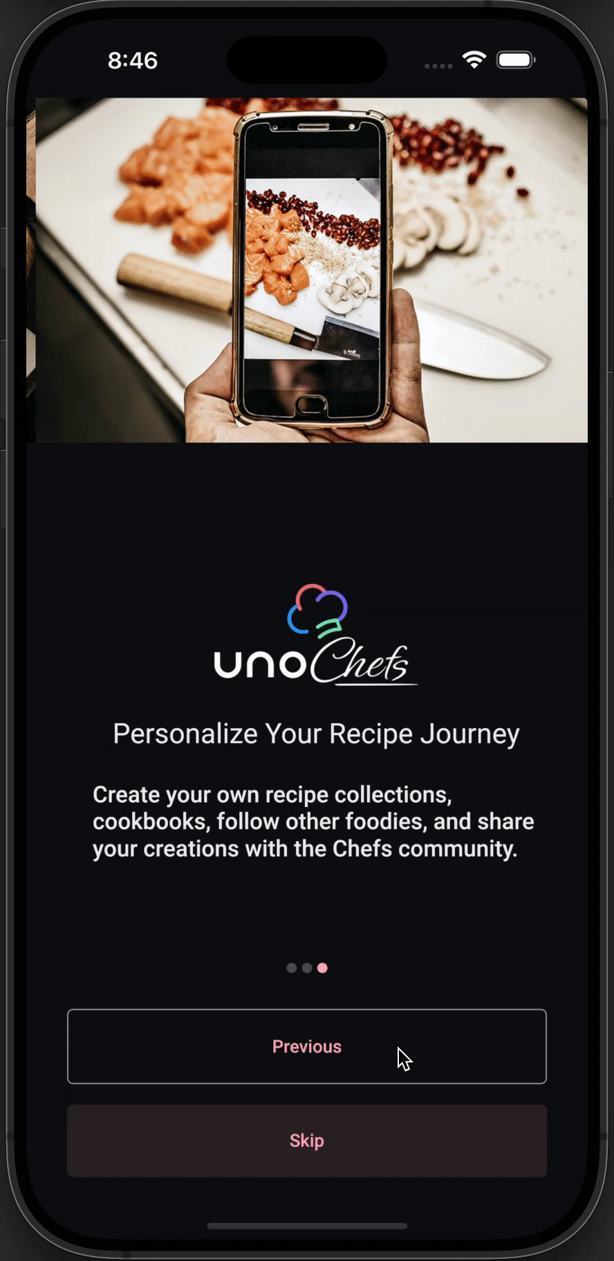
<ctrl:WelcomeView ImageUrl="ms-appx:///Assets/Welcome/third_splash_screen.png"
Title="Personalize Your Recipe Journey"
VerticalContentAlignment="Bottom"
Description="Create your own recipe collections, cookbooks, follow other foodies, and share your creations with the Chefs community." />
</FlipView.Items>
</FlipView>
You may have noticed an extra property set on this FlipView. The SelectorExtensions.PipsPager attached property from Uno Toolkit allows you to connect anything deriving from Selector (which is the case for FlipView) and keep its SelectedIndex in sync with a PipsPager.
The last pieces of the puzzle are the navigation buttons. We are using the FlipViewExtensions from Uno Toolkit to accomplish this. Given the following XAML, we can move the FlipView to the next or previous item, if possible:
1
2
3
4
5
6
7

<!-- Some code has been omitted for brevity -->

<Button Content="Previous"
        utu:FlipViewExtensions.Previous="{Binding ElementName=flipView}">

<Button Content="Next"
        utu:FlipViewExtensions.Next="{Binding ElementName=flipView}"/>
Putting it all together, we now have multiple ways to navigate through the FlipView items. The user can swipe left or right, click the navigation buttons, or use the PipsPager to jump to a specific item.
Only thing left now is to properly show/hide the Next and Previous buttons depending on the current index of the FlipView.
The MVUX Model
We could probably achieve this logic in the XAML itself, maybe using something like a Converter. But this way is more fun. Let’s take a look at the entirety of our WelcomeModel:
1
2
3
4

public partial record WelcomeModel()
{
  public IState<IntIterator> Pages => State<IntIterator>.Value(this, () => new IntIterator(Enumerable.Range(0, 3).ToImmutableList()));
}
That’s it?!?
Yes, that’s it! We are using MVUX as a presentation framework. MVUX is part of the Uno Extensions family and is designed around the notion of exposing immutable and observable streams data that are compatible with Data Binding. I highly recommend you check out the MVUX documentation for more details on how it works.
The IntIterator is a simple immutable record defined in Chefs that keeps track of the current index within a list of items. In this case, we are using it to keep track of the current index of the FlipView items. The Enumerable.Range(0, 3) creates a list of integers from 0 to 2, which corresponds to the three items in our FlipView.
We are exposing the IntIterator as an IState, an observable stream of data that can also store state. Meaning the IState can be updated from the View via two-way bindings. This allows us to two-way bind the SelectedIndex of the FlipView to the Pages.CurrentIndex, which is the current index of the IntIterator. You can see where we are doing this here. We are also observing the CanMoveNext and CanMovePrevious properties of the IntIterator to determine whether we should show or hide the Next and Previous buttons.
Next Steps
In the next article, we will move forward past the Welcome Page and dive into the Login Page and beyond. In the meantime, I encourage you to check out the Uno Chefs GitHub repository and explore the code for yourself. There are a lot of interesting patterns and techniques used throughout the app that you can learn from.
Hope you learned something and I’ll catch you in the next one 