
Toolkit Tuesdays: StatusBar
Welcome to another edition of Toolkit Tuesdays! In this series, I’ll be highlighting some of the controls and helpers in the Uno Toolkit library. This library is a collection of controls and helpers that we’ve created to make life easier when building apps with Uno Platform. I hope you find them useful too!
This week we are covering the StatusBar Extensions. This is a set of attached properties that allow you to easily customize the StatusBar on Android and iOS/Catalyst. The StatusBar is the bar at the top of your screen that displays the time, battery level, and other system information.
Anatomy of a StatusBar
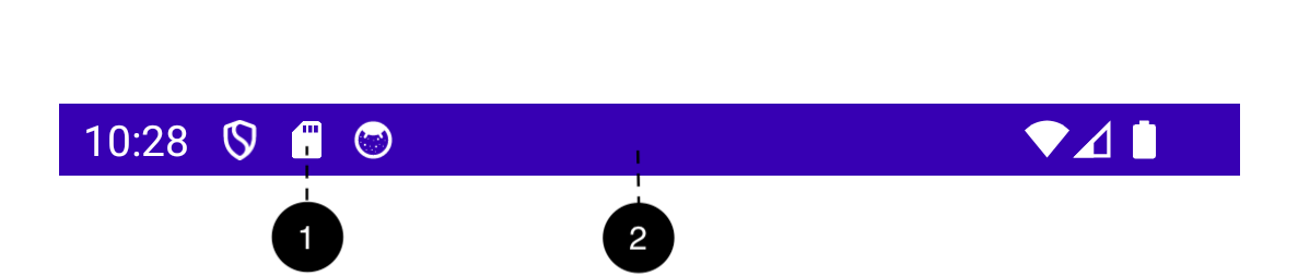
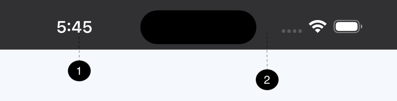
- Foreground
- Background
Attention! The StatusBar extensions are only supported for iOS and Android.
Attached Properties
Foreground
The Foreground attached property doesn’t accept normal values like a usual Brush-based property. The difference here is that the Foreground property is of type StatusBarForegroundTheme and supports the following values:
| Value | Description |
|---|---|
None |
Leaves the foreground in the last set color, and dispose any event registered by the extension associated to the current page |
Light |
The foreground will take a light/white color |
Dark |
The foreground will take a dark/black color |
Auto |
The foreground will adjust according to the current theme: light/white in the dark mode, and dark/black in the light mode |
AutoInverse |
The foreground will adjust according to the current theme: dark/black in the dark mode, and light/white in the light mode |
Background
The Background property is more straightforward and can be set to any color. It should be noted that, due to platform limitations, only SolidColorBrush is supported.
Examples
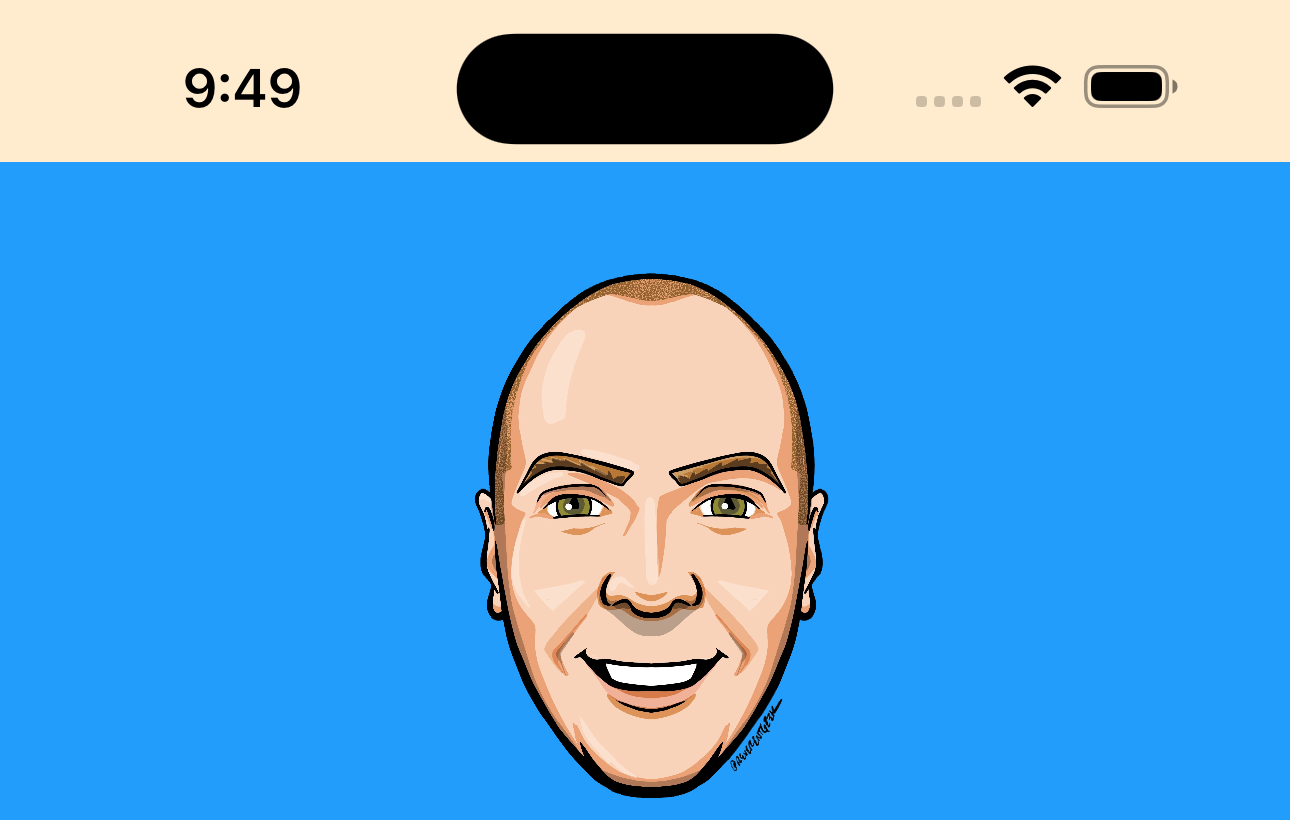
Let’s see it in action and jump into some code! Get ready to see my face plastered all over the place once again.
Note: I’ll be using iOS for my example screenshots going forward, but the same concepts apply to Android. This is mostly to make my life easier and not have to take screenshots on multiple devices.
Attention! On iOS, UIViewControllerBasedStatusBarAppearance should be set to false in your Info.plist.
Let’s start with a basic page that sets the StatusBar to some sexy Uno Platform colors.
First things first, let’s get some colors and brushes defined as well as the Uno Toolkit resources loaded in our AppResources.xaml:
1
2
3
4
5
6
7
8
9
10
11
12
13
14
15
16
17
18
19
20

<ResourceDictionary xmlns="http://schemas.microsoft.com/winfx/2006/xaml/presentation"
                    xmlns:x="http://schemas.microsoft.com/winfx/2006/xaml">

    <ResourceDictionary.MergedDictionaries>
        <!-- Load WinUI resources -->
        <XamlControlsResources xmlns="using:Microsoft.UI.Xaml.Controls" />
        <!-- Load Uno.UI.Toolkit resources -->
        <ToolkitResources xmlns="using:Uno.Toolkit.UI" />
    </ResourceDictionary.MergedDictionaries>

    <Color x:Key="UnoBlue">#FF229DFC</Color>
    <Color x:Key="UnoPurple">#FF7A69F5</Color>
    <Color x:Key="UnoGreen">#FF6CE5AE</Color>
    <Color x:Key="UnoRed">#FFF65678</Color>

    <SolidColorBrush x:Key="UnoBlueBrush" Color="{StaticResource UnoBlue}" />
    <SolidColorBrush x:Key="UnoPurpleBrush" Color="{StaticResource UnoPurple}" />
    <SolidColorBrush x:Key="UnoGreenBrush" Color="{StaticResource UnoGreen}" />
    <SolidColorBrush x:Key="UnoRedBrush" Color="{StaticResource UnoRed}" />
</ResourceDictionary>
Now, we can use one of those brushes as the background for our status bar:
1
2
3
4
5
6
7
8
9
10
11
12
13

<Page x:Class="StatusBarApp.MainPage"
      xmlns="http://schemas.microsoft.com/winfx/2006/xaml/presentation"
      xmlns:x="http://schemas.microsoft.com/winfx/2006/xaml"
      xmlns:utu="using:Uno.Toolkit.UI"
      utu:StatusBar.Foreground="Auto"
      utu:StatusBar.Background="{StaticResource UnoPurpleBrush}"
      Background="{StaticResource UnoBlueBrush}">
    <Image Width="200"
           Height="200"
           Margin="16"
           VerticalAlignment="Top"
           Source="ms-appx:///StatusBarApp/Assets/Images/steve.png" />
</Page>

I kinda hate the look of the default dark text on the Purple background so let’s change that to light text:
1
2
3
4
5
6

...
      xmlns:utu="using:Uno.Toolkit.UI"
-     utu:StatusBar.Foreground="Auto"
+     utu:StatusBar.Foreground="Light"
      utu:StatusBar.Background="{StaticResource UnoPurpleBrush}"
...

Much better! This way the text will always be White, regardless of the theme. Which is fine because our background is always going to be the Uno Purple color.
But what if we wanted to have our status bar change colors based on the theme? Let’s try that out!
First, let’s define some new brushes in our AppResources.xaml that change values based on the theme:
1
2
3
4
5
6
7
8

<ResourceDictionary.ThemeDictionaries>
    <ResourceDictionary x:Key="Light">
        <SolidColorBrush x:Key="MyStatusBarBackground" Color="BlanchedAlmond" />
    </ResourceDictionary>
    <ResourceDictionary x:Key="Dark">
        <SolidColorBrush x:Key="MyStatusBarBackground" Color="SaddleBrown" />
    </ResourceDictionary>
</ResourceDictionary.ThemeDictionaries>
And use that new brush as the background for our status bar:
1
2
3
4
5
6

...
      xmlns:utu="using:Uno.Toolkit.UI"
      utu:StatusBar.Foreground="Light"
-     utu:StatusBar.Background="{StaticResource UnoPurpleBrush}"
+     utu:StatusBar.Background="{ThemeResource MyStatusBarBackground}"
...
| Light | Dark |
|---|---|
 |
 |
Hmm, having a utu:StatusBar.Background of Light doesn’t look good anymore, especially when the app is in light mode. Let’s change that back to Auto:
1
2
3
4
5
6

...
      xmlns:utu="using:Uno.Toolkit.UI"
-     utu:StatusBar.Foreground="Light"
+     utu:StatusBar.Foreground="Auto"
      utu:StatusBar.Background="{ThemeResource MyStatusBarBackground}"
...
| Light | Dark |
|---|---|
 |
 |
Looking good! Now we have a status bar that changes background colors based on the theme and the text color changes to match the theme as well. Notice that the dark theme screenshot looks the same as before. This is because we set the utu:StatusBar.Foreground to Auto and the system automatically uses White as the text when in dark mode.
Now, what if we wanted to invert the background colors and instead use SaddleBrown when we are in Light mode and BlanchedAlmond when we are in Dark mode? Let’s try that out!
1
2
3
4
5
6
7
8
9
10

<ResourceDictionary.ThemeDictionaries>
    <ResourceDictionary x:Key="Light">
-       <SolidColorBrush x:Key="MyStatusBarBackground" Color="BlanchedAlmond" />
+       <SolidColorBrush x:Key="MyStatusBarBackground" Color="SaddleBrown" />
    </ResourceDictionary>
    <ResourceDictionary x:Key="Dark">
-       <SolidColorBrush x:Key="MyStatusBarBackground" Color="SaddleBrown" />
+       <SolidColorBrush x:Key="MyStatusBarBackground" Color="BlanchedAlmond" />
    </ResourceDictionary>
</ResourceDictionary.ThemeDictionaries>
| Light | Dark |
|---|---|
 |
 |
Yuck 
This doesn’t seem to work very well with the Auto foreground. Let’s try setting the foreground to AutoInverse instead:
1
2
3
4
5
6

...
      xmlns:utu="using:Uno.Toolkit.UI"
-     utu:StatusBar.Foreground="Auto"
+     utu:StatusBar.Foreground="AutoInverse"
      utu:StatusBar.Background="{ThemeResource MyStatusBarBackground}"
...
| Light | Dark |
|---|---|
|
|
The AutoInverse value is exactly what we need! Now the text color will always be White in Light mode and Black in Dark mode.
Conclusion
I’m sure you’re sick of seeing my dumb smiling face staring into your soul with every screenshot so I will wrap this up and point you to some resources for more information.
I encourage you to consult the full documentation for StatusBar using the links below. I also want to welcome you to contribute to making StatusBar even better! Whether you have discovered some bugs, want to make improvements, or want to enhance the documentation, please jump into the fun on the Uno Toolkit GitHub repo!
